Painting walls with color transitions has become fashionable again. The gradient method of applying paint allows you to enliven and visually expand the interior, making it mobile and fresh.
We will tell you how to do transition painting with your own hands, and also give a series of useful tips for performing this type of work.
Gradient wall painting
Purpose and features
A gradient is a smooth transition from one color to another, in which a clear boundary between these shades is not visible. The style that uses coloring with a transition is called ombre.
At the same time, transitions can be observed not only in the design of furniture, in the colors of curtains and drapes, bed linen, and in other decorative elements or shaped parts of the room’s decoration. This technique is used to give the interior dynamics, a certain element of movement, as well as for the visual effects of increasing space and creating depth and color relief.
If we look at our surroundings natural environment, then we immediately notice that clear lines and geometricity are alien to it, as are identical repeating forms. Also, we will not be able to find right angles, squares, permanent borders and strict colors. Everything seems to flow from one state to another, the transitions are barely noticeable, the boundaries are blurred and changeable.
This picture is familiar to us; we ourselves are not constancy and can change over time. However, the objects we create contrast with this picture: our rooms, pieces of furniture, houses, roads, cities - all have correct forms and right angles. To somehow smooth out this contrast, a gradient painting technique is used in interior design.
The direction of the gradient can be horizontal, vertical, diagonal, diverging or mixed.
By placing dark and light areas in different zones, you can achieve the following effects:
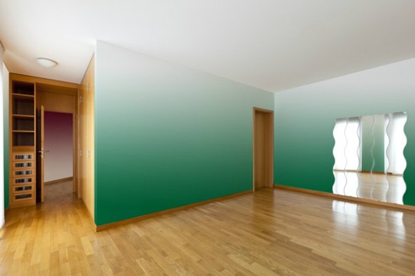
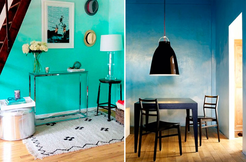
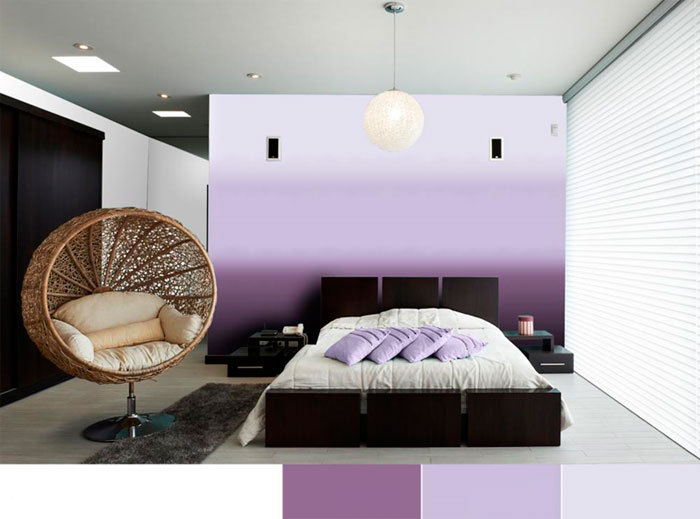
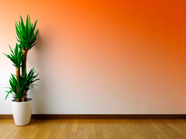
- When darkening the bottom of the wall and lightening the top the effect of vertically enlarging the room is created, the ceilings seem higher, and the floor seems more reliable and powerful;
- When darkening the top the impression of a receding perspective is created, and the room visually expands. The boundaries between the floor and walls are a little blurred, especially if the color flooring light;
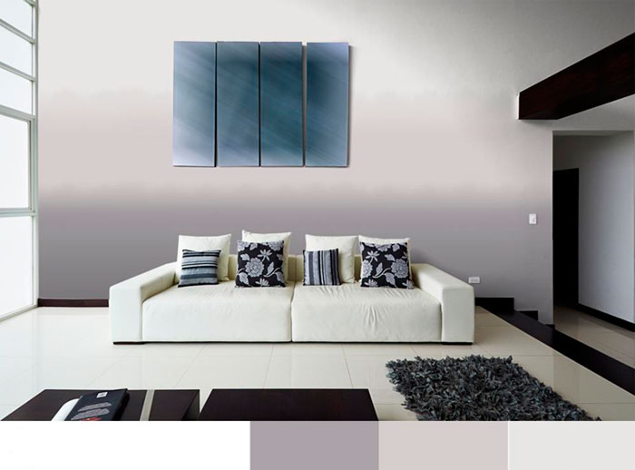
- When darkening the corners and brightening the middle of the wall the room loses its rectangularity a little, becomes rounded, and it may seem somewhat narrower. The interior becomes more contrasting and prominent;
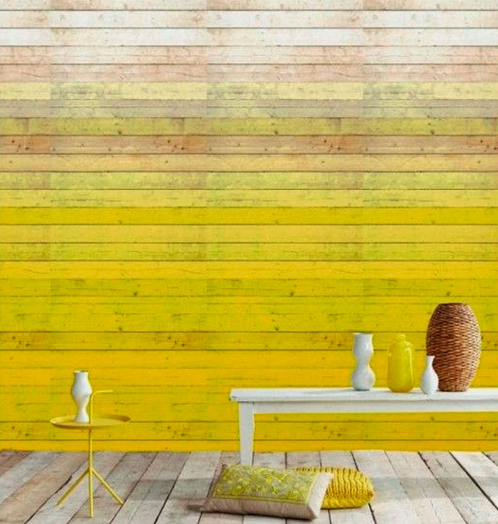
- When brightening corners and window areas while simultaneously darkening the middle sections of the walls the room expands and becomes brighter. The contrast drops and the lighting becomes more positive and brighter;
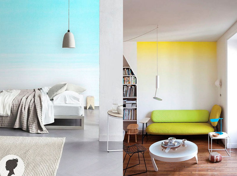
- Diagonal and wavy transitions they introduce more dynamics, the room becomes less strict and geometric, straight lines and angles are visually smoothed;
- Painting a spot with a transition in diverging directions used in cases where it is necessary to repair a small area of finishing and make the boundaries of this area invisible. This method also allows you to “break” the rectangular geometry of the walls and adds depth to them.
Important!
The ombre technique is a rather complex type of painting craft, and the price of such work performed by a professional is usually relatively high.
However, there is a technique for doing gradient painting yourself that will help you cope with the task without outside help.
Ways to make transitions
You can transition from one shade to another different ways, therefore, before painting with a transition, we should choose the method that suits us. This can be spray painting with a transition, using a spray gun, using a roller or brush followed by polishing the edges, using the trimming technique with a sponge or brush, creating sharp edges and other techniques.
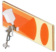
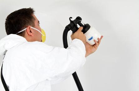
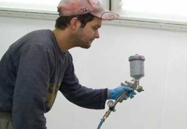
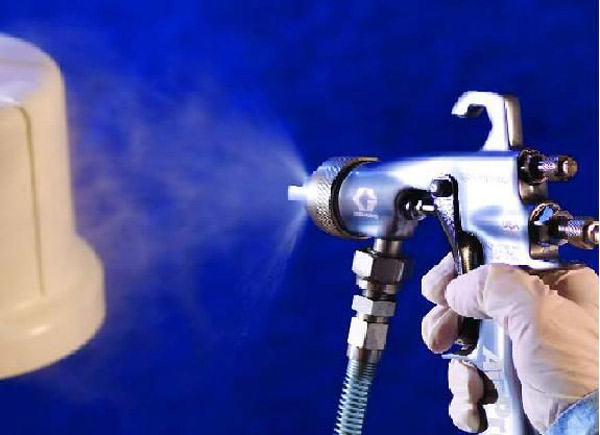
Most effective method how to paint with a transition with smooth “flowing” boundaries - this is work with a professional spray gun or airbrush. This tool allows you to regulate the intensity of paint supply during the finishing process; moreover, the specificity of applying the coating is such that the stain has a natural halo of a lighter shade, which can be used as a border between different colored zones.
When using, you will have to decide how to polish the paint transition, and this can take a lot of time and labor, because it’s not so easy to get your hands on it, but it will spoil the walls in own home- the option is far from the best. The most difficult thing to do is to paint with a transition to a silver color, since it is very difficult to evenly distribute aluminum shavings.
Painting with a smooth transition
Let's move on to the practical side of the issue.
Our instructions will tell you how to make a smooth transition between tones with your own hands:
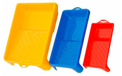
- Wash the spray gun and prepare it for work, set it up required pressure air supply and dilute the paint to the desired consistency using a viscometer. It is better to use a conventional device high pressure or HVLP, the nozzle must be universal and adjustable;
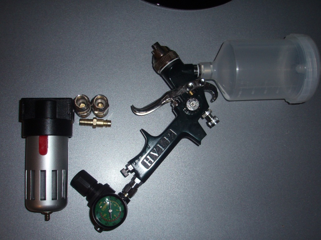
- Separately dilute white paint of the same brand, then mix both colors to the lightest possible shade. Pour paint into the tank and apply it to the entire wall;
- We wash the spray gun and pour unlightened paint, apply a dark stripe to the lower part of the wall one-fourth its height. Approaching the upper limit of the strip, we move the spray nozzle further from the wall, you can also reduce the stroke of the locking needle and achieve a lower intensity of paint supply;
- We wash the device again and refill it with slightly lightened paint. First, we try it on a piece of cardboard and achieve such a distance and feed intensity that the main spot is slightly lighter than the upper border (halo) of the dark stripe. We apply a lighter layer above the dark area up to half the height of the wall, we also make the upper border lighter by adjusting the feed and changing the distance to the nozzle;
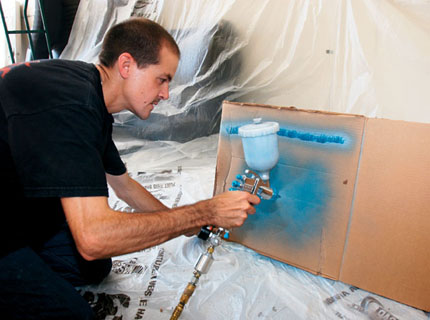
- We wash it so that it is slightly darker than the base that we applied to the wall. We make a third stripe with a transition at the upper border;
- We examine the result from different distances and under different lighting conditions and, if necessary, correct the transitions by applying a dark or light mist of paint of the desired tone, diluted to a watery consistency. In this case, we set the feed (needle stroke) to a minimum.
Important!
It is better to make horizontal borders not even, but slightly wavy.
This will give the transition greater fluidity and smoothness.
Conclusion
The gradient method of applying paint is coming back into fashion. Smooth boundaries between shades allow you to create original interior decoration, enliven the design and create interesting effects. The video in this article will tell you how to perform work using the ombre technique.
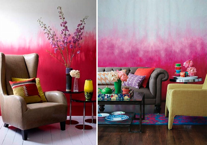
The gradient tinting trend became a hit and entered the canon of interior design. So today, not only hairdressers and stylists, but also interior designers pay tribute to the ombre technique. Painting ombre walls allows you to decorate your interior in an extremely interesting way, giving room for creative color fun. Thanks to this painting method, our homes will gain a unique character and taste, and a spectacular effect is guaranteed.
Ombre, translated from French means "shading". This is a special coloring technique that allows you to smoothly transition from one shade to another, gradually combining them in the middle, thereby creating a very interesting effect. This technique is very common in hairdressing, which is why in recent years we have often seen girls with an ombre effect on their hair. This trend is also penetrating into the design of our homes.
The ombre fashion lasts continuously for several seasons. And if until recently this technique was associated only with the beauty industry (make-up and hairdressing) and the clothing industry, today it has also made a brilliant triumph in interior styling. World designers have become passionate about this trend. And for good reason, the ombre effect on the walls looks very impressive. Depending on the execution technique, the walls resemble works of art, as if a real artist had worked on our interior.
The gradient in wall decoration certainly has its own charm - on a large surface it looks very impressive, seduces and tempts with its uniqueness. The number of fans of this technique is constantly growing. Thanks to the gradual tinting and dissolution of one color and the penetration of another shade into it, different climatic spaces can easily be conjured up.
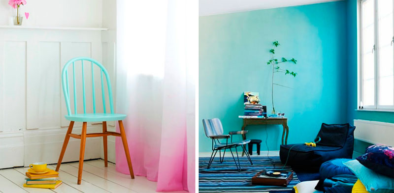
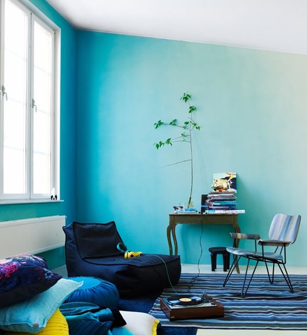
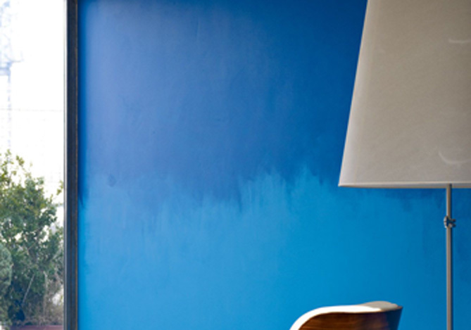
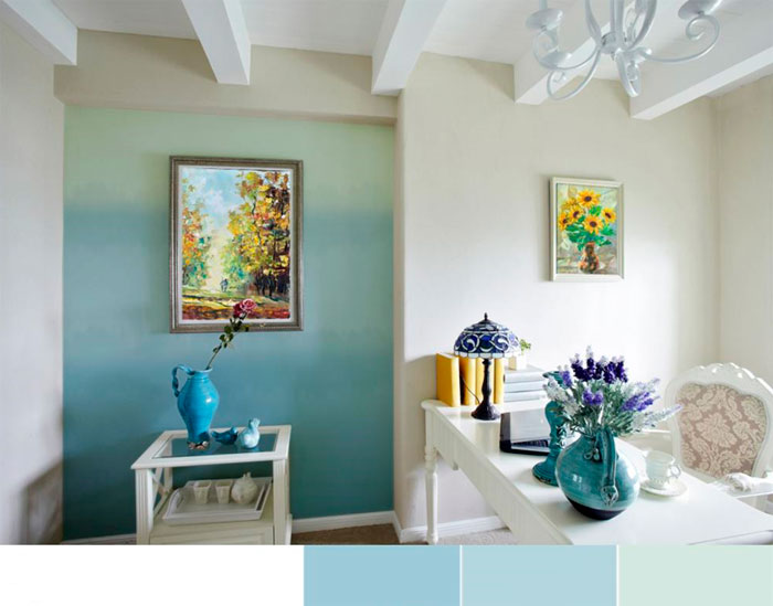
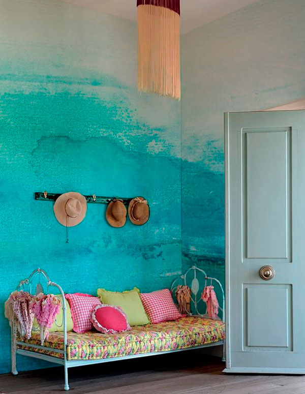
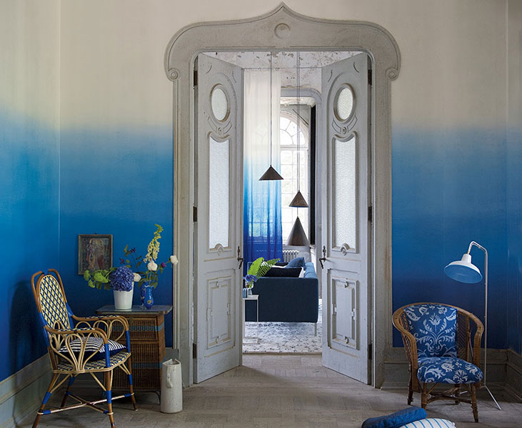
The ombre wall painting technique fits perfectly into the aesthetics of the Mediterranean style, which is dominated by blue and white shades. Painting the walls in ombre style will allow us to create a climate in the home space reminiscent of the charm of resorts.
Dream of summer travel
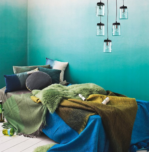
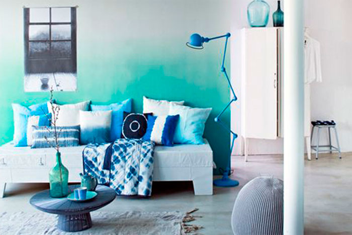
Combination turquoise color sea, golden sand and warm sun will make you feel like you are on one of the paradise islands. At correct design walls, a calming maritime climate can be present in our home throughout the year. A space reminiscent sunny days Regardless of the season, you can create it using the ombre technique. To do this, various shades of blue are applied to the walls.
We can freely choose and combine: blues, azure, cornflower blue, cobalt or turquoise. The Mediterranean hacienda is bright and cozy, so remember that blue shades should be accompanied by white. Together they create subtle and fresh compositions. By using these colors and the art of shading, we can easily create the most wonderful holiday memories in our home. Who among us has not dreamed of a house on the seashore? The blue gradient will give us its sweet impression.
On the way to the color of the sea
This technique is best suited for well-lit rooms. A wonderful trio is created using shades: azure, blue and mint. Depending on personal preference, we can choose more intense or bleached tones. When dreaming of an ethereal space, you can use shades of blue and hydrangea. Blue can also be highlighted beautifully with purple. An extremely charming combination will be created by combining blue with lilac. Such an interior becomes extremely charming and will be associated with heather in a forest clearing.
Light ombre accents on the walls
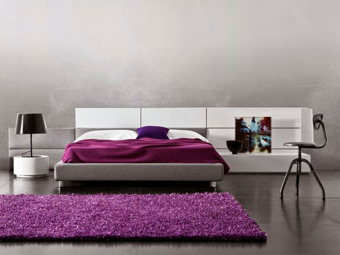
People who are careful when manipulating colors may enjoy painting ombre walls in a muted version. This could be, for example, a combination of intense gray with a slightly softer and velvety silver tone.
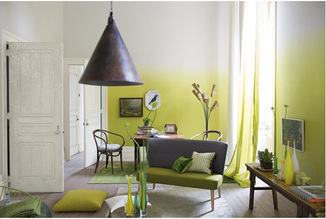
Slightly yellow tones that bring a little light into our home will also work well. And blue additions will coordinate beautifully with the natural surroundings, such as a pebble beach that slopes into the sea.
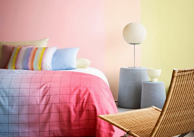
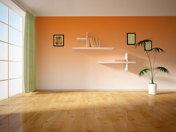
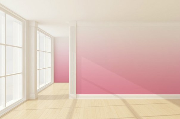
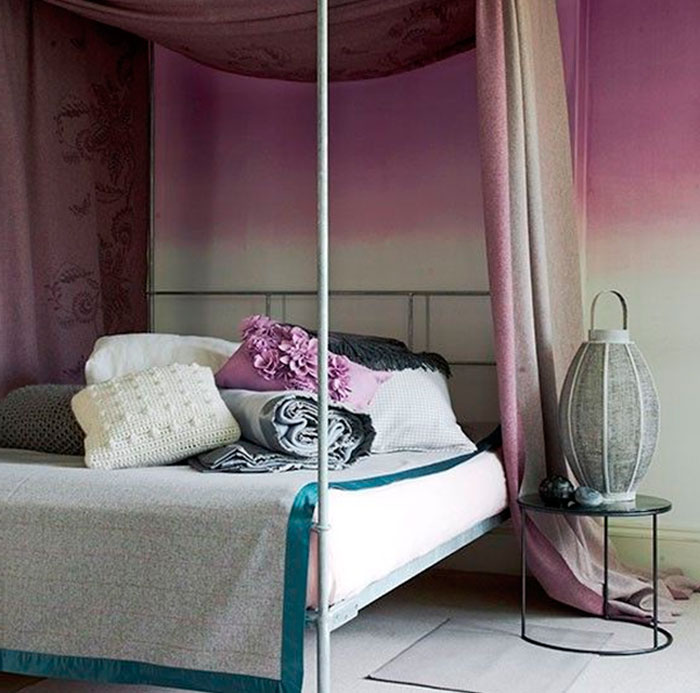
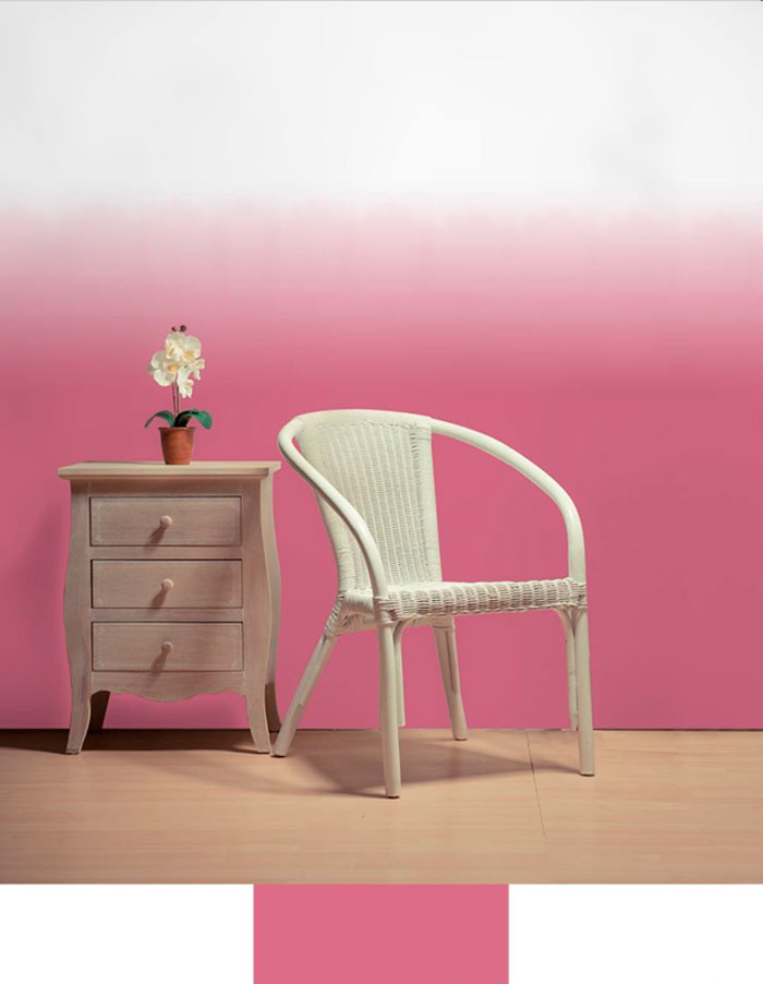
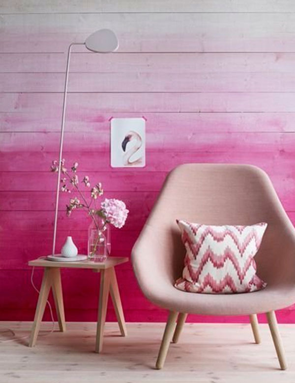
A pink gradient on the walls will create a beautiful and romantic atmosphere.
Painting walls using the ombre technique - step by step
Once we've chosen the tone and shading and developed a strategy, we can get to work. How to paint ombre walls? Let's not act in a hurry - we'll do everything in order.
What will you need?
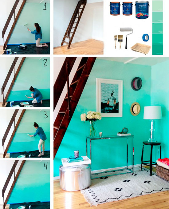
- First of all, you should prepare the surfaces for decoration: protect the edges and ceiling with adhesive tape and cover the wall with primer.
- The next step is to paint the entire wall with the lightest color from the selected palette.
- Each subsequent layer should be applied in stripes. Optimal choice- these are five colors, each second should be applied in a stripe wider than the others. The leading colors must be used - three original shades of paint and two obtained by mixing the leading colors.
- Shading should begin with the darkest tone from the selected palette.
- We then mix it with the middle shade and apply another stripe.
- After this, you should use the second chosen paint, then mix it with the lightest paint and finish the color fading effect.
- The boundaries between tones can be wiped with a brush or sponge. But the spots should not be regular; they are applied fantasistically, without a technique. By applying them, we can conjure up foamy waves or billowing clouds.
Ombre painting technique and accessories
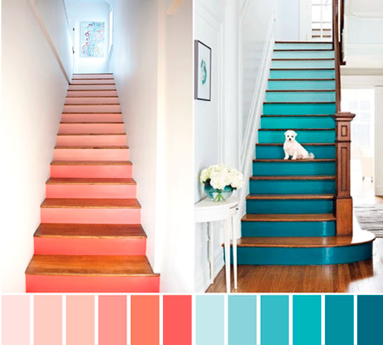
When the walls are ready, you should take care of the accessories. Every Mediterranean interior should be equipped with white, long and soft curtains. In such a whimsically organized space, linen curtains or bamboo blinds will also look good. Original idea- this is the coloring of a staircase with a gradation of colors for all steps.
In the room where we used the shading technique, openwork forged furniture, forged chairs and tables will be beautifully presented. Equally a good option- This is massive wooden furniture.
A fluffy rug in earth tones effectively warms up such a space. Pots with heather flowers can be displayed on the windowsills.
An interior with a touch of sentimentality is achieved by placing photographs of various sizes on one wall. Accessories should retain the color of the sea, but adding lavender, pastel greens or fuchsia won't hurt either. Decorations such as shells, miniature wooden sailing ships, or even an aquarium with fish go well with the Mediterranean aesthetic.
The ombre wall painting technique will help us create a space that brings the charm of warm countries to our climate zone. With flowers in shades of blue, beige and Ivory You can feel like you are in your own home in a resort atmosphere.
Diluted paints are a mixture of a small amount of pigment with a sufficient volume of water. The special properties of diluted paints are their transparency and luminosity, acquired due to the whiteness of the paper.
Uniform filling
The first thing a watercolorist needs to master is a uniform coating. Although the paint layer does not always have to be of constant density and color, it is very useful to have the skill of doing it. The basic principle that must be followed is that the paint should flow over the surface of the paper. To do this, the paper must first be stretched or in some other way give it the ability not to wrinkle.
To dilute the paint, you will need a sufficiently deep container of water (the approximate volume is an egg cup) to fill a 15 x 15 cm square. To cover a larger area, naturally, you will need a larger amount of diluted paint.
With experience, you will learn to prepare the right amount of paint, and general rule this: dilute what you think is a sufficient amount, double it and add a little more.
Before you start applying paint, tilt the tablet slightly. The paint will be able to flow down and pool at the base of each stroke.
Materials:
- 185gsm Pre-stretched Non-Hot Pressed Watercolor Paper
- Wide watercolor brush
- Watercolor paints: Prussian blue or phthalocyanine blue pigment
1
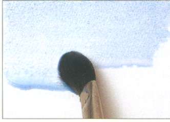
Using a wide brush, generously soaked in paint, make a light brush stroke from left to right.
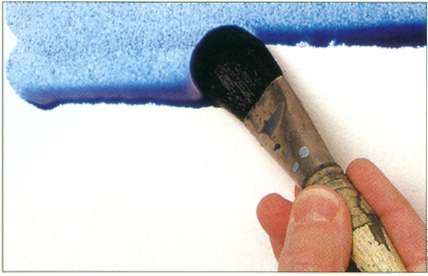
2
Dip the brush into the paint again and draw another one along the lower border of the first stroke, without touching the stripe of the first stroke.
3
Cover the entire sheet with paint in this way.
4
Wring the brush dry and run it along the base of the last stroke to remove excess paint and create an evenly colored edge.
Uniform filling
The paper is evenly coated with paint and has no brush marks. Please note that when the paint dries, it takes on a lighter tone.
Fill with shade gradation
The procedure for applying color with a smooth transition of shades is similar to the above, but instead of dipping the brush into pre-prepared paint, you add a little more clean water with each subsequent stroke to move from saturated color to its absence.
Materials:
- Not hot pressed watercolor paper 185 g/m2
- Wide watercolor brush
- Watercolor paint: cobalt blue
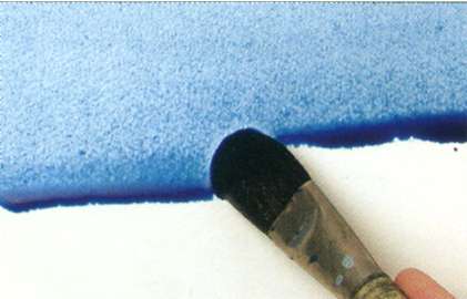
1
Using a wide watercolor brush, generously soaked in paint, make one light stroke from left to right.
2
Add water to the diluted paint, dip the brush again and make a second one a little lower, without affecting the stripes of the first stroke.
3
Repeat the previous step, adding another portion of water to the paint after each stroke. If the more saturated color of the previous stroke flows onto the lighter one below, reduce the tilt of the tablet.
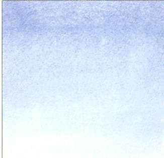
Complete coverage with a smooth transition of shades
The color saturation gradually weakens from top to bottom and disappears at the bottom of the sheet.
Multicolor fill
A multi-color coating with a smooth transition from one color to another is somewhat more difficult to perform than a single-color coating, and the necessary skill comes with experience. There is always the possibility that liquid paints will merge, but I perceive this property of watercolor as one of the elements of its attractiveness. You can partly control the behavior of liquid and flowing paints by tilting the tablet, as well as using a hairdryer.
However, the consequence of this may be uneven drying with the formation of numerous boundaries, however, many find them attractive. On some types of paper, the inks dry to form a border that is slightly darker than the ink background. Personally, I really like this effect, and sometimes to accentuate the border, I use a paper towel to specifically remove some of the paint in the middle of the color field.
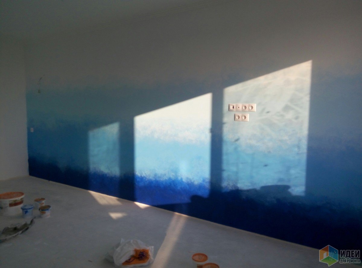
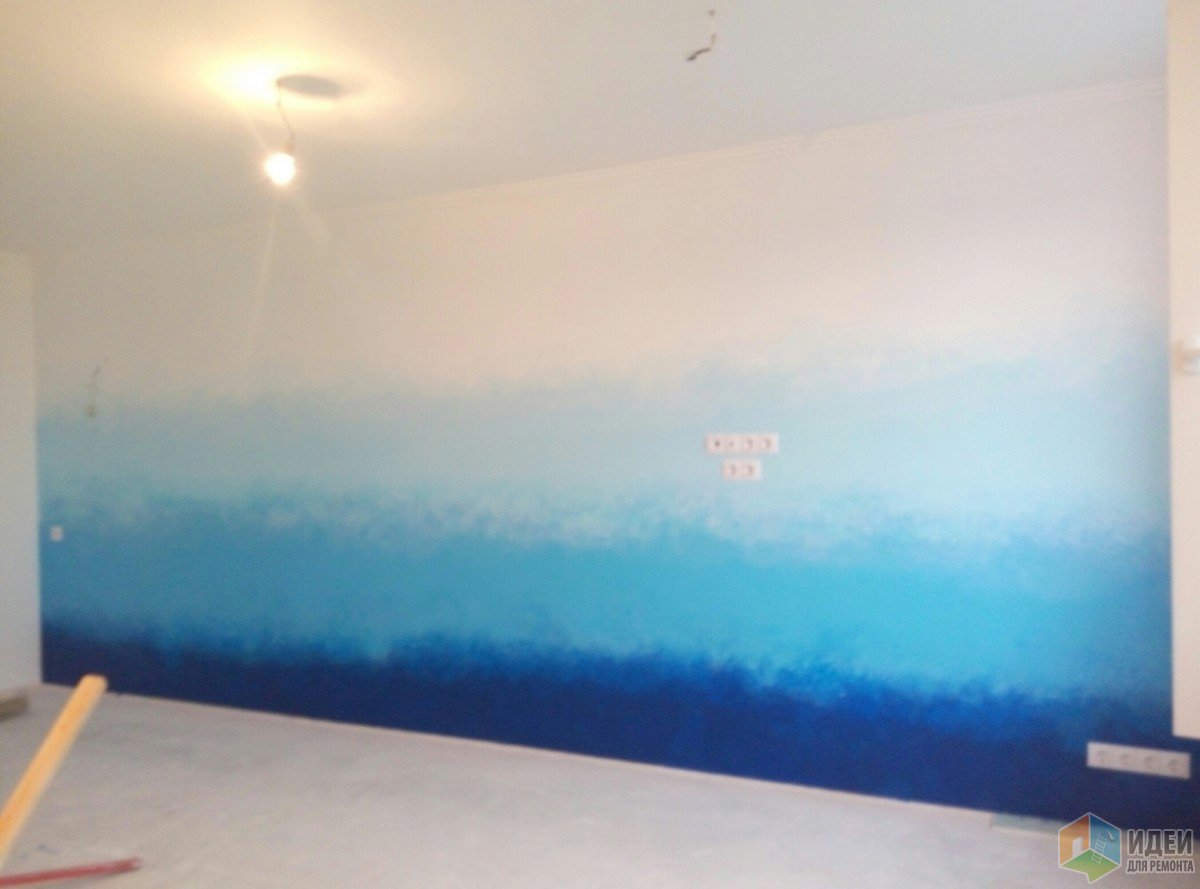
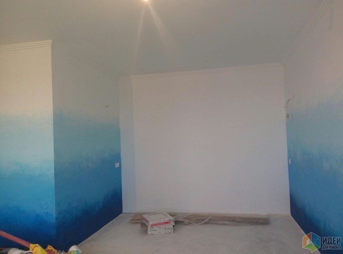
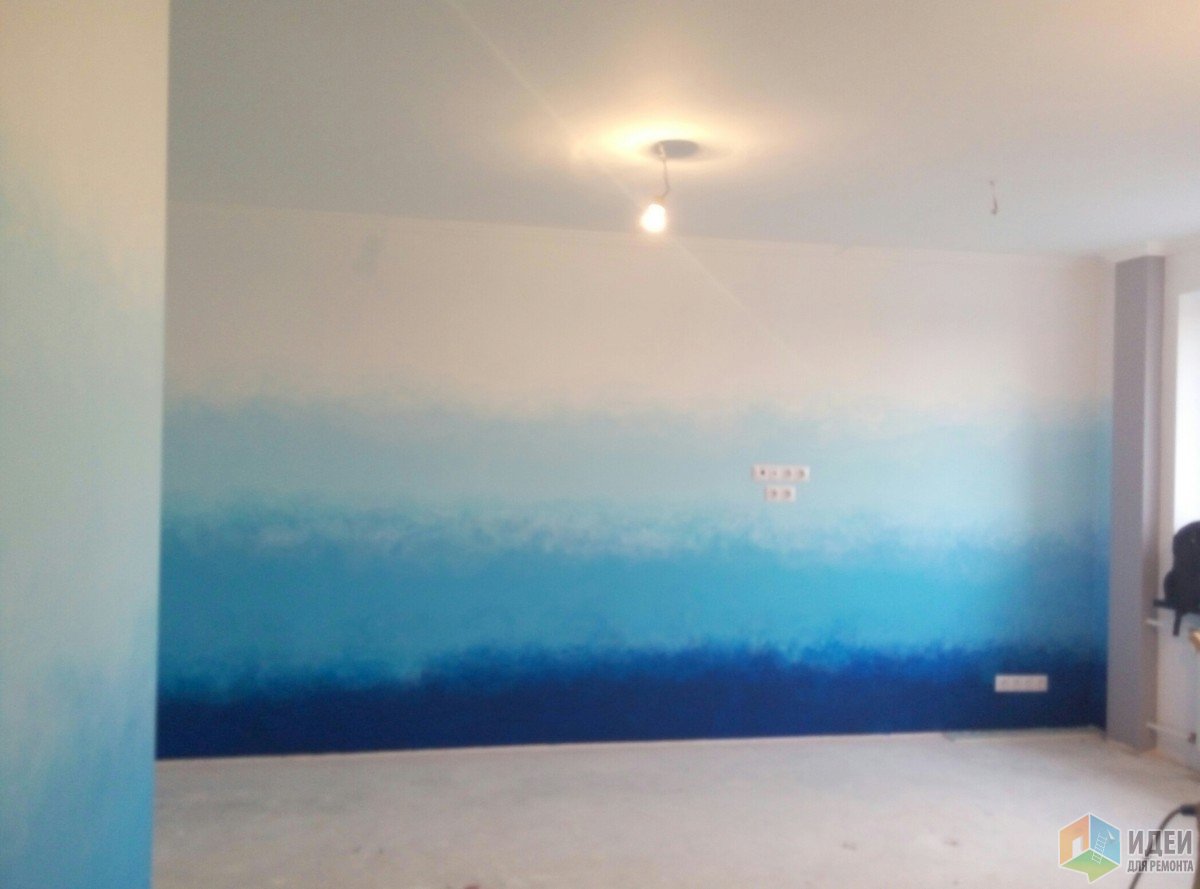
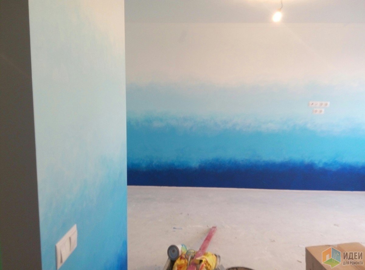
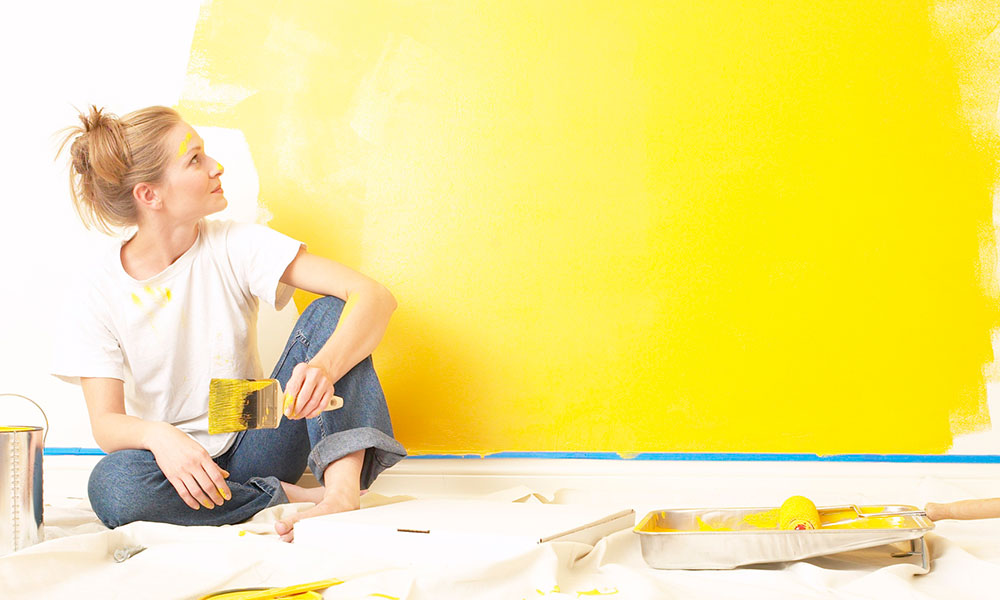
Hello. I'll be brief. My daughter and I were painting the walls in a new studio apartment. This is what happened, the photos are different, in different time days. If anyone is interested in how they painted it, I’ll answer in the comments.
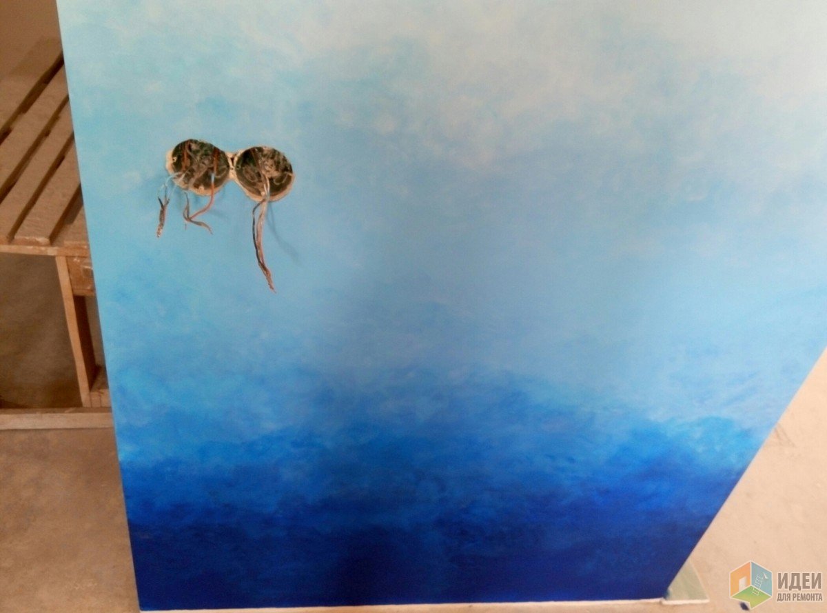
![]()
![]()
I'll show you a fuller picture soon. See you again!
P.S. I’m editing because I didn’t expect that everyone would be interested in the painting technology.
I'm telling you... The gradient can be made from the ceiling, at an angle from the wall or, like mine, from the floor. Under no circumstances do it on all walls!!! It's creepy! We choose colors to taste. You just have to remember that warm ones narrow the space, cold ones expand them, the gradient from the ceiling makes the room lower, from the floor - higher, from the corners - breaks the geometry, which is undoubtedly sometimes simply necessary. The gradient does not necessarily have to go white, it is any transition from dark to light. Quantity colors - choice personal, but less than three will not work, since then it is not a gradient.
We take a color chart, choose a color by number, and then pick up the shades for a longer period of time, I took F, G, H, J. Together there are 4 colors, they are usually colored by a liter or more, they definitely don’t make it smaller. The more shades you add, the more fun the gradient will be. You will also need masking tape, brushes for corners, rollers for slopes (small) according to the number of colors, sponges for dishes. We use water-based paint, washable, thick, so that we don’t have to do 10 layers.
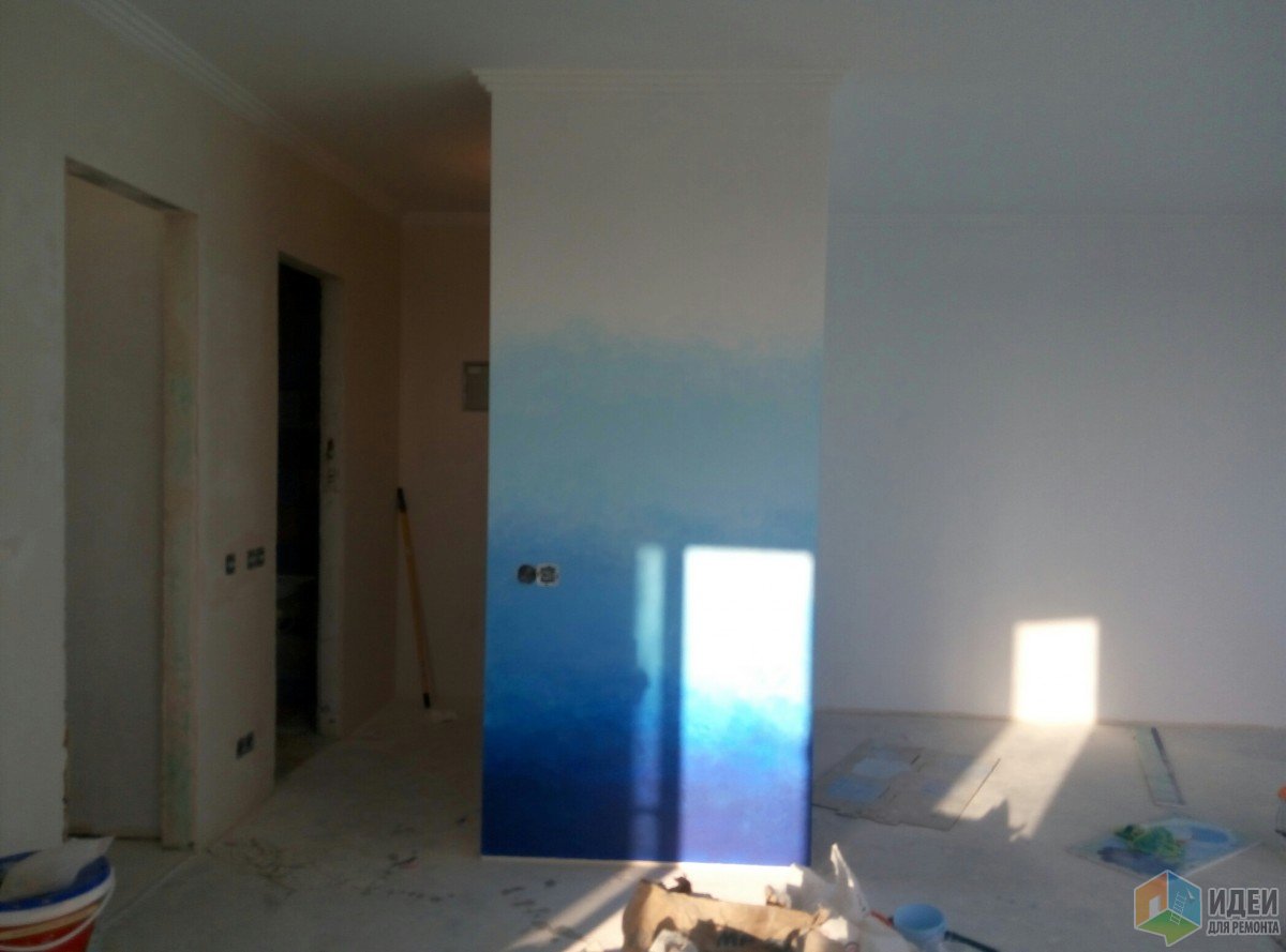
If your idea is an ideal gradient, with an imperceptible transition from one color to another, then you are welcome to professional painters with a spray gun. Our option is an artistic color transition.
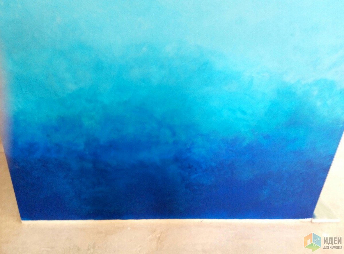
After reading the comments, I’ll say right away that we didn’t train at all) we watched enough videos on the Internet and go ahead) I warn you: don’t watch them at all! They only screwed us up, not a single method gave the desired result, rubbing with brushes is generally nonsense))) let’s not talk about mistakes. I'll tell you how to do it in the end. we take only one wall (only one at a time)!, we prime it, paint it white in one layer, then we find a place for each color, that is, we divide it into conditional shades, I had 5 of them - this is from blue to white, it is better to make the darkest narrow, take the lightest shade and mark the wall with it, that is, divide it into stripes (a brush will come in handy). and then we apply each color in its place, paint it 2-3 times, dry each layer, it is advisable to randomly add one layer to another during the painting process (to the extent reasonable, still adhering to your markings), then it will be easier to smooth out the transitions. Paint everything using purchased rollers.
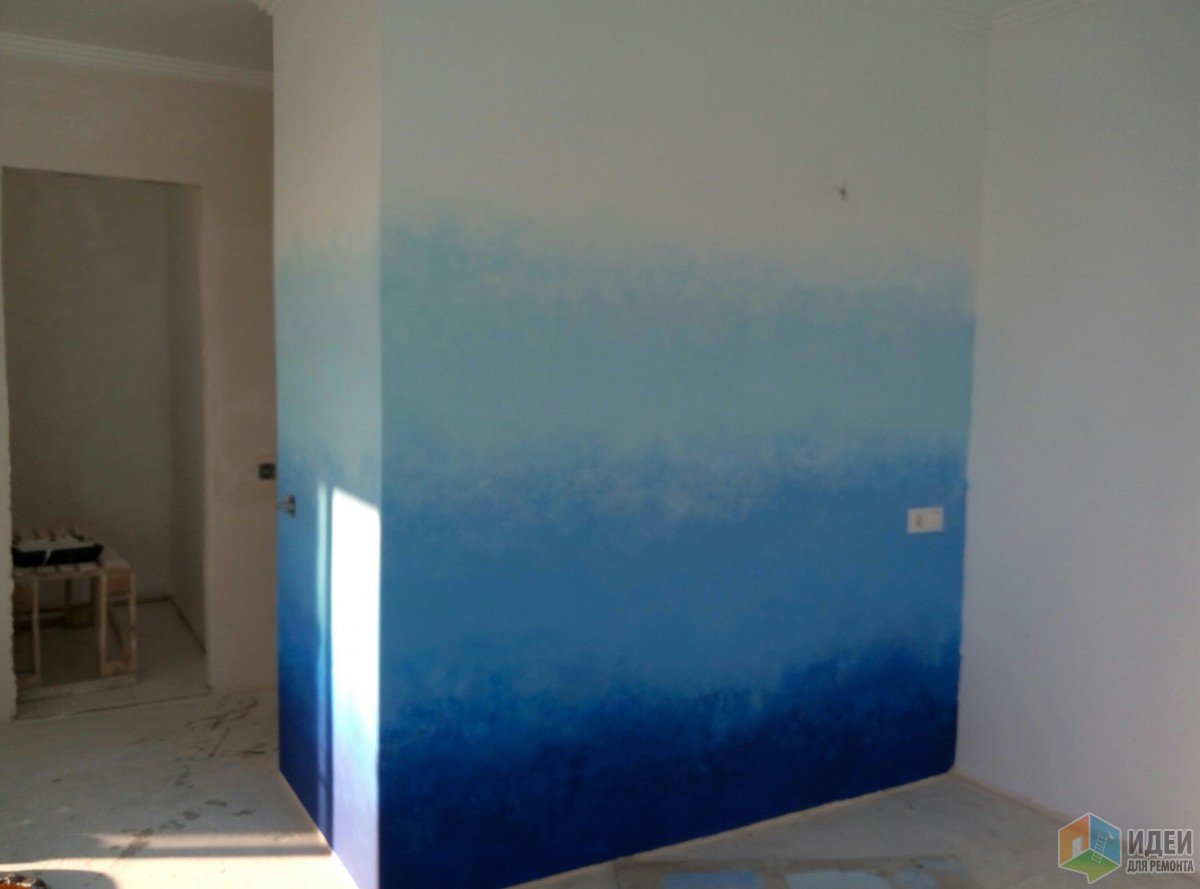
When everything is dry, or better yet completely dry, we take sponges according to the number of shades, a bucket of water and something like a palette (I took a large sheet of 50-30 gypsum board, or cardboard). We pour 2 adjacent shades onto the palette (it’s easier to start with a light one), for example, white and pale blue, and randomly smooth out the edges with a sponge, mix the paint a little on the palette, apply with tamping movements. It dries, then use the same movements again to move one color deeper onto another, that is, we raise the blue onto the white, lower the white onto the blue. Don't forget about chaos. It dries, then we moisten the sponge so that it is damp, dip it in, say, white and dampen the blue that went onto the white and vice versa, pick up the blue and dampen the white that ended up on the blue. On a wet sponge, the paint is diluted with water and it becomes translucent, so use your imagination and artistic talent, smear it with your hands, with a sponge, and be patient. Take note of a few rules:
1. the paint dries very quickly, so avoid smudges (this will ruin everything), after each layer, put all the rollers in different bags and tie them, wash the sponges.
2. if you leave the paint in the tray for at least 15 minutes, then it will be applied in flakes
3. remember that the paint changes color when it dries, very much. Therefore, do all the transitions step by step, allowing them to dry, so that later you can see what to correct and where.
4. don’t worry - you can fix everything, the main thing is that you like it!
Fade painting is a creative way to decorate walls in an unusual and attractive way using traditional paints. This painting technique is also called “ombre”, which means “shade” in French. What is it and how is it performed? All this will be discussed further.
Features of painting with tint transitions
Traditional coloring of walls with paints in one color is the most inexpensive method of decorating walls. This finish their surfaces are very simple and can be done with your own hands. However, it looks boring and too simple. Therefore, in the past this type of painting was preferred over wallpaper.
Now, thanks to the discovery of the new ombre technique, everyone has the opportunity to inexpensively, but at the same time very effectively and unusually decorate the walls in any room. Why, besides affordability and beautiful results, is it worth choosing paint with transitions for decorating walls?
This method, simply put, is a combination of paints on one plane. Both close shades and completely different shades are used different colors(up to 3), which smoothly and softly transform into each other.
Due to this, a complex gradient surface is created, where color and shade transitions can be performed in different ways:
- vertical;
- horizontally;
- diagonally.
This, in turn (depending on the location of dark and light areas), helps to divide the rooms into work areas. In addition, different graduations allow you to create all kinds of visual effects in the rooms.
| Type of graduated painting | Resulting effects |
|---|---|
| Lightening the top of the wall and darkening the bottom. | Visually increases the space. The ceilings appear higher and the floors appear more massive and stable. |
| Darkening the top area of the wall. | Makes the ceilings lower, but at the same time the room visually expands. |
| Lightening in the middle of the wall and darkening in the corners. | Allow the room to be a little visually rounded. The space may narrow, and interior details begin to stand out, becoming more prominent and contrasting. |
| Shade transitions are wavy or diagonal. | They bring more dynamics into the space. The interior does not look very strict and geometric, due to the fact that all the angular outlines of the details are visually smoothed out. |
| Spots with transitions expanding in all directions. | They add depth to the wall planes and “break” their rectangular geometry. |
| Darkening in the middle of the wall while simultaneously brightening the window and corner areas. | Visually makes the room lighter and more spacious. The contrast decreases, making the lighting look brighter, but at the same time soft and pleasant. |
All of the above makes this method of painting walls, unlike traditional method, preferable, since they can effectively adjust both the width and height of rooms, as well as create the desired atmosphere in the premises. And although it is more labor-intensive, the resulting effect is worth learning this technique. After all, there is nothing overly complicated in it, so any adult with at least some skills in painting work can handle it with their own hands.
Step-by-step process for creating a horizontal transition
Horizontal ombre is the most popular and great-looking room design. It is possible to paint a wall with such a smooth transition from one tone to another using a brush or roller. But when using them, you will also have to solve the issue of polishing the shade transition, and this will take quite a lot of time and labor. And the result of these painting devices, in the absence of good construction skills, will not be as neat as we would like.
The best quality results can be achieved by using a spray gun. It has a function for adjusting the intensity of the supply of coloring compounds, which allows you to create a natural “halo” on the treated area. light tone. This can be used as a border between different colored areas. That is, this tool is more functional and easier to use, so we will consider the process of painting walls with graduation using it.
The ombre technique using it includes the following steps:
- First, the paint (according to the type) of the main color is diluted with a viscometer to the desired consistency.
- Next, paint of the same brand is diluted in the same way, only white.
- In the next step, both colored and white paints are mixed together until they are homogeneous and as light as possible.
- Then the resulting composition is poured into a spray gun, after which the entire area of the wall is painted. This will be the base color. After completion of work, the tool should be washed thoroughly.
- At the next stage, unlightened paint is poured into a clean spray gun, after which you will need to apply a dark stripe at the bottom of the wall. The painted area should not exceed one-fourth of the entire wall height. When the upper part of the strip is created, in order to smooth out the boundaries for a soft transition of tones, you will need to move the spray nozzle away from the plane to the required distance. Also, at this stage, a smaller supply of coloring composition can be achieved by reducing the passage on the locking needle.
- Then the spray gun is washed again and refilled with lighter paint. To avoid damage to the wall, at this stage you first need to work on the cardboard with the sprayer. The purpose of this is to achieve this by adjusting the paint supply or changing the distance of the sprayer relative to the plane of a lighter color than it is at the upper border of the first dark stripe applied. After selecting the desired tone from the cardboard, you can move on to painting the walls directly. At the same time, you need to apply a lighter stripe over a darker layer up to half its height. The top edge of the second stripe is also made lighter, as is the “halo” of the first.
- The next, final stripe should be applied in the same way. In this case, the paint should be a little darker base color, in which the wall was originally painted. At its upper boundary, you will also need to create a “fog” by adjusting the distance of the nozzle from its surface. It should smoothly transition to the base color towards the ceiling.
Finally, it should be noted that color transitions are created both horizontally and diagonally using the same principle. Of course, painting walls using this technique may not work the first time. For high-quality execution you need to get good at it.