What living room color combination will suit your home best? This is perhaps the most important question that will confront you during a major or cosmetic renovation (or simply selecting furniture). After all, the living room is the face of the house, a place where all its inhabitants are concentrated, a room for relaxation, activity, conversations, and sometimes even meals.
It is precisely because of its versatility that the color of the living room can be absolutely any. Absolutely.
However, there are many small accents that we will talk about in this article.
Main background
Warm colors: red, orange, yellow.
Wood, burgundy wallpaper, red fabric, yellow plaster. Warm shades have long established themselves as almost the main ones in interior design and look great in any style - be it classic wood, or bright pop art.
If we talk about particulars:
- Brown, wood, and burgundy shades will add coziness and warmth to the living room.
- Reds will add dynamism and invigorate (although over time they will tire you, so you won’t get a quiet and peaceful rest)
- Orange will look modern and stylish, pairing well with neutrals like gray.
- Yellows are the “lightest” in the warm category and will add freshness and simplicity.


![]()
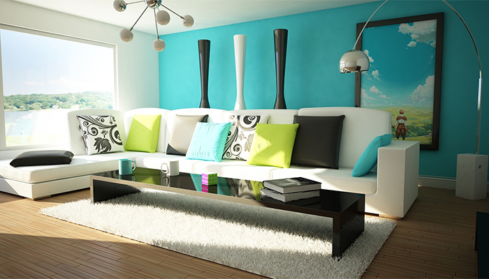
Neutrals: light green, green, turquoise
Being in the center of the color spectrum, these colors are nevertheless quite specific and very characteristic. Here are some examples of their use of green tones in the interior of the living room:
- Dark and malachite shades. Classic, interior Stalinist Empire style or a kind of Renaissance stylization - this is where dark green would be appropriate.
- Light green, light shades - more gentle colors They get along well with white and add freshness and naturalness to the living room.
- Turquoise is a rare color in interior design. It is warmer than blue, deep and rich, so it will look great in combination with reddish wood or in stylization for Indian ethnic interiors.

Cold: blue, light blue, purple
When decorating a living room in blue tones, you can go in three ways:
- Choose classic or baroque, focusing on rich blue textiles, stones and interior decor.
- Give preference to modern style and boldly play with different shades blue and light blue
- Focus on styling the water world, crystals, sky or winter landscape - everything that we associate with blue tones.
Each of these options will create completely different moods, although the possibilities of blue are not limited to them - fancy forms of Art Nouveau or Art Deco will also look great in blue design.
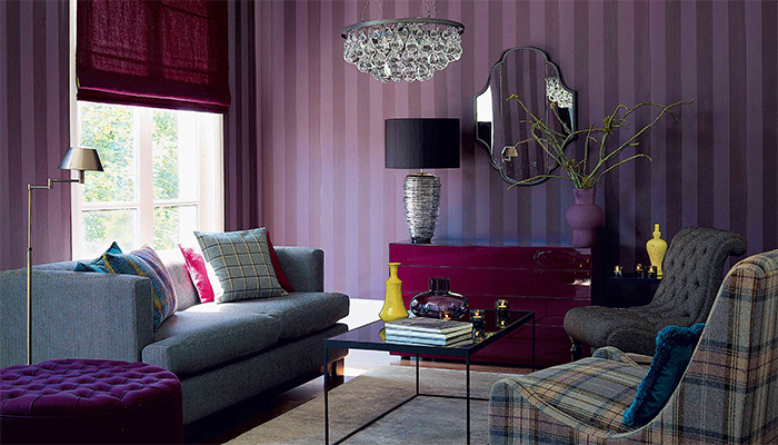
And purple stands a little aside - the color is quite warm, rich and original. With its help you can create a very stylish and unusual living room.

Color combinations
And now we come to the most important thing - the combination of colors in the interior of the living room. There can be a lot of combinations, but we will divide them into several groups.
Similar shades
Blue with purple, red with orange. This combination will allow you to place emphasis on functional areas- which is especially important in the living room - but overall it looks a bit boring. Although if you use interesting shapes and colors that are far from each other, you can get a very stylish interior.

Contrasting colors
These combinations contain the most poisonous contrasts. Purple with light green, blue with yellow, red with blue. Placed side by side, such colors only hurt the eye, but if you place them further away from each other, they will create indescribable dynamics in the interior of the house.
And in the living room they can be more than appropriate, especially since this room does not have strict requirements for either work or leisure.
Neutral with bright
Different bright colors against a background of pastel colors, white, black or gray. Not the best classic combination, but almost everything modern styles will look great in these color combinations. Moreover, with the help of color in such interiors, you can successfully place accents, which is important for the living room.


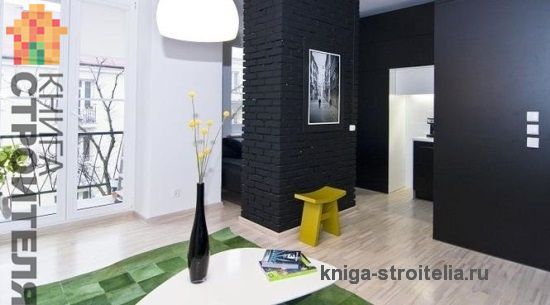
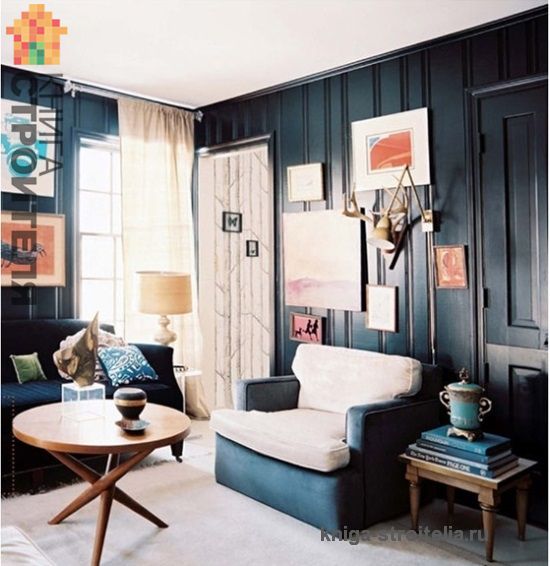
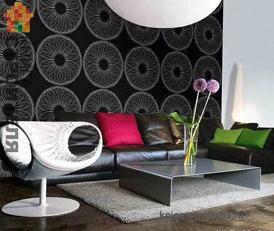
Black and white
Whether in combination or separately, black and white (or gray) are difficult to spoil the interior. The colors are clean, neutral and pleasing to the eye. However, it is better to decorate the living room in black colors - it looks more luxurious, especially not so easily soiled, which is important during a large influx of guests.
The living room is a place where people of all ages, with different tastes and habits, gather. Some prefer bright, intense colors, others prefer soft, muted colors. So that everyone feels comfortable in common room, take care of the correct color scheme.
- 1 of 1
On the picture:
It is well known that colors are divided into warm and cold. The first includes all shades of red, orange and yellow, the second includes blue and dark blue tones. It is believed that warm colors excite, cool colors calm.
The same color can be both warm and cold (depending on the predominant shade). A great example: the color of the yolk and chartreuse.
The texture of the material is also important in perception. A varnished, shiny surface makes the color rich, while a textured surface muffles and deepens it.
Adjusting space with color
We paint the walls and ceiling Objects painted in warm colors appear closer than those painted in cool colors. Saturated ones are closer than pale ones (the latter push the boundaries of space). So, low ceiling can be visually raised by giving it a cooler and lighter shade than the walls. Conversely, a high ceiling will appear lower if it is painted a dark color.
A black or very dark floor will light walls airy, and the light ceiling - higher.
By giving the end walls of an elongated living room a darker or warmer shade than the side walls, you can visually expand and shorten the room. For the same purpose, you can use cabinet furniture of a darker shade than the side walls.
- 1 of 3
On the picture:
Light ceilings contrasting with walls of dark, rich colors always seem higher.
Choosing a color according to the cardinal direction
The rule of "opposites". To decorate a living room with windows facing north, warm shades are recommended. For a southern and brightly lit room, on the contrary, light shades and cool colors are suitable: they will bring freshness and coolness to the interior. The rising sun makes all shades sharper, so in an east-facing living room it is better to use muted or pastel shades. The sunset seems to warm up the colors, so if the living room windows face west, you need to use cool shades.
For the color of the walls in the living room, where people often gather in the evenings, choose tones that look pleasant when artificial lighting.
- 1 of 5
On the picture:
In the living room, where people gather under artificial lighting, you need to especially carefully select the color scheme... or use lamps with light filters.
A color scheme
4 types color schemes: monochromatic, neutral, contrasting and harmonious. The first is based on shades of one color, its halftones, textures and patterns. The neutral scheme involves the most muted colors - whitish, grayish, beige shades. This color of the walls in the living room is an excellent background for furniture. A contrasting scheme uses antagonistic colors (orange and violet), while a harmonious scheme is based on tones from one half of the spectrum (blue and green).
Neutral, monochromatic, contrasting and harmonious interiors.
Pushing away from the furniture
Rule of 5 shades Every object has color, not just the walls and floor of the living room, so it is important to learn how to combine them. The following rules apply here: the furniture should be lighter than the floor, but darker than the walls; the maximum number of flowers within one room is five. There can be many more shades of each color.
White interior, needs contrasting details. It could be a coffee-colored coffee table or dark spot TV center. White interior It is recommended to “dilute” with juicy orange, green, and yellow. Combine shades of white: unbleached linen curtains, champagne-colored walls and a white tablecloth, for example.
Examples of interior accessories in white tones.
Light wooden furniture looks good on a dark floor and against the background of cream walls, lighter in relation to the furniture. It is counterbalanced by sofas and armchairs in dark or, conversely, bright white.
Furniture made of noble dark wood(walnut, cherry) contrasts perfectly with metal and glass. In this case, it is better to choose draperies that are several tones lighter. The combination of dark chocolate and Ivory. Light shades are good for the floor, otherwise the living room will be gloomy.
Furniture in bright colors. When choosing, you should start from the desired psychological effect of perceiving a particular shade.
| Color | Impact | Living area |
| Topolone sofa from the Edra factory. | Red tones, mobilizes, and in large doses causes aggression. | Guest and part-time work |
| Sofa Miro sofa from Spagnol Group. | Orange tones, pleases, warms. | Guestbook |
| Sofa Suita sofa with high backrest from Vitra. | Yellow warms and lifts your spirits. | Guest and work |
If you decide to renovate your living room and don’t know what color to choose for the walls, check out our selection of different interiors. The photo shows living rooms decorated in different styles and in different color scheme. Some interiors are calm and peaceful, others stimulate our consciousness. But, despite all the variety of interiors, we want one thing from the living room - a good atmosphere for relaxation. And this largely depends on the color of the walls.
Classic interiors love combinations of milk and brown colors. These colors have always been considered elegant and solid, and are often used for decoration. luxury interiors. Dark tone serves as a background for bright accents, light colors are an excellent basis for darker interior items and decoration. . They are most suitable for eclectic interiors and fusion style.
They are most suitable for eclectic interiors and fusion style.
And this largely depends on the color of the walls. Classic interiors love combinations of milky and brown colors. These colors have always been considered elegant and solid, and are often used to decorate luxurious interiors. A dark tone serves as a background for bright accents, while a light color palette is an excellent basis for darker interior items and decoration. The most daring can use unusual combinations, such as brown + lilac or brown + blue. They are most suitable for eclectic interiors and fusion style. Michail RybakovThe most daring can use unusual combinations, such as brown + lilac or brown + blue
 Michail Rybakov
 The most daring can use unusual combinations, such as brown + lilac or brown + blue
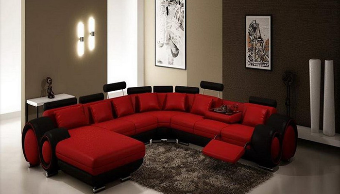
If you decorate your living room in red, you will get a glamorous and festive room. Designers love this color very much, it is interesting to work with, thanks to it, even the most unpresentable room can be turned into a masterpiece of design art. A frequent companion of red in the interior is white and cream. These colors perfectly neutralize the excessive intensity of red. . You can dilute the red color with black and gray
You can dilute the red color with black and gray
 If you decorate your living room in red, you will get a glamorous and festive room. Designers love this color very much, it is interesting to work with it, thanks to it, even the most unpresentable room can be turned into a masterpiece of design art. A frequent companion of red in the interior is white and cream. These colors perfectly neutralize the excessive intensity of red. This combination visually expands the space and refreshes it. You can dilute the red color with black and gray Michail Rybakov
 This combination visually expands the space and refreshes it.
 Michail Rybakov
 This combination visually expands the space and refreshes it.
 If you decorate your living room in red, you will get a glamorous and festive room. Designers love this color very much, it is interesting to work with it, thanks to it, even the most unpresentable room can be turned into a masterpiece of design art. A frequent companion of red in the interior is white and cream. These colors perfectly neutralize the excessive intensity of red. This combination visually expands the space and refreshes it. Michail Rybakov
 Orange is the color of celebration and inspiration. Incredibly warm and energetic, it comes in many shades. It is rarely used as the main color in the interior. More often, shades of orange are carried by accessories and textiles. "Types and differences of curtains." "Unusual curtains for your kitchen" "Curtains for the children's room. ideas and photos." "Curtains for the balcony" But if the living room windows face the north side and the sun is in it Not a frequent visitor, orange can be safely used to paint walls. It is also used for room correction. It tends to attract primary attention, so it is often used for zoning a room, for example painting partitions and niches with this color. Orange goes well with white, green, and cream. . Such interiors are compared to an autumn park on a sunny day.
Such interiors are compared to an autumn park on a sunny day.
 It is also used for room correction. It tends to attract primary attention, so it is often used for zoning a room, for example painting partitions and niches with this color. Orange goes well with white, green, and cream. Several shades in one interior make it unobtrusive and calm. Such interiors are compared to an autumn park on a sunny day. Michail Rybakov
 Several shades in one interior make it unobtrusive and calm
 Michail Rybakov
 Several shades in one interior make it unobtrusive and calm
 It is also used for room correction. It tends to attract primary attention, so it is often used for zoning a room, for example painting partitions and niches with this color. Orange goes well with white, green, and cream. Several shades in one interior make it unobtrusive and calm. Michail Rybakov
 Yellow is one of the lightest colors in the spectrum. It slightly tones and invigorates. It is classified as a sunny, warm color. But still, they shouldn’t oversaturate the interior. For classic options, combinations of yellow and white are most suitable. This color combination is suitable not only for living rooms, but also for children's rooms, bedrooms, and kitchens. Yellow goes perfectly with all shades of brown and natural wood. Furniture, curtains for living rooms and accessories in gray against the background of yellow walls create the effect of discreet luxury. “Laminate or linoleum, which is better” “Laying laminate with your own hands” “Laminate in the interior” “Glossy laminate” “How to lay laminate correctly” “Cork covering. Laying. Pros and cons" "Types of parquet" "Tricks and methods for laying vinyl parquet" "Do-it-yourself self-leveling floors" "Tools for laying laminate, carpet, parquet"
Pros and cons Types of parquet Tricks and methods for laying vinyl parquet Do-it-yourself self-leveling floors Tools for laying laminate, carpet, parquet
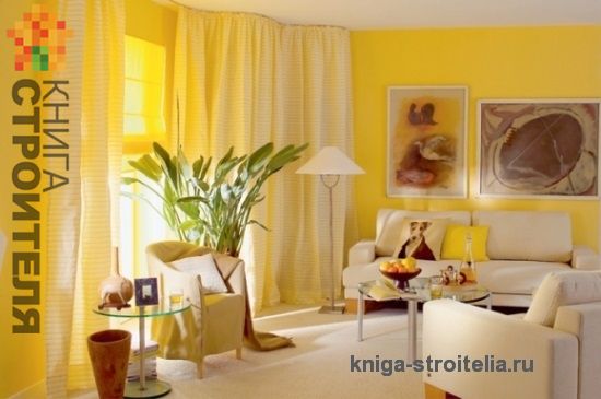 Yellow goes perfectly with all shades of brown and natural wood. Gray furniture, living room curtains and accessories against yellow walls create the effect of discreet luxury. Laminate or linoleum, which is better Do-it-yourself laminate installation Laminate in the interior Glossy laminate How to lay laminate correctly Cork covering. Laying. Pros and cons Types of parquet Tricks and methods for laying vinyl parquet Do-it-yourself self-leveling floors Tools for laying laminate, carpet, parquet Michail Rybakov
 Laying
 Michail Rybakov
 Laying
 Yellow goes perfectly with all shades of brown and natural wood. Gray furniture, living room curtains and accessories against yellow walls create the effect of discreet luxury. Laminate or linoleum, which is better? Laying laminate with your own hands. Laminate in the interior. Glossy laminate. How to lay laminate correctly. Cork covering. Laying. Michail Rybakov
 A living room decorated in pastel colors always looks modest but elegant. This wall color is chosen to decorate a living room in English or Scandinavian styles. Calm pastel colors create ample scope for realizing your wildest fantasies. . Beige interior the living room has become a symbol classic style.
The beige interior of the living room has become a symbol of classic style.
 A living room decorated in pastel colors always looks modest but elegant. This wall color is chosen to decorate a living room in English or Scandinavian styles. Calm pastel colors create ample scope for realizing your wildest fantasies. They look amazing against such a neutral background. natural materials, wood, brick, a natural stone. The beige interior of the living room has become a symbol of classic style. Michail Rybakov
 Natural materials, wood, brick, natural stone look amazing against such a neutral background.
 Michail Rybakov
 Natural materials, wood, brick, natural stone look amazing against such a neutral background.
 A living room decorated in pastel colors always looks modest but elegant. This wall color is chosen to decorate a living room in English or Scandinavian styles. Calm pastel colors create ample scope for realizing your wildest fantasies. Natural materials, wood, brick, and natural stone look amazing against such a neutral background. Michail Rybakov
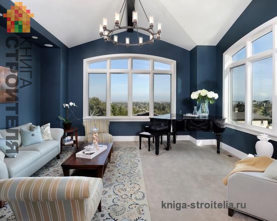
 Blue walls will require thoughtful lighting from you. Whatever the living room seems gloomy, and the corners are too dark, it is necessary to create diffused lighting around the entire perimeter of the room using spotlights or complement the central chandelier with floor lamps and wall sconces. You will never get tired of this color. This is the color of wisdom, calmness, stability. . This color can be used in any interior without exception.
This color can be used in any interior without exception.
 Whatever the living room seems gloomy, and the corners are too dark, it is necessary to create diffused lighting around the entire perimeter of the room using spotlights or complement the central chandelier with floor lamps and wall sconces. You will never get tired of this color. This is the color of wisdom, calmness, stability. It is able to drive away vain thoughts and allows you to fully relax after a busy day. This color can be used in any interior without exception. Michail Rybakov
 It is able to drive away vain thoughts and allows you to fully relax after a busy day.
 Michail Rybakov
 It is able to drive away vain thoughts and allows you to fully relax after a busy day.
 Whatever the living room seems gloomy, and the corners are too dark, it is necessary to create diffused lighting around the entire perimeter of the room using spotlights or complement the central chandelier with floor lamps and wall sconces. You will never get tired of this color. This is the color of wisdom, calmness, stability. It is able to drive away vain thoughts and allows you to fully relax after a busy day. Michail Rybakov
 If someone says that gray walls are boring and uninteresting, believe me, he is deeply mistaken. The gray color was completely undeservedly awarded with negative epithets and transferred to the rank of a hermit. In fact, it has many faces and is rich in shades and emotions. Everyone endows him with those qualities that he himself perceives from life. For some it is the color of poverty and wretchedness, but for others it is the color of wisdom and elegance. IN modern interiors grey colour became a symbol of high society, true ladies and gentlemen. It has powerful potential, it is functional and can significantly change the space. . The wooden floor will warm up the gray color of the walls. "Wood for finishing floors and walls. Parquet and wood fantasies" "Parquet flooring. selection criteria" "We lay block parquet ourselves" "Parquet boards. DIY installation"
The wooden floor will warm up the gray color of the walls. Wood for finishing floors and walls. parquet and fantasy wood Parquet flooring. selection criteria We lay block parquet ourselves. Parquet boards. DIY styling
 For some it is the color of poverty and wretchedness, but for others it is the color of wisdom and elegance. In modern interiors, gray has become a symbol of high society, true ladies and gentlemen. It has powerful potential, it is functional and can significantly change the space. It can be combined with many warm colors. The wooden floor will warm up the gray color of the walls. Wood for finishing floors and walls. parquet and fantasy wood floor coverings. selection criteria Laying strip parquet yourself Parquet board. DIY styling Michail Rybakov
 It can be combined with many warm colors
 Michail Rybakov
 It can be combined with many warm colors
 For some it is the color of poverty and wretchedness, but for others it is the color of wisdom and elegance. In modern interiors, gray has become a symbol of high society, true ladies and gentlemen. It has powerful potential, it is functional and can significantly change the space. It can be combined with many warm colors. Michail Rybakov
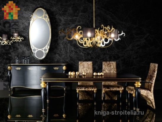
 Although black has acquired a reputation for being gloomy and mournful, using it in interiors has recently become bold and fashionable. The walls can be painted black or lined with natural wood or stone of this color. “Leveling the walls” “High-quality painting - beautiful walls in the apartment” “Painting the walls with water-based paint” “Putty the walls” “paint for the walls” “Preparing the wall for painting” You can use elegant black wallpaper for the living room. “Choosing wallpaper for walls” “Liquid wallpaper for a cozy interior” “Photo wallpaper on the wall” “Gluing wallpaper from “A” to “Z”” “How to glue non-woven wallpaper” “Vinyl wallpaper” “Simplicity and features of the technology of applying liquid wallpaper.” “Liquid wallpaper, application method” “How to glue photo wallpaper” “How to paint wallpaper for painting” In interior design, there are many techniques for using walls painted black, both as the main decoration and to create the necessary accent. To soften the strong impact of this color, bright accessories or furniture in contrasting colors are used in the interior. Metal or silver candlesticks, chandeliers, and mirror frames look good against the background of black walls. . Black color is ideal for minimalist and art deco interiors.
Black color is ideal for minimalist and art deco interiors.
 The walls can be painted black or lined with natural wood or stone of this color. Leveling the walls. High-quality painting - beautiful walls in the apartment Painting the walls water-based paint Wall putty paint for walls Preparing the wall for painting You can use elegant black wallpaper for the living room Choosing wallpaper for walls Liquid wallpaper for cozy interior Photo wallpaper on the wall Gluing wallpaper from A to Z How to glue non-woven wallpaper Vinyl wallpapers Simplicity and features of the technology for applying liquid wallpaper Liquid wallpaper, application method How to glue photo wallpaper How to paint wallpaper for painting In room design, there are many techniques for using walls painted black, both as the main finish and to create the necessary accent. To soften the strong impact of this color, bright accessories or furniture in contrasting colors are used in the interior. Metal or silver candlesticks, chandeliers, and mirror frames look good against the background of black walls. Gilding in a black interior will add luxury. Black color is ideal for minimalist and art deco interiors. Michail Rybakov
 Gilding in a black interior will add luxury
 Michail Rybakov
 Gilding in a black interior will add luxury
 The walls can be painted black or lined with natural wood or stone of this color Leveling the walls High-quality painting - beautiful walls in the apartment Painting the walls with water-based paint Plastering the walls, paint for the walls Preparing the wall for painting You can use elegant black wallpaper for the living room Choosing wallpaper for the walls Liquid wallpaper for a cozy interior Photo wallpaper on the wall Gluing wallpaper from A to Z How to glue non-woven wallpaper Vinyl wallpaper Simplicity and features of the technology for applying liquid wallpaper Liquid wallpaper, application method How to glue photo wallpaper How to paint wallpaper for painting In interior design, there are many techniques for using walls painted in black color, both as the main finish and to create the necessary accent. To soften the strong impact of this color, bright accessories or furniture in contrasting colors are used in the interior. Metal or silver candlesticks, chandeliers, and mirror frames look good against the background of black walls. Gilding in a black interior will add luxury. Michail Rybakov
 This is the color of renewal, rebirth. Green color in the living room calms and improves mood. For walls, shades of pistachio, olive, and moss are often chosen. Bright green is chosen for furniture and accessories. It goes perfectly with white and color natural wood. . Deep green, when properly lit, can visually expand the size of a living room.
Deep green, when properly lit, can visually expand the size of a living room.
 For walls, shades of pistachio, olive, and moss are often chosen. Bright green is chosen for furniture and accessories. It goes perfectly with white and natural wood colors. If the walls are decorated in a green tone, cork, parquet or laminate are used as flooring. Deep green, when properly lit, can visually expand the size of a living room. Michail Rybakov
 If the walls are decorated in a green tone, cork, parquet or laminate are used as flooring
 Michail Rybakov
 If the walls are decorated in a green tone, cork, parquet or laminate are used as flooring
 For walls, shades of pistachio, olive, and moss are often chosen. Bright green is chosen for furniture and accessories. It goes perfectly with white and natural wood colors. If the walls are decorated in a green tone, cork, parquet or laminate are used as flooring. Michail Rybakov
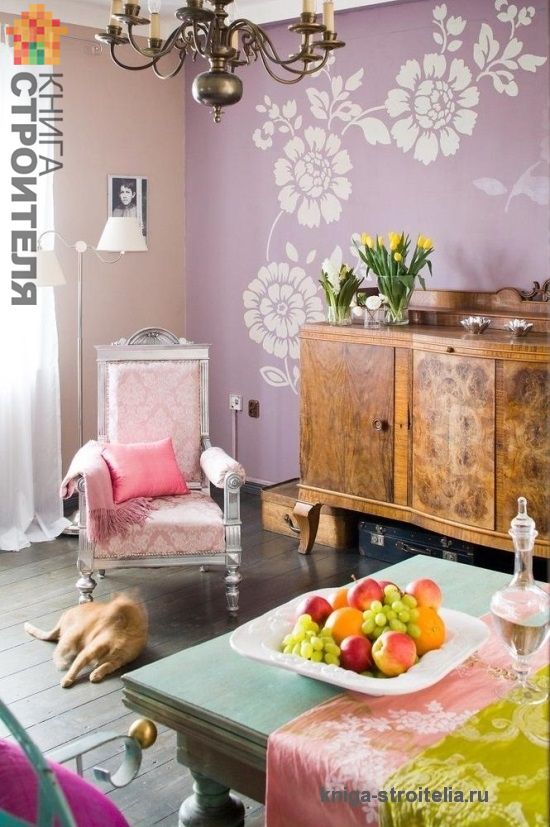
 Pink is more suitable for life-loving, cheerful and easy-going people. This color is more likely to be chosen by a young girl than by a mature woman. Likewise, in the interior it is more often used for children's rooms, but the living room, as a representative room, does not always perceive such a frivolous color. Rather, it would be more appropriate to use shades of lilac for the living room. . Shades of lilac add depth to the interior, filling it with hidden philosophical meaning
Shades of lilac add depth to the interior and fill it with hidden philosophical meaning.
 This color is more likely to be chosen by a young girl than by a mature woman. Likewise, in the interior it is more often used for children's rooms, but the living room, as a representative room, does not always perceive such a frivolous color. Rather, it would be more appropriate to use shades of lilac for the living room. The variety of its shades in in capable hands allows you to create fantastic interiors - luxurious, mysterious, mysterious and festive. Shades of lilac add depth to the interior and fill it with hidden philosophical meaning. Michail Rybakov
 The variety of its shades in skillful hands allows you to create fantastic interiors - luxurious, enigmatic, mysterious and festive
 Michail Rybakov
 The variety of its shades in skillful hands allows you to create fantastic interiors - luxurious, enigmatic, mysterious and festive
 This color is more likely to be chosen by a young girl than by a mature woman. Likewise, in the interior it is more often used for children's rooms, but the living room, as a representative room, does not always perceive such a frivolous color. Rather, it would be more appropriate to use shades of lilac for the living room. The variety of its shades in skillful hands allows you to create fantastic interiors - luxurious, enigmatic, mysterious and festive. Michail Rybakov
 The variety of its shades in skillful hands allows you to create fantastic interiors - luxurious, enigmatic, mysterious and festive
 This color is more likely to be chosen by a young girl than by a mature woman. Likewise, in the interior it is more often used for children's rooms, but the living room, as a representative room, does not always perceive such a frivolous color. Rather, it would be more appropriate to use shades of lilac for the living room. The variety of its shades in skillful hands allows you to create fantastic interiors - luxurious, enigmatic, mysterious and festive.
When developing design solutions for the living room, everyone who undertakes to design and carry out the work themselves should remember the features of this room. The living room is perhaps one of the few rooms in your home where guests, in addition to family members, will gather.
This room is intended for relaxation, communication, and celebrations, so the interior of the living room should be quite luxurious, formal, or at least very stylish.
A serious approach to living room design
What are the instructions for creating living room interiors? She doesn't exist. In any case, in this understanding, as clear guidance. Process of creation perfect interior Each home is completely unique. We can only give some advice, of a recommendatory nature, on how to choose the right wallpaper for the living room.
Living room color scheme
I think many of you have paid attention to how the environment affects your mood and even your general physical condition. , in which the room for receiving guests will be made - the most important aspect in creating a microclimate favorable for all visitors and household members, and an appropriate mood.
Before choosing the color of the wallpaper in the living room, you need to take into account all the factors.
These should include, in addition to your personal preferences and the wishes of all inhabitants of the home, other fundamental points:
- Room orientation:
- Eastern.
- Northern
- South.
- Western.
- Dimensions.
- Geometry of the room.
- Expected style.

Advice!
For rooms oriented to the north, colors from a warm range will be very appropriate: orange, brown, yellow, red, beige.
For sunny living rooms, it is permissible to use colors of the cold spectrum.
Now a few words about specific representatives of the color palette for the living room.
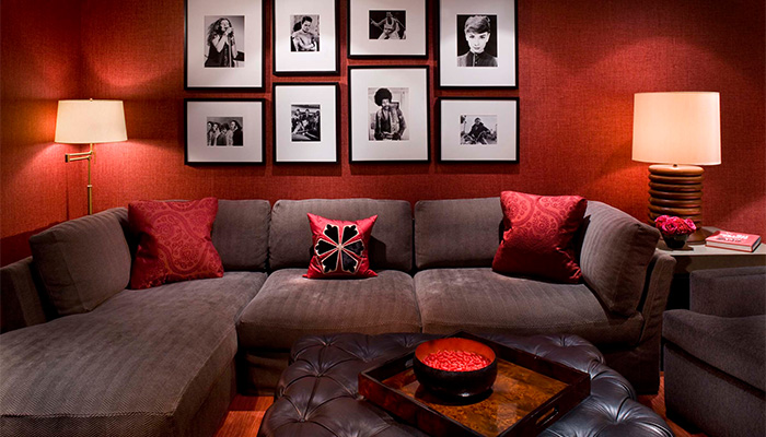
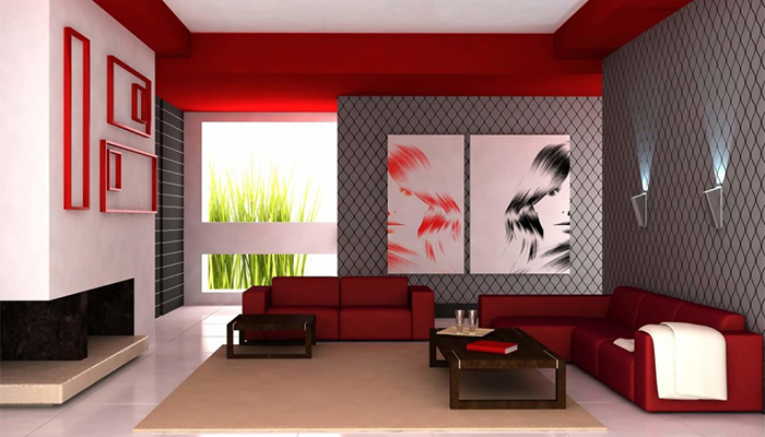
Red
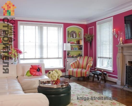
The well-known possibilities of energetically saturated red color will allow you to create a unique feeling of fun and joy, a holiday in the living room. It is no coincidence that the brightest and most beloved holiday in the whole world New Year and his permanent symbol Father Frost (Santa Claus) are associated by everyone with the color red and its other variations.
The presence of red in the living room, despite design solution premises will certainly make it stylish and in some cases even extravagant.

Interesting!
In England, it is traditional to decorate the living room in monochrome red with white frames.
Our compatriots consider this too bold.
It is more often used as if in a secondary (partial) manner in: details (wallpaper ornaments, edgings, friezes and borders), accessories (curtains, pillows and carpets) and individual pieces of furniture.
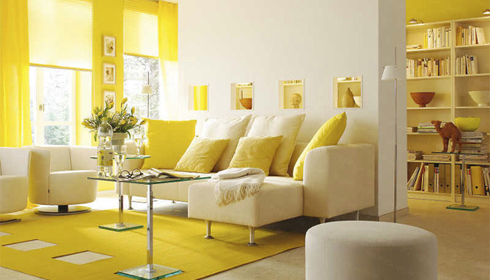
Yellow
- Solar yellow, symbolizing wealth and cheerfulness, even in cloudy weather in a poorly lit room will fill the living room with bright radiance and sunny warmth.
- It will be great to have fun in the yellow living room, celebrating significant holidays for you. However, the color yellow, which stimulates the hyperactivity of the human body and encourages constant action, is unlikely to allow you to relax on an ordinary day watching TV or with a book in hand.

Therefore, it is better for yellow lovers to give preference not to the saturated primary color, but to its muted, blurry versions. Against the background of yellow walls, furniture in both light and dark colors will look equally impressive.
It goes well with:
- Violet.
- Green.
- Brown.
- Red.
- Grey.
- Blue.
Feel free to combine the decoration of your yellow living room in this palette.
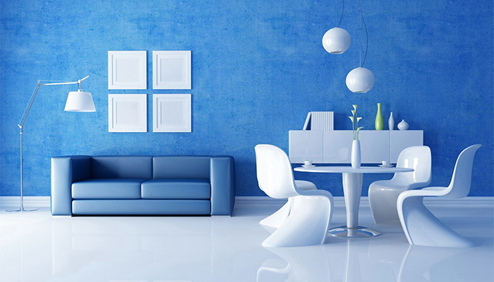
Blue
Most often in the design of living rooms they use deep Blue colour. This, of course, with excellent lighting of the room will give it a truly luxurious look.
Important!
In a poorly lit room, blue can cause depression and discomfort.
If you are an amateur soft light, but don’t want to give up blue in the interior, take lighter shades as a basis:
- Blue.
- Cornflower.
- Azure.
- Turquoise.
In the photo - the turquoise shade goes well with yellow, green and bed tones
- Dilute the blue tone of the wallpaper with golden, gray, beige, white or yellow inclusions and he will reveal his best sides.
- Warm colors in blue interior compensate for his coldness. Use light blue to create a delicate, light Provençal style. Such a sophisticated blue can push the boundaries of space to imperceptible limits.
For your information!
You can do repairs with your own hands, but not everyone can decide to create an interior on their own.
Try to at least first consult with people who have already undergone “repairs”.
Beige
Universal classic beige has received the greatest demand in interior design:
- A beige living room can be designed in absolutely any style, from strict classics to modern. You shouldn’t even begin to list the colors with which beige harmonizes; this is practically the entire palette. To avoid the monotony of a beige living room, it is recommended to use interior items, accessories, and furniture in contrasting, bright colors.
- Changing surface textures also effectively enlivens beige walls.. Indispensable beige color if you need to increase the space of the room. In this area, beige has a very limited number of competitors.

This is just a small piece of information on a truly limitless topic. Read more about how to choose wallpaper for the living room in our other articles.
In any case, do not limit your choice to the standard set of colors and shades offered; feel free to experiment and you may be able to invent your own style.
Advice!
If you are not entirely confident in your abilities to decide how to choose wallpaper for the living room, use the services of professional ones.
Although the price for their services is quite high, the result will every day justify every penny invested in the comfort of your own life.

Conclusion
We tried to reveal the “sick” topic - the color scheme of the living room, but at the same time you should not dwell on what you read above. You must boldly follow your desires, observing the basic rules and capabilities of your living space. We wish you a successful renovation!
In the video presented in this article you will find additional information on this topic.
Interior decoration in the living room is task No. 1 if you want to pleasantly surprise any guest and immediately introduce him a little to yourself. In this article we will tell you in detail about such an aspect of the design as the color scheme of the living room.
Color in the living room interior
The combination of colors plays a vital role when decorating a living room. A lot happens here - from ordinary get-togethers with friends, to meeting important guests on whom your fate may depend. For example, if you invite your future boss to your home, a harmonious color scheme can have a positive impact on your negotiations and leave a good impression of your home and of you. Psychological impact There are a huge number of flowers per person, and can instantly influence whether you and your guests will feel cheerful or tired, joyful or depressed in the room. What color should I use for the living room?
There are three main schemes in which you can combine living room colors::
- Analog, which combines different colors one palette, spectrum, for example, a combination of lilac curtains with blue walls. The main rule here is to choose colors that are either cool or warm. If the walls are made in rich blue tones, and the curtains are in pastel colors, the latter will seem insufficiently luxurious. One of the analog circuits also includes an attractive combination of red and yellow, which creates a very warm atmosphere in the house.
- Monochrome design is an even deeper immersion in one color, for example, a combination of green and light green, yellow and beige. The floor in such a living room needs to be made darker, the walls lighter, and the ceiling in the most light colors. This scheme expands the space and accommodates a lot of light. In such a room, as they say, it is easy to breathe. But in order to feel truly comfortable in such a design, you should diversify the even palette of shades with brighter interior items - ottomans, lamps, flower pots etc.
- Contrasting design is the most extravagant. However, it is with its help that you can advantageously zone a room. This is especially true in studio apartments or one-room dwellings. Example - combination of chocolate walls and furniture turquoise color. It is also good to combine white walls with furniture in rich colors.
Are you lost in the variety of options and don’t know how to choose the color of your living room? We will show you how to make this choice easier depending on the purpose of the room.
- If the living room will be used mainly only for receiving guests, it is better to use heavy curtains in the interior, hang panels on the walls, and furnish the room with massive upholstered furniture. In decoration you can use bright, including golden shades. Decorative architectural structures, such as false columns or arches in combination with stucco molding, will make the living room conducive to a long, comfortable stay in a pleasant conversation.
- If the living room during the day is combined with the bedroom at night, which often happens in small apartments, you need a color scheme that correctly zones the room. Contrasting colors in the interior of the living room will appear here the best option. Pearl and beige shades are most suitable for the sleeping area, while it is better to receive guests in an area in coffee or burgundy tones. Cozier room will happen if you complement the color schemes with a partition in the form sliding door or curtains.
- The combination of a living room and a dining room can also occur quite often. The difference with the previous option is that the partition is not so necessary, but even here it is necessary to give the two zones a color contrast. Make the living room bright and festive; terracotta or orange colors, and decorate the dining room in calmer colors.
Important! Be sure to consider the level of sunlight in the room.
If the rays often come to visit you, it is best to decorate the living room in cool green or blue tones. Use burgundy, peach, various shades of yellow - if the living room is rarely illuminated by daylight. The combination of golden and scarlet colors is magnificent; it is very positive and festive, and at the same time solemn. This option will look especially impressive when using the living room for its intended purpose.


Choosing what color to make the hall
We have come to the most important thing - a description of the impact of each color on the human psyche. After reading this section of the article, you will be able to decide exactly what color the living room should be, based on how you would like to feel in it, what mood to share with the guests of your home.
Red excites the psyche, gives more energy and strength. It is perfect in combination with some other warm color, but it is not recommended to completely decorate the living room in it, otherwise it can create tension. Red is recommended to be used in the form of accessories, red furniture, and panels.
Orange, orange in the living room - a free source of inspiration and joy. It has been proven that this color, like green, also has a healing effect, not only improving mood, but also strengthening the immune system.
Yellow like the sun - warm and joyful, tones well, but does not strain. In combination with sand, coffee, beige or peachy shades creates an atmosphere of peace and comfort. It also stimulates brain activity, so it is recommended both in the nursery and in the office. Softer pastel colors, such as sand or straw, will have a relaxing effect. It should be borne in mind that the combination of yellow with other colors strengthens or weakens its influence on you color design generally. With red it tones even more, with green it calms.
A special color loved by many designers is beige. Its creamy undertone is quite warm, very calm, and can be used in almost any living room design style, from baroque to modern trends hi-tech.
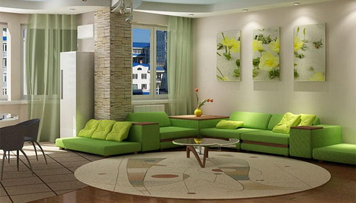
Green in all cultures is the personification of nature itself. And for good reason - just like a walk in the forest, it gives the apartment owners peace and freshness.
Important! When decorating your living room, do not use flashy shades of green. They cause migraines for many. Prefer soft green tones.
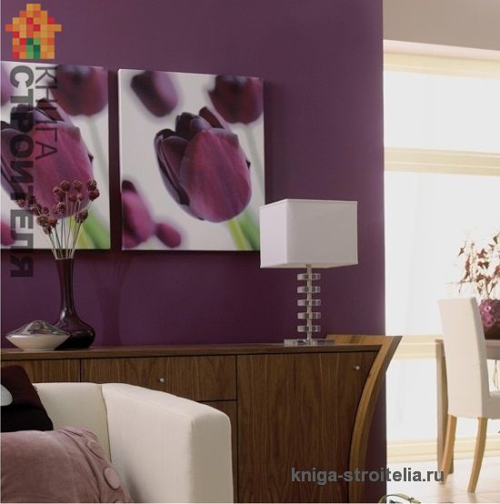
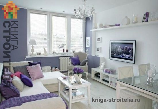
Lilac, blue and purple colors They also perfectly pacify and even somehow elevate the soul. But here again, the use of overly rich and deep tones that can put pressure on the psyche and depress it is contraindicated.
Separately deserves attention purple colour, which, in combination with brown, gray, gold, white or blue, will look simply gorgeous in any living room, adding a lot of coziness.
Blue itself is also very popular, its cool, but deep and noble tones wonderfully warm everyone in the living room. It is best combined with gray, yellow, beige, peach and pink colors.
White is the king of all colors, giving a feeling of lightness and purity. And not just because they all come from it, but also because white goes well with any color and any style. As an option, the living room is designed in pure white, but with the addition of a little contrast, for example, furniture in rich or dark shades. This combination looks quite solid, luxurious, and is very often used in expensive apartments. Leading designers do not recommend a living room exclusively in white, as it can create the effect of psychological devastation, leading to depression.
Black color is the opposite of white, but when used wisely, it can add solidity, modernity and attractiveness to a room. Decorating a living room only in black is too gloomy and uncomfortable, so it is strongly recommended to combine it with white, beige, yellow and sand. When thinking about what color to make your living room, it is useful to know that black and white living room design is very popular. It is simple and restrained, and at the same time solid and harmonious.
Grey in the living room impresses with its practicality, this is especially noticeable in apartments with small children. To get rid of the excessive neutrality of the impact of such shades, the living room can be ennobled with accessories in brighter and richer colors. And the presence of black accessories will give the room a business style.
Brown is also a very “business” color. In any shade it gives self-confidence and orderliness psychological state. It is not for nothing that this noble color was often used in the homes of representatives of high society.
One of the shades of brown - chocolate - is the most preferred among designers. In such a living room you will have a great rest, it is warm and comfortable. Chocolate curtains and furniture look best.
Pink pastel shades the color scheme of the living room will create a romantic atmosphere, while bright ones can irritate. This should be taken into account when choosing such an extravagant color scheme, which is quite rare in our homes, but very fashionable. The pearl shade, which combines best qualities both pink and white colors.
As you can see, the variety of colors in the guest room is amazing. When deciding what color to choose for the living room, you need to remember that even if you decorate the room specifically for receiving guests, in any case, you will be the one who will spend more time in it. Therefore, create coziness and comfort in this room, first of all, for yourself. Do not overload the interior with accessories or overly bright colors. color solutions or decorate the living room in a single color, because, like any excess, it will not add a good mood to you. The rule of the “golden mean” in design, as in life, is one of the main ones.
In view of the above, we advise you to first clearly decide on the choice of which color in the living room will be leading and which will be complementary. Go through a variety of colors, shades and their combinations; they should be in complete harmony with each other, pleasing to the eye and warming the soul. It would be a good idea to consult with people experienced in this matter who can guide you to the most advantageous design options and look through various design catalogs. You need to see in advance how your chosen solution will look from the outside. And when you finally implement it, you will rejoice yourself and admire your amazing interior in the living room of your guests for a very long time.