- Color combination of walls and curtains
- Combination of curtain patterns and wallpaper
- Curtains - a stylish interior detail
The style of the room consists of a harmonious combination of all interior details: materials, color palette, texture, decorative finishing. Therefore, it is very important to choose the right decorative elements and furnishings for the room. How to choose curtains for wallpaper? First you need to clearly decide in what style you want to decorate your house, apartment or office. Typically, style preference stems from a person's personality. Work, hobbies, life position - all this is involuntarily reflected in the interior.
The choice of curtains depends on the overall style of the room, color scheme, and your taste preferences.
The final stage of decorating the room is curtains. Correctly selected curtains can become a real decoration of the room. Lush drapery, lambrequins, tassels and other rich decorations are for palace classics, Roman blinds are for country, and curtains that blend into the overall decor are suitable for high-tech and minimalism style. The design of the window opening should become a continuation of the walls. Then the question arises of how to choose curtains to match the wallpaper.
Color combination of walls and curtains
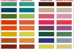
Figure 1. Color combination table.
Today everyone wants to stay in trend - at the peak of the wave of fashion and popularity. A person’s career and entire life may depend on this. Style must be consistent in everything. And the furnishings of an apartment or house especially clearly convey human nature. Therefore, even when decorating a window, you should adhere to the basic aspects of design art, which will help you choose the right curtains for the wallpaper and the overall decor of the room.
- In small rooms, the color of the curtains should repeat the basic tone of the wallpaper. Curtains that contrast with the walls will conceal even more small space rooms.
- If the wallpaper has an ornament, then the curtains are chosen in one color. The color of the curtains can repeat the basic tone of the wallpaper or the color of its pattern. The wallpaper pattern is usually darker than the base color. Then, when choosing the tone of the curtains, you need to start from the daylight lighting of the room. If the rays of the sun flood the room with bright light all day, then for curtains you can choose more dark tone. When the window faces north and there is sorely lack of sunlight, choose lighter shades for the curtains.
- Due to the color of the curtains, you can adjust the visual perception of the size of the room. For example, light curtains will visually push back the wall with a window opening, and bright curtains in rich shades will bring the window closer.
- Do not neglect the rule of color combinations: warm tones are selected for warm shades (Fig. 1), and cool colors are combined only with similar tones.
- Curtains in warm colors visually occupy more space and are perceived as protruding interior details. The colors of the cold palette visually expand the space of the room.
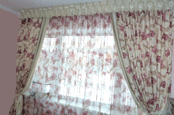
Figure 2. Window decoration with tulle and curtains for daytime and nighttime.
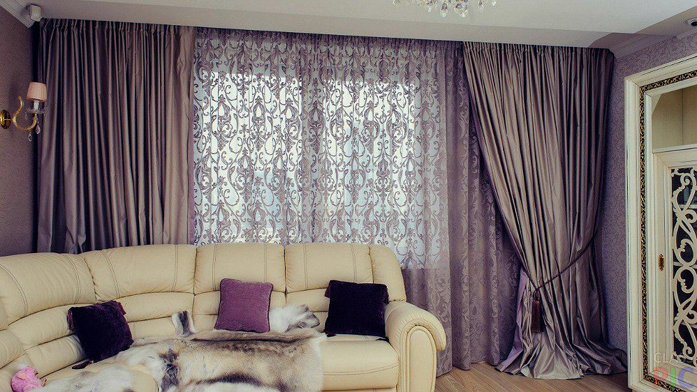
Very often, a window opening is decorated in two layers: tulle for daytime and curtains for nighttime. In this case, one of the layers should match the main tone of the wallpaper. Usually this is light tulle and darker curtains to match the color of the walls. But original solution just in reverse. If the room is well lit by daylight or is a bedroom, then you can use a trendy design technique - dark tulle and light curtains (Fig. 2).
Return to contents
Combination of curtain patterns and wallpaper
Choosing the right curtains for wallpaper is not so easy. A positive result can be achieved only with strict adherence to the rules of window styling dictated by experienced specialists. Then the room will delight you with comfort and integrity. It is very important not to make mistakes when choosing curtains with a pattern. You need to have a rich imagination to accurately imagine how the selected curtain fabric will look against the general background of the room. It’s better to review it in advance as soon as possible more photos With successful interiors, notice what suits your wallpaper and interior.
Figure 3. Curtains with a bright large print are hung in a room with plain wallpaper.
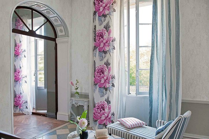
- Large and bright ornament- flowers, geometric figures, stripes – on curtain fabric requires special attention. Curtains with expressive prints are chosen only for plain wallpaper. At the same time, the colorful palette of curtains should include the color of the walls (Fig. 3).
- At low ceilings In a room, it is better to avoid large and clumsy designs. If the wallpaper is plain and without a print, then in this case curtains with longitudinal stripes are more suitable, which will visually extend the space in height.
- A room in the Art Nouveau style can combine different patterns at the same time: circles, stripes, flowers and geometric shapes (Fig. 4). In this case, the main color of the wallpaper and curtains should match. And it's simply necessary a large number of decorative pillows with an ornament that repeats the wallpaper pattern, the print of the curtains, and the color.
- A large, colorful pattern of curtain fabric is perfect for Roman blinds and country-style interiors. In this case, the walls should be covered with plain wallpaper.
- Horizontal stripes of curtains expand the space of the room.
- Satin and plain curtains with a characteristic shine are perfect for walls covered with silk-screen printing (Fig. 5). The most impressive look will be a complete match of the color of the curtains and the basic tone of the wallpaper.
Return to contents
Curtains are a stylish interior detail
Figure 4. In a room in the Art Nouveau style, different ornaments can be combined, while the basic tone of the wallpaper and curtains must match, and the room textiles must have the same pattern and color as the curtains.
Palace styles (Baroque, Rococo, Empire, Classicism, etc.) are characterized by majesty and pomp. The walls and window opening are finished expensive materials noble tones. Usually the walls are covered with silk-screen printing with an ornate pattern or plain wallpaper in golden shades. In the first case, satin or silk without a pattern is selected for the curtains and exactly matches the main color of the wallpaper. The lush drapery of the curtains will give the room a special royal flavor. In the second case, brocade or jacquard with printed patterns is perfect.
High-tech and techno styles cannot be imagined without chrome parts and shiny metal. Everywhere practicality and coldness Metallized smooth curtains without a pattern or roller blinds- this is what you need! In this style, it is imperative to maintain the clarity of the lines to the point of mathematical precision. No floral prints. Everything is functional and concise.
Roman blinds are good in Provence and country styles. If the walls are covered with plain wallpaper, then for curtains you can safely choose bright fabrics (chintz, cotton, linen) with floral patterns. For walls with a pronounced pattern, plain curtains of a similar shade are suitable.
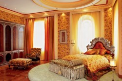
Figure 5. Plain, satin curtains are perfect for walls covered with silk-screen printing; the room will look very impressive if the tones of the curtains and wallpaper completely match.
Art Deco style is a daring mixture of decorative details different styles. A bold grouping of incompatible things into a harmonious complex: textiles, furniture, art, ceramics. Windows in this style are designed in a defiantly luxurious manner. Multilayer fabrics of different textures (velvet, organza, silk) with lush tails should fall freely to the floor. Abstract lines of spirals and zigzags, exotic animals and plants, oriental patterns on expensive fabrics. Gold cords, tassels, rich tiebacks, forged cornices of intricate design are irreplaceable details of curtains in the Art Deco style. Luxury, but not kitsch, an abundance of textures and colors, but not tackiness - important principles this design direction.
In eco-style, it is important to maintain naturalness in everything. Only natural fabrics are used for curtains natural shades: olive, linen and moss color, all shades of wood. Usually the color of the curtains is matched to the tone of the wallpaper. Light curtains do not stand out, but are an inconspicuous continuation of the walls. Plain Roman or roller blinds, bamboo blinds and light curtains are great for this style.
How to choose curtains for wallpaper? The above aspects from world-famous interior designers (Kelly Hoppen, Ross Lovegrove, Alessandro Mendini) will help you understand this.
Effectively selected colors, textures and patterns on the walls and curtains will create harmony of a single space and comfort in your home.
If you started a renovation or wanted to partially change the decor, then in both cases you will have to think about new curtains. And then a pressing question may arise: how to choose the right curtains for wallpaper or furniture. For those who don’t know the answer and are hesitant about making a choice, our little instructions will be a good help.
Initially, curtains played an important protective role. They protected the home from cold and drafts, scorching rays of the sun and sultry air. Thousands of years later, their main purpose became interior decoration. Curtains add to the already familiar design notes of newness and freshness. They help visually expand the walls or, conversely, a large room is given coziness and comfort.
Curtain selection options
There is no specific rule according to which curtains are selected strictly for one thing in the room. Usually they settle on the option that suits them most. Someone wants curtains highlight new stylish upholstered furniture, and some, like the parents of Uncle Fyodor from the cartoon “Vacation in Prostokvashino”, need something hide flaws wallpaper
Designers suggest choosing curtains according to one of the following options:
Practical
Curtain fabric can match the upholstery color upholstered furniture. Since we don’t buy headsets for one season, but change the wallpaper on the walls much more often, a more economical option would be to buy or order curtains to match home textiles. Help you make a choice armchairs, sofa, chairs, banquette. It will be enough to repeat or color or design available on the upholstery.
Popular
Often, owners select curtains to the already pasted wallpaper. This option helps visually combine design placements into a single whole, and also visually expands the boundaries of space. Based on the design of the walls, use one of the presented options:
- combine wallpaper and curtains in tone or achieve a smooth transition shades;
- choose one of the colors shown on the wallpaper and decorate curtains in it;
- duplicate shades but they do emphasis on differences in textures wallpaper and textiles;
They use a single background for curtains and walls, but different patterns, or, conversely, one pattern on a different background of wallpaper and curtains.
Neutral
This option is usually preferred by housewives who do not want to be puzzled for too long about the correct combinations of curtains with a specific room. Canvases in neutral shades: sand, beige, cream- fit well to any situation and perform their main function - protection from sunlight and prying eyes. They contribute notes of calm and comfort, while remaining only just in the background, on which you can create any ensemble of furniture and decorative elements.
Universal
If it is difficult to choose the main color in the room and there is half a rainbow palette, which is typical for passionate and life-loving natures, then a universal option would be to select window textiles that match with the tone of the biggest thing in the room. It could be a palace a blanket on the sofa or a canopy over the bed. For the kitchen such an element will be furniture facades.
Accent
In such a room, the main emphasis is on the window. In case of obvious deficiencies in the room, you can visually focus all attention on the curtains. Their bright colors, unusual prints or catchy design will become main decoration premises and will distract from unwanted objects. And so that such curtains do not look like aliens among the furnishings of the room, add a tablecloth, napkins, sofa cushions from the same fabric. You can choose other design ideas that will match the curtains in style and design.
- How to choose curtains according to style
- Color combinations
- Choosing the right curtain pattern
- Curtain fabric texture
The interior of your apartment can be refreshed by simply pasting new wallpaper. This option does not require large financial expenditures, but it immediately makes you feel the changes in your home. The question arises about how to choose curtains to match the wallpaper so that they look harmonious. Curtains simultaneously serve as window decoration and hide all the imperfections of its opening. In addition, it is necessary to combine them with the color scheme of the wallpaper and the room as a whole. We should also not forget that curtains cannot stand out from the overall style of the room. Properly selected curtains will help make the room beautiful and cozy.
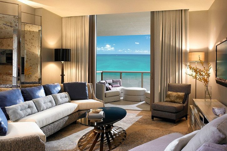
Photo 1. Properly selected curtains will decorate the room and give it the right atmosphere.
How to choose curtains according to style
When choosing curtains, great importance is attached general style interior of a separate room or apartment.
Not very good for minimalism good decision there will be flowered curtains. This is not exactly something that will harmoniously combine with plain wallpaper and laconic furniture. For Provence or country style, curtains with a complex cut, decorated with drapery and tassels, are suitable (photo 1). Modern style requires strict outlines of curtains. The baroque interior will be decorated with flounces, frills and fringes. bright colors(photo 2). Multi-layer curtains will decorate any bedroom. After all, all the furniture, along with floor covering and the ceiling will be imbued with Baroque style, and the curtains will give them softness and warmth.
Small curtains look appropriate in rooms with small square footage. This could be the kitchen or veranda. If you choose an option with a shade 1-2 shades darker than the wallpaper, you will thereby give the room warmth and comfort. The main rule here should be simplicity and conciseness.
Return to contents
Color combinations
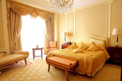
Photo 2. Graceful curtains bright colors perfect for Baroque style interiors.
If you have figured out how to choose curtains for wallpaper according to stylistic design, you will invariably have trouble finding the right color scheme. There are several options for choosing the shade of curtains. Each case is purely individual, but there are some recommendations that, if followed, will make curtains the highlight of your interior.
Curtains can be the same color as the wallpaper. This option is acceptable for small rooms. Decorating the window opening in a contrasting color will visually make the room smaller. In some cases, when using several types of wallpaper or wall coverings with a pattern, it is possible to repeat the basic tone in the curtains. This solution involves the color of the curtains being the same shade as the background or image.
If it is important for you to maintain smooth lines in the interior, then you can choose an option that is several tones lighter or darker than the wall covering. Purple colour will go harmoniously with eggplant, and for deep blue-green, delicate aquamarine will be an excellent complement. The contrast of shades of champagne and chocolate will help make the interior unforgettable.
Sometimes there is a need to visually bring the wall in which the window opening is located. Then curtains of bright and rich colors will come to the rescue. To visually distance the window area, on the contrary, lighter and airier colors are used.
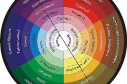
Photo 3. Basic color combinations.
We should not forget about the basic color combinations(photo 3). For warm shades you need to choose from the same category, and for cold shades you need to follow the same rule. The color of the curtains may contrast with the tone of the wallpaper, but color scheme must be from the same group.
When choosing color range You need to pay attention that cold shades tend to visually expand the space, while warm ones reduce it. If you decide to give the room space with the help of color, then the curtains should be made in the same tone.
When decorating a window opening twice, one of the elements must match the color of the wallpaper. If the wall decoration in the room is blue and blue, then one of possible options There will be blue curtains and white tulle. Or you can choose aquamarine curtains in combination with blue tulle.