Properly selected wallpaper is a guarantee of comfort and harmony in the home. But only if they are combined with furniture and correspond general style interior Read about your options in our review.
- 1 of 1
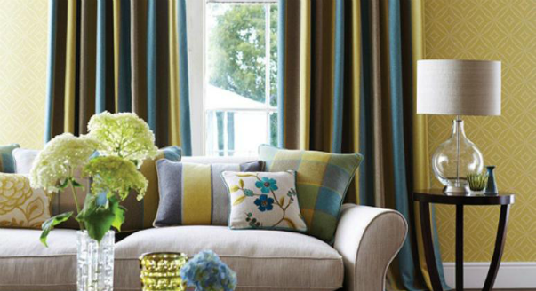
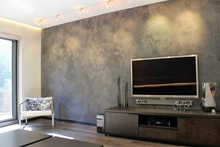
On the picture:
Furniture has been purchased. Choosing wallpaper
Where to begin? Decide on a color. Despite its apparent simplicity, this task is not an easy one. You can understand how to select by answering three main questions:
- What atmosphere do you want to create in the room: relaxing or invigorating? For a relaxing experience, use wallpaper pastel shades or decorate the walls in blue or burgundy brown. More energetic colors will create an invigorating atmosphere: red, orange, etc.
Colorful wallpaper is good, but in moderation. IN small rooms ah, set aside only one wall for them. Cover the rest with plain colors.
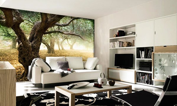
In the photo: Flowering Tree wallpaper ZTRA05006 by Zoffany.
- How is the room lit? If the lighting is bright, it is better to use cool shades: blue, green, purple, etc. For rooms with insufficient sunlight or artificial light, wallpaper in warm colors, close to red or brown, is needed.
- How to choose wallpaper for furniture so that it turns out harmonious interior? Play with a combination of patterns on furniture upholstery and wallpaper. Take or buy small sample pieces from the store. If your furniture is of a well-known brand, then look at the catalogs. There you can find ready-made solutions for interior. Manufacturers are increasingly offering entire collections of harmoniously combined fabrics and wallpapers.
- 1 of 3
On the picture:
When choosing companion fabrics, try to ensure that one of the colors is repeated in the wallpaper colors. The same applies to ornaments: for example, damask on wallpaper and on fabric, but in a paler or, conversely, brighter form.
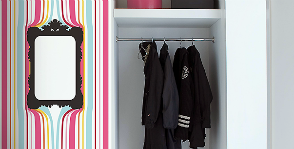
Option for small rooms- stick on three walls light wallpaper, and cover the fourth wall with wallpaper of a more saturated shade of the same range.
Another fail-safe principle- selection of wallpaper that is similar to furniture upholstery in tone: combine a warm tone with a warm one, a cold tone with a cold one.
The wallpaper is pasted. Choosing furniture
What to look for? Not only on the combination of shades and patterns, but also on style. If the wallpaper in the room is neutral, background, then you are more or less free in choosing furniture. Wallpapers with character require a more careful approach. Golden stripes and monograms make for a classic look. Floral patterns are combined with country and Provence style. Geometric patterns are suitable for modern furniture laconic forms.
In the photo: London sofa from Provasi factory.
This situation may arise if you bought an apartment with finishing. The developer did his best and did not regret it for you good wallpaper. Therefore, there is no point in re-gluing them. When choosing furniture, you have several options.
- Typical headsets. They are available in a variety of colors, making it easier to choose the appropriate shade and style. Well, if you don’t manage to find exactly what you were looking for, then you can always shift the emphasis from furniture to accessories. In a bedroom or nursery, these could be pillows or framed photographs. In the living room or hallway there are poufs, paintings and other decorative elements.
- Own project. This solution is suitable for those who, despite the wide selection of furniture in showrooms, would like to see something unique in their home. Although this pleasure is not cheap. When discussing your future furniture with designers, do not forget that it matches the texture and color of the wallpaper.
Wallpaper + furniture: choose at the same time
- Children's room. Very light wallpaper is often used for this room, where White color goes well with shades of blue or pink. Therefore, light wood furniture is best suited here.
In the photo: How it works White wallpaper from the PaperBoy factory.
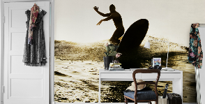
- Living room. Don't limit yourself to just choosing classic colors and style solutions. You can use several types of wallpaper with different textures, patterns or colors. For example, two types of wallpaper with the same color, but some with a pattern and others without. You can arrange furniture against the background of wallpaper without a pattern. But if you decide to hang photo wallpaper, then remember that you need to place them on a wall free of furniture.
- Bedroom. Its design requires a particularly delicate approach. To make this place a romantic island of relaxation, it is better to choose cool colors for the wallpaper, and light and light furniture. If the bedroom should represent stability and respectability, then it is better to decorate it in dark and muted shades of red or other warm colors. It is better to choose a bed and furniture from solid wood and preferably dark.

- 1 of 3
On the picture:
In the bedroom, wallpaper does not stand alone in any case and acts as a neutral background; here it is part of an overall well-thought-out ensemble. In the bedroom, everything is in harmony with each other: draperies on the windows, wall decoration, bedspread and headboard, color of furniture and floor.
Comment on FB Comment on VK
Also in this section
Remember Tom Sawyer, who assured his friend that painting a fence was easy and enjoyable? This will happen, but only if you prepare well for this process and follow a few rules
Oily stains, bubbles, scuffs on the wallpaper - is it worth re-painting the entire room because of them? We tell you how to cope with these and other troubles without extra costs and effort.
Unlike the owners large apartments Residents of small apartments have limited choice finishing materials. And wallpaper is no exception. Not every pattern, color or texture will look good here.
Modern photo wallpapers are photographs, collages, engravings, and abstract patterns applied digitally. They decorate the apartment very much. But what if their sizes don’t suit you?
There are many possibilities for unconventional use of not only whole rolls, but also leftover wallpaper. This is how they are created interesting solutions in the interior. Simple and original.

This is quite possible if you show ingenuity. You can transform your hallway with the help of painted trompe l'oeil, beads, old music notes... What and how to glue, paint and hang in a low-budget hallway?
Combination different types coatings in the interior are original and modern. To correctly combine wallpaper, take into account the degree of illumination, the dimensions of the room, and the orientation of the room windows.
The influence of colors

Warm wallpaper combinations
Reds are combined with brown, purple, pink. Successful combinations with blue, green, gray and golden yellow hues. To create contrast, use red and white or red and black. A wonderful combination of red wallpaper and decorative stone in the interior:

Burgundy is suitable for a classic style; it looks impressive in combination with pink, pumpkin, black and dark wood. Take a look at the photo.

Pink shades are successfully combined with light brown, gray, milky and sandy tones.
Orange wallpaper looks original together with brown, dark chocolate, and caramel elements. especially with decorative stone. Sky blue, green, violet, lilac and white - good options for a combination. Look at the photo to see what this combination of wallpaper, stone and lining looks like.

Brown is a solid and practical color that looks good together with beige, blue-green, gray and gold tones. Peach colour combined with a delicate pastel palette, orange and dark brown.
Beige can be combined with warm colors. See what the combination of these colors looks like in the photo.

See how wallpaper should look in the interior.

Cold palette
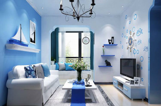
Blue color goes well with red and gray, gold trim. But it doesn’t go well with decorative stone. Blue wallpapers are complemented favorably with red, brown, blue, orange, and light purple. Photo below.
Green combines well with white, blue, brown, blue, everything natural shades, creates contrast with red. Turquoise goes well with olive, gray, black and metallic tones. Look at the photo.

Purple wallpaper goes well with purple, pink, and beige. Purple colour can be combined with white, gray, milky tones. At the same time, they create a pleasant combination with decorative stone. Pay attention to the photo below:

Gray is complemented by black, pink, red, yellow and blue.
Monochrome palette
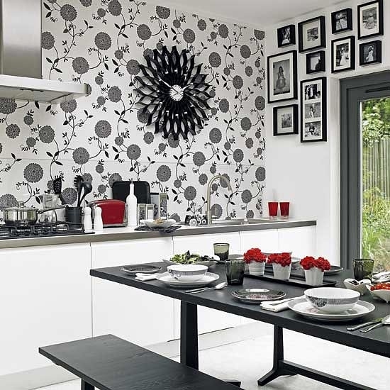
Black and white combinations in interior design look original and stylish. When choosing such a palette, you should take into account the style of the room. For classic interiors coverings with small floral patterns are suitable; traditional designs use stripes and geometric figures. Look at the photo to see what the combination of two types of wallpaper looks like in the interior.

To avoid creating overcrowding in the room, use a wall free of furniture and equipment for decoration. Black and white coverings are well complemented by furniture in pink, coral, red and scarlet tones.
Among the types of monochrome patterns:
- herbal compositions;
- geometric patterns: circles, squares, waves, zigzags, diamonds;
- graphic inscriptions and drawings;
- animal prints.
When choosing such coatings, you should take into account the size of the pattern and the frequency of repetition of the motif. To create an accent wall, pasting the surface with dark, large colors is suitable. Small drawings are used to decorate the entire room. Look at the photo to see what a black and white palette looks like in a bedroom.

Geometric patterns are used in kitchens and hallways. To raise the ceiling, cover the room vertical stripes. To visually expand the space, use small geometric patterns. Pay attention to the photo.

Stylization of black and white graphics, such as photographs, inscriptions, newspaper publications on the walls look rich and interesting. They are suitable for decorating bedrooms and living rooms. A minimum of decor should be used in decoration. Photo below.

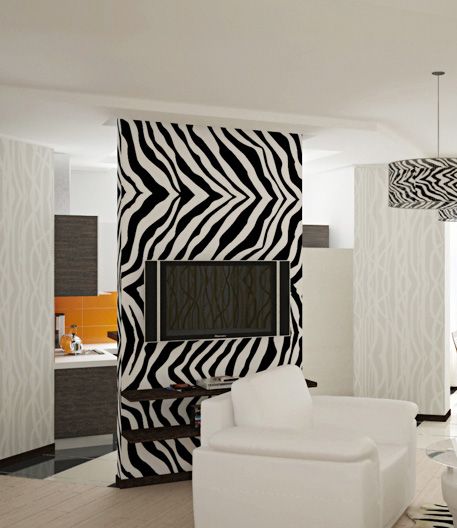
Black and white animal prints of zebras, Dalmatians, giraffes, and leopards will add naturalness to the interior; to maintain the style, use textile accessories and furniture in discreet colors. Look at the photo to see how animal style looks in the interior.
Contrasting ideas
The color that occupies a large area in the room is usually called the background color. Color spot - details and interior items that are superimposed on a given background. The relationship between the background and the color spots creates contrast, the strength of which depends on the intensity of the decorating elements, including furniture.
When choosing a color scheme, you should take into account the style of the room:
- Minimalism uses monochrome combinations, while the pop art style focuses on the contrast of active color and achromatic white, black and gray.
- Shades of similar meaning - dark marsh gold - dominate in baroque and classical styles.
- Modernist design tends to contrast shades of burgundy and viridon green.
- When combined different wallpapers two types and similar shades in the interior, you should be careful, for example, the colors of lemon and sea wave are successfully combined.
Contrasting elements used in decor:
- textiles - curtains, pillows, rugs;
- decorating furniture and equipment;
- photographs, figurines;
- design of ledges, niches;
- wall inserts;
- decorating the floor with a contrasting color.
Look at how contrasting color combinations in the interior.

Color palette in different rooms
It is not recommended to use too intense or dark shades in the decoration of the bedroom. Green, blue, soft yellow, sand and pastel colors will ideally fit into the sleeping space. You should be careful with a monochrome palette. To brighten up the interior, add catchy accents: textiles, finishing of niches and ledges. furniture.
You should choose rich colors for the living room; emerald and burgundy shades look expensive and rich in the interior of the halls; monochrome wall decoration is often used. Finishing part of the wall with decorative stone will add luxury to the interior. How to properly combine stone and two types of wallpaper is shown in the photo:

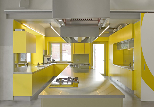
In the kitchen you need to choose colorful shades and appetizing pictures. To increase appetite, use warm color scheme, dynamic tones are suitable: red, orange, yellow. If you want to create a calming environment, use green wallpaper and white furniture.
![]()
When decorating corridors, use color combinations that are in the middle of the color spectrum. Sand, light brown tones, turquoise, blue, light purple tones are suitable.

Selection of furniture
- furniture should not draw attention to itself;
- You should choose light wallpaper for dark sets, and vice versa;
- when using massive furniture, it is not recommended to use coatings with large patterns in the design;
- to emphasize the typefaces, you should add bright accents and catchy details. You can use light decoration of furniture surfaces.
See how to properly combine furniture with wallpaper in the interior in the photo.

Combinations of different types of coatings
Decorative stone and wallpaper
As a rule, decorative stone is used in the interior to decorate an accent wall, so it is important to correctly combine different types of coatings.
Tips for combining wallpaper and stone:
- a decorative stone at the bottom of the wall will visually elongate the space;
- horizontal or vertical stone panels are not recommended to be combined with patterns and ornaments;
- To create accents, you can decorate doorways or ledges to look like stone.
Look at the photo on combined wallpaper with decorative stone in the interior.

Combinations of lining and wallpaper
Among the options for combining lining and wallpaper are:
- zoning - most of the room is finished with wallpaper, and accent wall designed to look like wood;
- decoration of wallpaper inserts with wooden frames.
See how interesting the combination of lining and wallpaper in the interior is in the presented photo.

The lining can be different, which means that the interior with it will have a different personality.

Correctly chosen combinations of colors and different types of coatings, such as stone wallpaper, lining and others, are the key to success. Follow our advice and create an interesting and original design in my house!
Options for wallpaper combinations in the interior can be seen in the video:
As you know, the overall atmosphere of a home largely depends on correctly selected wallpaper. But walls alone are not the whole interior, and a competent combination of furniture and wallpaper is a fundamental factor in coziness and comfort in the house.
For those who are used to doing everything with their own hands, let’s say right away that there are no universal recipes with a 100% guarantee. Naturally, there are certain norms and rules of design, but each person has his own unique taste. Therefore, we will try to outline general directions in order to protect you from serious mistakes.
Advice: many experts argue about what should be taken as a basis - matching furniture to wallpaper or vice versa.
Both of these views have a right to life, but we are convinced that it is better to match the wallpaper to the furniture.
Since it is much easier and cheaper to re-glue the walls than to buy new furniture.
The video in this article gives advice on choosing wallpaper.
- One of the basic rules is that you should not overload the interior. bright colors . There should be no more than three primary colors in the room, but these colors should not be bright or strongly contrasting. Red walls combined with yellow or dark brown furniture are more likely to cause anxiety and irritation than to calm you down.
- But it happens when bright, flashy colors are already present and you need to do something with them. In this case, two colors are universal: gray and white. If you got furniture with an excessive amount of gilding, then a gray or silver ornament on the walls can set off the brightness of the colors. Whitened colors, that is, smoothed with a white tint, are visually well perceived.
- The walls and floor with ceiling are the fundamental background; the concept will be built on this basis in the future. They occupy about 70% of the total color content. Furniture together with curtains takes up 25%. The remaining 5% comes from figurines, paintings, lamps and other decorative items.

- In traditional styles, the background is usually filled with neutral, calm flowers and on this basis bright inclusions are made that place accents in the interior.
- If there are 2 or several bright colors in equal proportions in a room, then staying in such a room for a long time will be psychologically difficult, you will get tired of the colors and the atmosphere will begin to oppress.
- But using only one color is also not an option; such filling will reek of melancholy. Although this law does not apply to achromatic colors. If the combination of white and black is diluted with variations of gray and silver. Competently add texture and place accents by combining matte surfaces with glossy ones, you can get a very decent result.

Tip: if in the room gray furniture Whatever wallpaper you choose, it should have a gray or silver pattern.
The background can be almost anything, depending on your personal preferences.

- If an interior designed in an achromatic tonality is diluted with bright red colors, then you will get East style, closer to Japanese.
- If in your room low ceilings, then it is better to choose light, warm, neutral shades of wallpaper. But paint the ceiling white or sky blue, so it will seem a little higher and further away. Blue wallpaper glued to the ceiling with white furniture is perfect; this combination will add lightness.
- For tall, voluminous rooms the approach will be slightly different, wallpaper in warm, pastel colors It’s better to stick it on the ceiling, so the room will be more comfortable. IN in this case warm wallpaper for dark furniture will be more suitable.

In the video in this article you can do it yourself.
A color scheme
- In design, there are 2 fundamental approaches to the problem of combining the interior. The first is more common because it provides greater freedom of choice for non-professionals. According to this principle, warm wallpaper colors are matched to the same warm options furniture. Accordingly, the same color of furniture is selected for cold shades. Here you will not find a lilac set against a background of golden wallpaper.
- As for the second approach, it is closer to professionals. Opposition different colors typical for high-tech, minimalism or loft styles, but you should be careful, without having applied knowledge you can do too much. In any case, we are not talking about a militant opposition of cold and warm, only a soft combination.
Light and dark
- Which wallpaper to choose for light furniture with dark inserts is far from an idle question. Let's say you, succumbing to a fleeting impression, purchased light furniture with chocolate-colored details. Something in between is more suitable here, cream or beige wallpaper to light furniture and rare inclusions on the canvas in chocolate tones.
- If your furniture is dark, for example made of wenge, then lilac, light purple or amethyst will go well with it.
- Among the headsets in classic style Red shades are often found; it is better to surround them with a brown-golden or peach background. The price of this furniture, as a rule, is serious; it is a work of art in itself, so obsessive ornaments on the walls will only distract from such beauty.
Wallpaper on furniture
- Decorating furniture with wallpaper yourself was very common in the last century. With the development of production and the filling of the furniture market, interest in this type of creativity has changed somewhat. Decoupage has acquired all the signs of an independent art.
- This technology is attractive not only for its simplicity, but with its help you can turn your grandmother’s chest of drawers into a stylish piece of furniture. And wallpaper with a 3D effect can turn old wardrobe as a child's pride.
- Previously, the choice was limited only to stenciling and paper appliqué. Now the possibilities have increased significantly. The canvases will allow you to adapt any wardrobe to the upholstery upholstered furniture, glass wallpaper will revive a battered kitchen. In addition, you and your child can decorate it desk and he will be happy to teach lessons on it.
- The technology itself is extremely simple. The surface is well cleaned with emery cloth and degreased. After this, the pre-prepared canvas is glued to the surface. The glue is selected for this purpose. If necessary, after drying, you can coat it with furniture varnish.

The video in this article shows some decoupage techniques.
Conclusion
In conclusion, I would like to note that the price of wallpaper and furniture, of course, plays an important role, but in creativity this is far from the main thing. Well-placed accents and an impeccable sense of style and proportion can turn an ordinary Khrushchev-era apartment into a modern, cozy home.

Concluding the series of materials about types of wallpaper, I would like to talk about how to correctly combine this wall covering in the interior. After all, the most in a simple way To make your apartment unusual is to combine textures and colors in wall decoration. Therefore, it is important to choose the right combination of wallpaper. In this material we will try to introduce you in the most accessible way to the basic rules for selecting wallpaper, furniture and textiles for rooms that are designed in different styles.
A little theory
It is most convenient to select flowers using the “color wheel”. It is generally accepted that there are three primary colors: yellow, blue and red. If these colors are mixed in pairs, you get three more colors: purple, orange and green. If you continue to mix them, you can get a palette of twelve colors.

So how do you use this “color wheel”? For example, if you want to create a soft and calm interior, then it is best for you to combine adjacent colors of the spectrum. This solution is suitable for those rooms that are intended for relaxation. For example, for a bedroom or recreation room. For a more active and bright interior It is best to take opposite wheel colors. This combination is suitable for creating the interior of a living room, nursery or study.
The main tasks of combining wallpaper
So, why is it necessary to combine different colors and shades of wallpaper? This technique has not only aesthetic value, but also helps to correct any shortcomings in the room. For example, a small room with fairly high ceilings looks like cardboard box. In order to fix this, the technique of combining wallpaper is used.
Also, by combining wallpaper, you can divide a large room into functional areas. If your room is too elongated, then a combination of colors and textures will help to achieve a visual effect.

Let's get acquainted with combination techniques
Horizontal wall division
The most common way to combine wallpaper recently is to divide the wall horizontally. Often the wall is divided into three parts. The top two are covered with wallpaper of the same color, and the bottom - another. There are the following classic techniques for horizontal wall division:
The bottom is a strip, and the top is plain wallpaper or wallpaper with a small pattern;
The bottom is a large floral design, and the top is plain wallpaper;
The bottom is plain wallpaper, and the top is a large pattern.
It will be good if the wallpaper is from the same series or matches well in color. To decorate the horizontal joint between the wallpaper, a decorative strip or molding made of polyurethane foam is used. This method of combining wallpaper is suitable for those rooms where there are high ceilings or there is a large section of the wall that needs to be visually divided.

Alternating vertical stripes
This technique is ideal for apartment owners in Soviet-built houses, where one of the rooms has the shape of a wide corridor. In order to give it a visually square shape, you can use bright wallpaper with a large print and combine it with calm plain wallpaper. There are 3 ways to glue wallpaper:
In the center of long walls you can glue bright wide stripes one opposite the other. This way the room will visually become smaller in length;
The principle of “asymmetry” is applied: on one of the long walls there is a wide bright stripe in the center, on the other - several narrow stripes in the far corner of the room. The most important thing is that the stripes are of different widths;
You can use alternating stripes. One of the long walls can be covered with dark wallpaper, and one of the short walls can be covered with light wallpaper. The second short wall is covered with stripes of dark and light wallpaper with a slight overlap on the second long wall. With the help of such alternation, the clear outlines of the room are blurred, and the room visually takes on a different shape.
In order to use this combination of wallpaper in the living room, office or bedroom, do not forget that the wallpaper must be from the same material. Otherwise, the joints between the sheets may not look neat.
Selecting an entire wall
This method is used extremely rarely in practice. After all, highlighting an entire wall with contrasting wallpaper can visually make the room smaller. This combination of wallpaper is most often used in large bedroom when the furniture is somewhat lost in a spacious room.
Visual separation of another room
This technique is ideal for those who have decided to get rid of boring doorways and connect the rooms. In order to visually draw a line between two rooms, you can simply cover them with wallpaper of different colors. There is one “but” - the effect of such a technique can be greatly spoiled if the walls in two rooms are very different. But this drawback can be easily corrected with the help of curtains. For example, the pattern and shade of curtains in one adjacent room should be in harmony with the wallpaper in another room.

Highlighting a section of wall with texture or color
Quite often in different rooms it is necessary to select some structural element. This question becomes especially relevant if the main type of wallpaper in the room is brightly colored. In order to eliminate this drawback, you can paste over the niche with wallpaper of a different texture or a calmer shade. If you want to clearly zone the room, then you can use different finishes walls, i.e. you can apply not only color variations, but also different types wallpaper

"Wallpaper panel"
This method is quite common for decorating walls in big room. Its meaning lies in the formation of decorative inserts from bright wallpaper. It is worth adding that this method is also quite economical, since you only need to buy one roll of some beautiful and interesting wallpaper.

Photo wallpaper in the interior
Photo wallpapers are rightfully considered a new word in design. There are a number of rules for working with photo wallpaper:
This type of wallpaper does not like combinations with large drawing on other wallpapers;
The decoration of the room should be matched to the photo wallpaper or the interior should be based on contrast;
Landscape wallpaper should never be transferred from one wall to another through a corner;
For a small room, it is best to use wall-sized photo wallpaper;
The design of the photo wallpaper must fit into the style of the interior;
If your room is designed in a classic style, you need to abandon the idea of using photo wallpaper.
More detailed information You can learn about photo wallpaper from the material posted on our website.
Secrets of combining wallpaper in different rooms
For large spacious rooms, you can use wallpaper in dark colors (gray, black, purple) with large patterns. If you want to place furniture near the wall, then it is better to decorate it with plain wallpaper.
In a cramped room, you should not use dark and contrasting combinations. In order to visually make a small room larger, cover one of the walls with light wallpaper with a textured, barely noticeable pattern. But you can cover the remaining walls with plain wallpaper with a glossy coating or silk-screen printing.
If the walls have minor imperfections, then it is not recommended to glue light-colored wallpaper. In a room with uneven walls, you can use special leveling wallpaper with a thick base with a dim pattern or a spotted background.
In case there is a deficiency in the room solar lighting, then it is best to use wallpaper in warm colors. One of the walls in this case should be much brighter than the others. You can use a monochrome combination of colors (for example, golden and sand, rich coral and pale pink).
