How to choose the right floor color, taking into account the maximum number of factors, how can it affect the interior of the room? Most developers are faced with these issues; their solution depends not only on appearance premises in general, but also indicators of living comfort. Before proceeding to registration separate rooms, you should learn the general rules.
A very important factor when choosing the color of the floor is how it will combine with the color of the walls, ceiling and furniture, which shade will be dominant and which will complement it. Developers solve problems in different ways; some take pieces of wallpaper or examples of paints used, photographs, etc. with them to the store. But this approach cannot be considered optimal; it is very difficult to accept based on these elements alone optimal solution. After all, the choice of floor color is influenced by many factors, including the number and size of windows, their location in relation to the cardinal directions, the purpose of the room and the personal preferences of the residents. No professional can create the final design of a room based on a piece of wallpaper.

When choosing, the peculiarities of the human brain also play an important role; optical illusion occurs on a subconscious level. Pay attention to the picture.

It seems to us that the top half of the square is much darker than the bottom. But this is not so, this is what both squares would look like without the influence of the color of the floor and walls.

They suddenly turned out to be completely identical. This is how our brain perceives information; surrounding objects can completely distort reality. Conclusion: color selection should only be done comprehensively; you cannot select the color of each element separately. The fact is that after they are connected final result may differ significantly from expected.


Taking into account the peculiarities of the human brain, professionals have developed general recommendations for choosing color solutions. They can be slightly adjusted depending on the wishes of customers and the characteristics of the premises, but too large deviations are not welcome.
| Flooring color | Design and performance characteristics |
|---|---|
| Floors of this color are associated with purity and simplicity; they are often used during the creation of modern styles decoration of premises. A white floor makes the room much lighter, which helps compensate for the lack natural light. The combination of a white floor with green walls creates an atmosphere of calm and freshness without straining the eyes. White and purple emphasize the prestige of the room; in combination with crimson, it gives them lightness and optimism. White floor and yellow walls - perfect solution When creating a classic style, with brown walls the rooms look more strict; this option can be used to decorate large living rooms. |
| Gives spaces a serene yet elegant look. Gray and blue can be used when decorating bedrooms and offices; gray and orange can calm the activity of the nervous system. It is not recommended to combine gray with green, these colors depress each other, but it looks great with purple. For visual expansion indoors, white shades can be added to this combination, but gray should remain the main one. Women like the combination of gray and pink; this combination makes the room airy. |
| The colors are reminiscent of natural wood of various species, and this material will always be in fashion. With such a floor, almost all colors of wall and ceiling decoration can be used, in some cases the rooms become businesslike and strict, in others elegant and festive. To increase volume, increase the amount of white; to add nobleness and severity, add more brown. |
| Noble, expensive wood has these colors. Accordingly, the use of orange and red floors gives the premises an expensive, exclusive look. Almost the entire spectrum of colors can be used with them, the only limitation being blue. |
| A very original color that can simultaneously give the room sophistication and rural simplicity. Often used when decorating rooms in country style. But it is recommended to use such color schemes only when there is enough natural light in the room. |
| The color of bohemia must be applied very carefully and carefully. Looks great paired with gold decorative elements, black and yellow emphasizes the extravagance of the tastes of the apartment owners. |


These general tips by choosing the color of the floor, but each room has its own rules related to the purpose of the rooms.
Kitchen floor color
The kitchen is the room in which housewives spend a large number of time. But they not only work in it, but also relax; in addition, the size of the room is most often much smaller than in the hallway. These features require increased care when choosing floor color. The main rule is that you cannot approach the choice of floor color separately from linking it with the design of the walls and type of furniture. All these elements should be combined and complement each other as much as possible.


Color should not cause irritation or other negative emotions. Do not forget that due to the correct color design you can visually enlarge the space; it becomes wider and lighter. But you can also get the opposite result - an already small kitchen becomes lower and smaller.

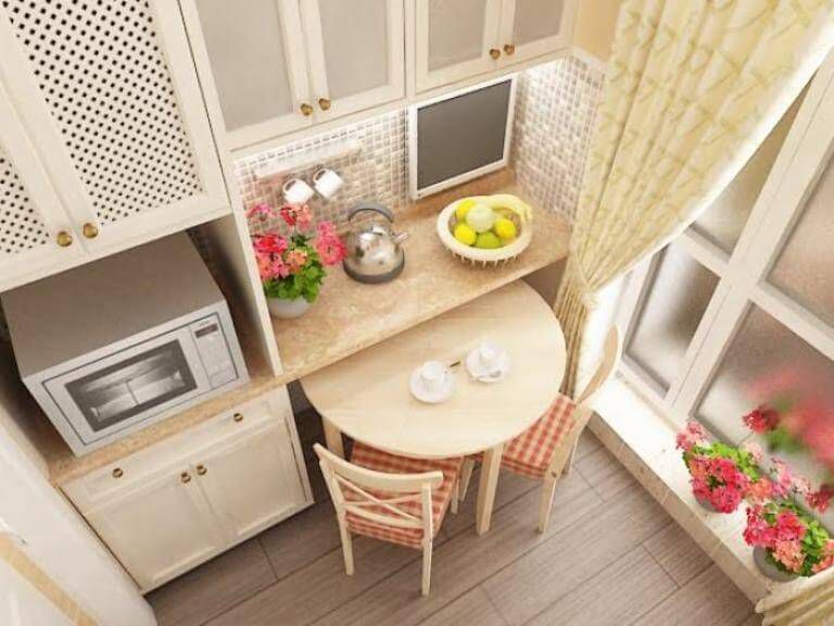
Another option for color solutions is not to make the floor monochromatic. True, not all floor coverings allow you to use this recommendation; this should be kept in mind when choosing a specific material. The easiest way to implement such a solution is with ceramic tiles- the most common material for flooring in the kitchen. The room is divided into several working areas, each of which makes its own decision. Work zone and the sink may have a dark floor, the rest of the area is lighter.


A dark floor makes it possible to create contrasting room design solutions. The perfect combination– dark floor, light walls, dark furniture and Appliances. In this case, you need to take into account the size and location of windows and doors. If there is insufficient lighting, a dark floor is not recommended; such an environment causes rapid eye fatigue. You have to constantly use artificial lighting, and none of them can completely replace solar.


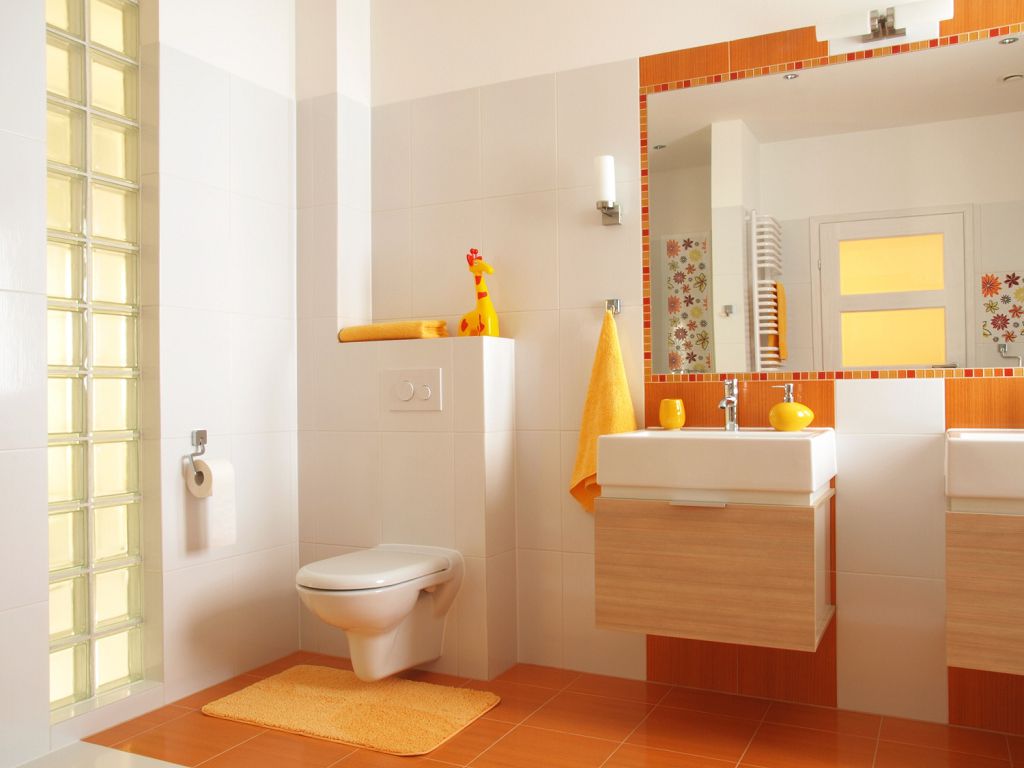
Bathroom floor color
The day begins and ends in the bathroom; it should both stimulate work and calm you down after a busy day. working day. The right floor color helps solve these mutually exclusive problems. The subjective perception of the room depends 40% on the color of the floor, the walls and ceiling have another 50%, and the remaining 10% depends on the accessories.

Nowadays, most designers do not subscribe to the widely held belief that bathrooms should have as much white as possible. This rule existed 20–30 years ago and was explained by the small range of materials for flooring. Excess white color makes the room boring, it does not evoke any positive emotions, and is always associated with a hospital ward. The only advantage of white is that it increases illumination. But today's lighting this problem can be easily solved for any color designs. The time spent in bathrooms is very limited, so you should not pay attention to safety parameters artificial lighting for vision.


Dark, gloomy bathroom floors are considered inappropriate. Such premises may look stylish on the pages of glossy publications, but it is unlikely that there will be anyone who wants to use them all the time. Dark colors, in principle, cannot evoke the positive emotions needed in the morning and evening.
The best flooring solutions are light green, blue, light gray and lavender.


The color of the floor in small rooms can match the color of the walls and ceiling; in large bathrooms you can experiment with different combinations. Although the use of more than three shades is considered a lack of taste.

Lovers of bright and saturated colors are somewhat limited in their choice. Red should not be used, it has too active an effect on the nervous system. But yellow and pink look natural in rooms and do their job perfectly. Of course, the choice of floor color should take into account the style of the bathroom. Classic style requires a sand-colored floor; for Japanese, a brown floor is recommended. The French prefer white, and Mediterranean countries are fond of light green and blue floors.

Hallway floor color
The hallway is one of the smallest and busiest rooms in the apartment. It is this that significantly influences the final opinion about the apartment and the tastes of the residents, and the first impression is very difficult to change. The color of the floor in the hallway also plays an important role in solving complex specific problems.
Many developers prefer dark colors floors, their reasoning is simple - dirt and mechanical damage are least noticeable on such surfaces.

Excellent performance modern materials for flooring give designers the opportunity to break tradition and choose various light colors and their combinations. But there are also certain general patterns of influence of floor color on hallway design.
Small rooms should have light-colored flooring. Small inclusions of dark areas in the form of paths in the middle of the hallway are allowed. Thanks to this technique, it is possible to combine all the advantages of both colors. Light areas make the hallway more spacious, while dark ones hide dirt in places where people pass.

The spacious hallway makes it possible to implement many ideas, including with different shades. Dark floors look great with white walls. General rule– the floor should always be darker than the walls.

The bright floor is combined with light, plain walls. This option is better suited to rooms that do not have natural light.

The choice of color in the hallway is greatly influenced by the number, type and placement of lamps. If spot ones are planned, then the color of the floor must be chosen in such a way that it scatters the rays and makes the lighting uniform. Furniture should always be slightly darker than the floor.


Which color is the most practical?
Above in the article we looked at the rules for choosing floor colors from the point of view of designers. It should be pleasing to the eye, go well with the colors of the walls, ceiling and furniture, with the design style, etc. And what color can be considered the most practical for each room?
Corridor. In the dark, dust from clothes and dirt from shoes after slushy weather are clearly visible. In terms of labor intensity of cleaning, a dark floor is almost in no way inferior to a light one. Practitioners advise choosing brick, terracotta colors, and various shades of natural wood in hallways. An excellent solution is a motley floor of several colors, with stains and spots.

Bedroom. Both very dark and very light colors are not recommended. It should be borne in mind that light dust collects on the floors in bedrooms, and it is least noticeable on clear varnish. That is, you need to choose not so much the color as the finishing flooring materials.

Hall. If this room is the least visited, you can use any colors for the floor. The main attention should be paid to the design; the cleaning process is not difficult. Since there are few people in the room, there is nothing to clean.


Bathroom and toilet. Professionals recommend blue and light blue tones; they do not stain from dried water. As for cleaning, in bathrooms you need to use moisture-resistant materials with smooth surfaces.


Of course, no color guarantees that the premises need not be cleaned; it simply masks dirt, and this does not make the floors cleaner.
Gender color and human psychotype
Choleric people feel calm in rooms with a predominance of orange color, but for phlegmatic people such an environment has a depressing effect.
Best suited for sanguine people light green color walls and light floor.


Science has proven that the color in a room has a serious impact on mental state. This is very important due to the fact that we spend most of our lives indoors. The red color causes a rapid heartbeat, can cause anxiety, and sometimes a person becomes unreasonably aggressive. This color is categorically not recommended in bedrooms, kitchens and children's rooms. It is allowed to be used only in living rooms, and then in limited quantities.

Red furniture in quality bright accent living room. Floor: light laminate

The yellow floor brings the energy of activity, but without aggression and anxiety. It stimulates brain activity and can be used in workrooms and schoolwork preparation areas.

Purple and blue are recommended to be used in limited quantities; prolonged stay in rooms with a predominance of these colors can cause depression. The pink floor gives the room a romantic character.

Most friendly to human body counts green color. Make it the main one when decorating the premises and, depending on the shade, choose the color of the floor.


Always strive to have color balance, gender plays an important role in it. But don’t forget about human psychology.
Combinations of floor color and existing furniture
The main rule for these elements is that a significant difference in tones and shades, but not colors, is required. In the first case, the furniture becomes invisible against the same background of the floor, in the second, on the contrary, it looks like unnatural, sharp inclusions in the style. If such a mistake has already been made, then it can be partially corrected by using a contrasting carpet for the floor - place it under the furniture, and it will look more organic against the background of the floor. Professionals recommend the following combinations of floor and furniture colors:

There are options dark furniture and dark floors, they have the right to life, but they look very unusual.

And one last thing. In any combination, furniture cannot have more than three colors, otherwise any room turns into game room children's preschool institutions.

Organically designed children's room. The color of the floor is in harmony with the wallpaper, curtains, furniture, bedspread
Only two options for combining shades and colors are used: a contrasting option and in one color. If the floor and doors are the same color, then choose the second one several tones lighter. Due to this, the space is logically perceived in the direction from above, from the light ceiling to the dark floor. If white doors are installed in the room, then transitions should be made through the use of structural accessories on the walls and furniture. Doors in dark colors are recommended for use in cases where the floor is pastel in color.

There are two universal rules when selecting colors for floors, walls and ceilings, which can be used in 90% of cases.
There is no need to read articles about what color and how to choose a floor, what goes together and what is not recommended for use. Remember that not a single advisor will live in your apartment, and accordingly, he will not “enjoy” the results of his recommendations. And since you live in it, then the decisive and final word is yours. All clever words about which color is friendly with which and which is not should be taken only as recommendations, and not a prerequisite.
The main rule is that the colors should be friendly to you and please you personally. If your tastes coincide with the opinions of the designers, great; if not, don’t pay attention to them, do what pleases you.
The color of the floor should match your favorite shades and match your psychological profile. These are two factors that have the maximum impact on the comfort of living in an apartment.
Conclusion - you can combine any floor colors with any walls and ceilings. But you can do this not only with pleasure, but also according to the rules.
First you need to familiarize yourself with two characteristics of color.
- Lightness. The hue gradually changes from standard to lighter or darker - the process of a smooth transition of color to white or black is called lightness change.
- Saturation. Changes when gray is added to the base color. As the concentration of gray increases, the saturation changes and eventually the color becomes gray.
Colors combine well if they have the same lightness, saturation, or both lightness and saturation.

To simplify the choice of floor color, you can use special color fans; they are sold in specialized stores. Each fan tab has a different color with various options its saturation. For ease of use, all shades have an international classification.
How to use color fans?
Step 1. Choose a wall shade that already exists in the room. Determine its location on the fan tab.
Step 2. Unfold the fan and notice what colors the chosen shade goes with. All options are located at the same fan height.
Step 3. Choose a suitable floor color option.

This is a theory, but in practice it is necessary to take into account the finishing floor covering materials currently in use. You should know their shades and focus on real options.
Video - Options for color combinations in the interior of premises
Color plays a huge role in a person’s life; it affects well-being, mood, performance, and relationships. The kitchen is an important part of our home, we spend a lot of time there, so we should take seriously the choice of wall color for this room.


Basic rules for choosing wall colors for the kitchen
- A large pattern visually reduces the size of the room.
- A small pattern, on the contrary, makes the room seem larger than it actually is.
- Geometric patterns on the kitchen walls in the form of intersecting stripes, like the patterns on Scottish kilts, create the illusion of continuous space.
- The vertical pattern “raises” the ceilings, visually “increasing” the height of the room.
- Horizontal pattern and horizontal stripes on the walls they “expand” the kitchen, while simultaneously reducing its height.
- Diagonal lines on the walls add dynamics to the kitchen interior, creating the illusion of movement.
- Textured wallpaper looks very extraordinary. By endowing the surface of the walls with new qualities, they are able to create an additional dimension in the room. Thanks to the play of shadows and penumbra, curious color nuances and unexpected alternations of textures can produce a lot of interesting effects.
empstenup/ January 6, 2017 / /
Whatever style the room is decorated in, the walls carry the central load. They are responsible for psychological comfort, the degree of illumination, and the combination of interior elements. For more details on what the color scheme of paints for the walls in each room should be, read on.
Difficulty of choice
On video: the use of color in the interior by Italian designer Daniele Bonicolini
The main problem that arises when performing repair work— choice of color for interior decoration. The store offers dozens of shades of gray, hundreds of tones of blue and more than a hundred options of white. But the color on the palette will look different than on the wall. In order not to waste a lot of time searching, you should adhere to simple rules.


Shade to suit your mood
The colors of the walls determine the atmosphere of the entire house. Some people prefer the bright and orange of summer, others prefer neutral shades, and still others strive for coolness. Analyze which side the windows face and decide what you want the room to look like: bright, colorful or muted.

If the color scheme is selected for a nursery, it is worth inviting children to participate. They will have to live in this room. It's important that they like her.
Choosing the main color
Think about what colors represent the chosen atmosphere? Are they suitable for the premises? For a south-facing room, it is better to choose cool shades. In summer it will be comfortable in such a room. The range of neutral shades is suitable for any room. If the room is small daylight, it is better to give preference to light colors. Leave more saturated shades for an office, a room decorated in English style.


If you want to use a combination of bright and muted colors, it is important to remember that the richer shade attracts attention. Paint three walls a light tone, and highlight the fourth with a richer color.
Choosing a shade
Shades are divided into warm and cold. You can combine them, but this should be done very carefully. Try to find examples of interiors in salon catalogs. Want to use neutral colors but are afraid of creating a “cool” feel? Take gray with a touch of beige, or green with purple.

Trying shade options
Never use one shade to paint your walls. Even if you are sure that you have found the best one. Depending on the lighting in the room, the same shade will look different in different parts. Color is the background for the rest of the interior. You should first purchase furniture for the room, and buy paint taking into account the entire basic range.


Examination
Buy barrels of paint in several tones. Paint sheets of drywall measuring 50 cm x 50 cm with them. Label each with the name of the paint. Each sample must be brought to the wall opposite the window and monitor how the colors change in different time days.
Paint changes properties in space. If you prefer blue, a subtle shade will work for a small bath without natural light. Otherwise, the room will “shrink” and the walls will “press.”

Online interior
Programs have been developed specifically for smartphones, with which you can select shades of colors for a specific room. All you have to do is take a picture of the room and then “try it on” desired color. The palette is pre-sorted by type into cold and warm tones. The settings allow you to see what the room will be like at different times of the day.
Interior colors
Red symbolizes the energy of life. It attracts the eye, stimulates, excites. In the interior it is better perceived by energetic people leading an active lifestyle.


Orange color symbolizes optimism, good nature and freedom. It is perfect for rooms where people often meet.


Yellow is joy, laughter and love. It has a positive effect on mental abilities and promotes concentration. IN yellow color The room of a schoolchild or student looks good. The main thing is not to oversaturate the shade. Otherwise, there will be a feeling of confusion.


Green symbolizes peace, life, balance. It will fit perfectly into any room.


Blue color is associated with cold. It is best used in bedrooms and lounges. Blue color, on the contrary, gives the interior seriousness and respectability.


The color purple symbolizes wisdom. It should be used in bedrooms and offices of creative people.


White is purity, purity, light. It personifies lightness, freshness, openness. White is suitable for any room that needs to be visually expanded. Complete whiteness creates a hospital taste. Therefore, there should be other color accents in the room.


Black is a secret, an enigma, secrecy. In the interior it is preferred by single individuals. But this color is not suitable for small rooms. It visually reduces the dimensions.


Purpose of the room
When choosing the color of the walls, you need to take into account the type of room. Warm, muted tones are more suitable for the bedroom. If the design provides workplace in this room, it is better to use neutral colors that promote mental work.

The children's room should be painted in a light shade so as not to reduce the illumination. Cold colors and large bright drawings on the walls negatively affect the mood of children, distracts them from doing their homework, and does not allow them to relax before bed. Kids perceive orange and its light shades well, schoolchildren perceive blue and green.
Hallway- This is a limited space. There is not enough daylight here. A hallway in light colors visually looks wider. Drawn horizontal stripes lengthen the space. The vertical pattern adds height.

Premises for elderly people should be decorated in soothing colors. People are in the room long time. Its color should promote comfort.
It is customary to decorate the kitchen in light colors. IN small apartments where the dining room is combined with the kitchen, you can use rich colors. Kitchen equipment will stand out against a dark background. Thanks to this contrast, the room looks elegant. For painting you will definitely need a roller. You will find recommendations for choosing it in the article: “ “
2 videos on choosing colors for walls
Choosing wall color (38 photos)


The apartment or house in which a person lives is a separate small world, where there is its own character, a set of feelings and emotions, which together influence all spheres of life of their household. Therefore, it is very important in the process of planning future renovation work to determine the palette of colors and shades that will decorate all the walls of the home.
Colors in the interior work real miracles, because in addition to the fact that different shades influence the psycho-emotional state of a person in different ways, they can also modify the proportions of rooms, divide them into functional areas, and simply create a certain feeling from visual perception.

Features of choice
To make it easier to decide what color to choose for the walls, you need to soberly evaluate all the features of the room. Here you need to take into account the size of the room with the height of the ceilings, the lighting, and the presence of any defects in the form of cracks, protruding beams, etc.

When choosing a color scheme for a room, you should know that there are 3 options for combining the color of the walls in the interior:
- similar colors are combined, for example, blue and sky;
- a combination of tones of one specific color of different saturation, for example, turquoise and indigo blue;
- contrasting duets.


There are also some tricks when working with the color wheel. So dark colors perfectly hide any defects and imperfections of surfaces, while simultaneously visually making the room smaller.

A light palette increases the area, filling the room with light and lightness. But multicolor can overload the space. Here it is important to choose one dominant shade, and the rest should be a harmonious complement to it.

As for the illumination of the room, for areas facing the darker northern side it is better to choose light colors. Whereas the colors of the walls in the interior of southern rooms can be chosen from a bright, intense palette of tones.

A very important note is that the same shade looks on different surfaces differently. On smooth textures the paint looks lighter, on rough textures it looks darker. On matte canvases the color appears warm, while on polished ones it appears cold.

If there are any doubts before covering the walls with paint, then it is advisable to test coloring a small area of the surface to ensure the correct choice.

Basic combinations
Charcoal is a universal color. It goes well with all shades. The best companions for black are traditionally snow-white, rich red, shades of green, lemon and orange.

Red is considered a shade of passion and activity. It harmonizes perfectly with snow-white, charcoal, yellow, gray and green.

Lemon – tones the body and strengthens the nervous system. Goes well with sky, blue and purple.

The color of greenery is fresh and inspiring. Combines with a golden brown background, run.


Blue is associated with infinity, the depths of the sea or the expanse of heaven. Helps increase concentration. Harmonizes with steel, yellow and purple.

Room decoration
Hallway
The designers claim that it is the hallway that conveys the full impression to guests about the owners of the apartment. To decorate it, you can safely choose shades that inspire confidence, namely the color of dark cherry, copper, “mahogany”.

With the correct placement of accents, such a palette will not affect the visual perception of a small corridor space.


Saturated shades need to be diluted light colors. Beige and snow-white details will combine so perfectly with the selected bright colors. Dark background, complemented large mirror strict forms will seem endless.

It is also important to arrange furniture correctly without cluttering narrow hallway. To do this, you should limit yourself to a stylish steel hanger.

Bedroom
To decorate wall surfaces in the bedroom, it is advisable to use halftones. Smoky, slightly blurred shades will help you set the mood for rest and relaxation. Here it is appropriate to use a snow-white background in combination with soft purple, lilac and heavenly shades.


Kitchen
This room should set the mood for awakening and activity, because this is where household members meet after waking up in the morning. Combinations with juicy lemon, pink and orange tones will completely drive away drowsiness.

Stylization and coloring
Stylization also influences the choice of wall color. Thus, minimalism is characterized by cold tones in the form of pale sea, snow-white. Very often in minimalist interiors they use grey colour walls

Baroque is distinguished by its multi-layered nature, so the finishing palette can contain 3 shades at once. For walls, as a rule, noble red and golden colors, emerald and natural brown are chosen.


For antiquity, the characteristic tones are beige, azure, olive and snow-white. This calm palette is complemented by plaster decor in the form of frescoes and stucco.

Modern style gives you the right to choose any shade for decorating wall surfaces. Modern design walls in the interior is considered to be painting one contrasting wall with a different color from the general background.

The main thing here is to choose this combination wisely. For example, a coal wall can visually lengthen a room, while an orange surface, on the contrary, brings the distant part closer.


Smart selection color palette for painting walls will help to achieve complete comfort in the perception of the living space.

Photo of wall colors in the interior


