We have been looking at the color of the facade and roof of a house for many years, so they need to be selected carefully. The play of colors can be used not only in the interior. Relevant color combination individual elements of the building with outside makes it possible to hide the shortcomings of the facade and emphasize the advantages. Correctly selected colors will give the building expressiveness and character, and vice versa, if the combination is unsuccessful, they will make the building invisible, drowning in the surrounding landscape.
Depending on the effect you want to achieve, you should select a combination of colors for the roof and the facade of the house. When designing a facade, you should not rely only on aesthetics. Practicality and common sense. The house becomes part of the landscape and must fit into the environment. Before choosing color design buildings, it is worth determining which colors of houses dominate in the area. Neutral tones are almost always a safe bet. Let's start with choosing the color of the roof.
Roof color selection
Before deciding on the final color of the facade, you need to choose the design of the blood.
Interesting fact! Californian physicists have come to the conclusion that in large metropolitan areas, the roofs of buildings should be decorated in light colors. Light colors reflect sunlight, dark colors absorb sunlight. Light-colored roofs reduce air conditioning costs in summer and reduce the greenhouse effect in the atmosphere. More light-colored roofs will significantly reduce emissions carbon dioxide in atmosphere.
This is a scientific view of reality. In practice, light roofs can only be seen in winter, when they are covered with snow; they are not popular.
You need to start choosing a roof exterior finishing. This principle dictates a narrow range of shades in which roofing materials can be selected. This does not mean that homes are doomed to monotony. Manufacturers of roofing materials are constantly expanding their offerings with new color solutions.
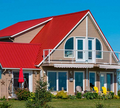
The color of the roof and walls of the house should match well, for example:

Houses with a black roof, photo


Which façade color should I choose – light or dark?
Facade paints determine appearance, character of the building. Unlimited shades of plaster and facade paint, commercially available, will help implement the most complex projects. In contrast to the limited color design of the roof, facade materials are presented in a full range of colors. They can be divided into two groups:
- light - create the impression of optical enlargement of the surface;
- dark - optically make the object smaller, making the contours clearer.
Light facades will make the building visually appear larger. Houses decorated in light colors, look cheerful, joyful, very noticeable against the background of the landscape.
When choosing, you should remember that facade repairs are usually carried out very rarely. It is necessary to assess whether household members are ready to look at the chosen shade for 10 -15 years. To achieve a positive result, it is important to take into account the style and character of the building. Some proven principles should be applied:
- strict colors suit a classic home;
- for a modern building there is more freedom of choice;
- if the architecture of the house is rich in details (bay windows, columns, attic), the paint for the facade should be calm, pastel;
- in a house with simple smooth walls devoid of details, you can play with color design.
Let's take a closer look at popular façade design options.
White
Always fashionable, often used color is white. White walls are common on old buildings and modern ones. White is universal and does not cause difficulties in combination with other colors. The building will receive a modern, innovative design if:
- combine white walls with a dark roof and other finishing elements;
- White walls of a house with a red or orange roof look modern.
The light facade will perfectly highlight other materials:
- natural stone plinth,
- wooden joinery,
- clinker brick,
- brown tiles.
Attention! White walls have a serious drawback - they get dirty quickly and often need updating.
White colors of house facades, photo


Yellow
Yellow walls are more practical, they become dirty more slowly, and will make the building warm and cozy. Yellow for facade painting is used for small buildings; it helps them appear more spacious and wider.

Green
Pastel tones of green blend harmoniously with wildlife. Juicy green should not be used on all walls, but should be used to highlight individual zones. Houses with a green roof in combination with walls look beautiful:

Shades of blue
Blue should be used with more caution. Blue, blue walls look harmonious on modern buildings, combined with:
- white,
- gray.
White and blue horizontal stripes you can visually reduce the building in height and make it optically wider. This decoration will make the building more modern.

Houses with a blue roof, photo


Gray facades
Gray walls are less common. Although in modern architecture The trendy gray surfaces fit in harmoniously. Even on a building with a sloped roof, dark gray plaster looks modern. The modern style is emphasized by a gray metal roof.
Severe gray interior Wooden elements will make it more comfortable:
- window frames,
- doors,
- decorative panels.

A bolder solution is a combination of gray with shades of red, applied to certain parts of the house, for example, on a corner or balcony. Red adds dynamism and modernity to the harsh gray façade and emphasizes style.

How to match the color of the facade to the roof?
When choosing plaster or paint for walls, remember the chosen shade of the roof. When roof slopes are sloped, their large surface area has a significant impact on the appearance of the building.
You need to match the shade of the walls to the color of the roof, and not vice versa! The color palette of roofing materials is much smaller than the range of facade paints.
What color should the façade be painted? The walls must be in harmony with the design of the remaining elements of the building:
- window and door frames;
- pipes, drains;
- base,
- garage door,
- columns,
- stairs.
Roofing materials are dominated by shades of red brick and gray. Most often used different kinds tiles and roofing sheets. It happens that a certain shade is only available in certain materials.
The specific shade is also influenced by:
- incident light,
- material type,
- form,
- texture,
- texture.
For example:
- red ceramic tile looks completely different than red shingles;
- metal tiles sparkling in the sun seem brighter than matte ceramic tiles of a similar tone.
This should be taken into account if you plan to choose a bright shade facade material. Mixing two intense colors looks too intrusive, causing an undesirable variegated effect that is tiring for the eyes.
Attention! The shade of the material changes over time. This happens with a lot of roofing materials, especially in humid climates. The surfaces become covered with a greenish coating, creating the effect of an aging roof. Such a roof does not look good in combination with a bright, expressive wall. It is advisable to initially plan pastel walls for it.
The size and relative proportions of the wall and roof planes should also be taken into account:
- a large dark roof will overload the exterior and visually make the building lower;
- if the walls create a small area, they need to be lightened, visually enlarging them.

A dark facade looks impressive when combined with a dark roof, but this option needs to be carefully considered. The dark building looks a little extravagant; not everyone will like it.

A roof is not just protection of a building from cold weather, but also the logical completion of the implementation of the overall architectural design. The shape and color of the roof should be in harmony with the facade of the house and fit perfectly into the landscape. A competent combination of the color of the roof and facade helps to visually highlight the house against the backdrop of summer greenery or hide it against the backdrop of the winter landscape. You can find the optimal color solution different methods, but you can’t do without knowing the basics of combining different shades. It is important to take into account environmental conditions, as well as advice from color specialists.
What is important to know when choosing the color of roofing materials?
Everyone enjoys admiring a beautiful new house, and even better - to live in it. But it turns out that not everyone has good taste, especially few who have an artistic education. Therefore, you should not take on the construction of a facade and roof without a project, without having a complete idea of how the house will look upon completion of construction.

If you walk along a street with relatively new houses in the private sector, it will become obvious that not all buildings evoke pleasant aesthetic feelings. One of the reasons is a violation of unity:
- color range and stylistics;
- building proportions and color balance;
- combination of facade and roof.
Some mistakes are easy to correct during renovation, but it is difficult to change obvious inconsistencies or completely change the shape and color of the roof. Complete replacement roofing is expensive, and painting it is often impractical. Therefore, it is also very important to initial stage choose color and variety roofing material, which will be perceived very harmoniously. Peaked roofs attract the most attention, but also the facades of houses with flat roof It’s also important to think about it.
Advice: Do not hesitate to seek professional advice when in doubt. Today it is also possible to use:
- successful “finds” of designers;
- shade matching tables;
- advice from psychologists on color perception;
- special computer programs by design, etc.

When choosing the main color, the style of the house and the landscape design of the local area are taken into account. Someone wants to hide the building in the shade of trees behind a high fence. Others intend to show off the beauty of their home to their neighbors and friends. And the correct choice of color will help with this - photos of roof facades.
Don't forget about the change of seasons. Green color the roof is hidden behind the crowns of trees, but in winter it will look like a bright spot on a white snow-covered canvas if it is not covered with snow. Or if there are a lot of evergreen coniferous plantings in the yard, green facades of the roofs of private houses will be very appropriate.
Brown roofing harmonizes perfectly with autumn foliage, and this is important for households in a climate zone where autumn is warm for a long time. A terracotta, burgundy or chocolate roof looks advantageous against the backdrop of low wooded slopes. Gray roof evokes boredom in a humid climate zone where there is little sun - it is advisable to refresh the facade with warm colors. And in a mountainous area somewhere on the shore of an endless sea, a white facade of a house with a blue roof is more appropriate.

To emphasize the advantages of a tall building with a roof of complex shape, it should not be blocked by tall trees. Such houses are built on a hill or separately, so that the beautiful roof is visible against the backdrop of a clear blue sky. But it is equally important to take into account the color of the roofs in a given area, as well as the style of neighboring houses.
Today, entire streets, houses, neighborhoods, cottage villages are designed in a general manner. This has its advantages, especially when neighboring buildings have a roof made of general materials, for example, metal tiles or corrugated sheets. But let us remember how beautifully perceived the historical quarters of European and Asian cities are, made in one piece. For example, how luxurious Prague or Old Tallinn look under tiled roofs, or all-white neighborhoods in the coastal towns of Italy or Greece.
Attention: Bright, visible buildings attract not only tourists, but also robbers. The selection of shades of roofs and facades of houses and the style of construction is a personal matter for each developer, but it depends on taste and the right choice in harmony with environment depends on the overall landscape. When choosing an extravagant architectural project, you risk running into bad taste and obvious shocking without meaning. Some of these houses were not completed, being ridiculed by relatives and neighbors.

Factors influencing the choice of roofing for a finished facade
1. Anyone who deals with the construction of a house in the private sector has to choose the type of roofing material and its color, based on the offers of the modern building materials market. The cost of all layers of the roof and rafter system, costs for steam, hydro and thermal insulation and other parameters.
2. The degree of heat absorption by the roof cannot be ignored. Today part of the roof is covered with panels solar panels in regions where there is a lot of sun. A dark roof absorbs heat better, and snow melts on it much faster, the attic warms up faster in early spring. This is reflected in maintaining the temperature inside the building, especially in a house where the thermal insulation of the roof is poorly organized. IN northern latitudes they prefer natural wood and dark shades of roofs; in the south they often use a light roof.
3. Visual features of each color. All colors of the spectrum are divided into “cold” and “warm”; there are also “non-spectral”, calm “pastel” and neutral tones. Some shades are associated with “tasty” sensations, others are too bright “acidic”. Classic contrasting combinations help emphasize the advantages of complex broken lines. The general color of the facade and the color of the roof are a special design or architectural technique for certain styles.
4. The fading or burnout of some shades also cannot be ignored. Over time, any coating changes its rich color, and the overall impression becomes different. The destruction of pigment is affected by ultraviolet radiation, temperature changes and other factors. But high-quality roofing materials lose their original color much more slowly, some shades darken, others remain unchanged under the rays of the sun.
5. Visual combination of facade and roofing materials. Today, the most popular shades for roofing are blue, green, red and brown. It is not a fact that in a few years the old roof will look as good as the new one today. But it is important that the façade material itself is in harmony with the roofing, joinery and other finishing. For stone, brick and plastered facades, only roofing materials are needed, and for whitewash, log house or siding - others.
6. Availability of materials in a given area, low cost and combination of them are also important. In forested mountains, as a rule, we use what is at hand - wood. Saving on manufacturing and transportation is an important argument when choosing a roof and its natural color.
Tip: Terracotta tiles go well with natural wood-based materials or brickwork. Under a plastered facade or white cladding sand-lime brick Almost all types of roofing materials are suitable.

The most common mistakes when choosing a roof color:
- choosing one shade of the facade and roof (even if the color is the same, the walls should be darker or lighter than the roof);
- variegation or the use of several colors at once from warm and cold colors spectrum;
- choosing a roof color that is too bright against the background of a nondescript building;
- inability to use neutral colors to balance bright colors;
- too bright contrasts with a predominance of dark colors, and not vice versa;
- limited understanding of the possibilities for choosing roofing materials and facade paint (for all types of external surfaces).
Attention: If an unfortunate mistake occurs, today you can repaint almost everything! However, you should not repaint the roof; it is easier to change the color of the facade. The range of shades of roofing materials is much poorer than the palette of facade paints.
A win-win option is white walls that are suitable for all types of roofing. But it is important to choose companion shades for a harmonious finish when choosing the color of the roof and facade.

It is important to consider that with a sunny color, the roof looks different in cloudy weather, and in winter it looks brighter than in summer. Experts often use win-win options, for example:
- the combination of a light facade with a dark top, which is pleasing to the eye and visually increases the height of the walls;
- a single solution when choosing a color, where a slight play of shades is recommended;
- a light roof and dark walls look original, but this is not always advisable, since the facade attracts attention, and a light gray or blue roof “dissolves” against the sky;
- contrasting combinations allow you to dilute the boring appearance of the house.
Characteristic features of some colors
Those who know the secrets of each color can highlight the advantages or hide the defects of any item. Or distract attention from shortcomings, as ladies skillfully do who intend to visually hide their curvaceous shapes and lengthen their proportions. The same thing can be done with buildings using color perception.
White color- associated with cleanliness, prosperity, order and improvement. Such roofing is often used for transparent glass or polycarbonate inserts. A completely white house looks great against the backdrop of lush greenery, but “disappears” against the backdrop of a snow field.
Gray is a great companion color that balances the 2 bright shades, but is associated with cloudy weather. This is the color of slate, metal and some other roofing materials. It is practical and familiar, does not attract the attention of strangers.

Yellow color is often used in northern latitudes to add optimism and somehow “add” the sun. Often used for facades that go well with brown and dark red roofing. Such a house looks attractive and hospitable.
Green color of various shades is becoming increasingly popular in the decoration of facades and blood. Until recently, it was little used for exterior decoration, but today it harmonizes perfectly with landscape design and “hides” buildings in the garden.
Brown color is simple and friendly, it is readily used both in interiors and in exterior decoration. Brown roofing in shades of chocolate and honey is the classic “dark top and light bottom” option.
The color blue is not often present in classical architecture, but is becoming increasingly popular in modern buildings. It is often fashionable to see a blue roof, which looks great against the blue sky. Excellent for whitewashing walls, cladding white brick and light gray siding.
Red is the most memorable color, and its most subdued shades are now successfully used in the latest generation of roofing materials. This combination of roof and façade colors matches natural wood, brickwork and textured plaster.

The easiest way is to match the color of the roof facade to a gray, black or white house. Complex and transitional shades when painting a facade are achieved by mixing pigments into the paint base. But then it can be difficult to match the color of the roof to these walls.
The perception of color is largely subjective, since each color evokes its own associations. different people. Therefore, no matter what experts advise you, it is always fashionable to reject the offer, for example, choose yellow walls and a green roof.
Natural color combinations are most appropriate, but what seems normal in nature is not always suitable for construction. For example, we all admire the beauty of classic tulips, but green walls and a red roof don’t look very good.

It is important to pay attention to the connection of a certain color to the style of the house. Any historical and classic style welcomes white and light pastel shades, country loves natural wood, and modern styles prefer bright colors combined with the shine of metal.
For a harmonious combination of facade and roof, special computer programs are used. Any service for experimenting with interior design and for architectural design is also acceptable. It is also recommended that you familiarize yourself with the “Color compatibility for walls and roofs” - color combination table.
In a private home, just like in a person, everything should be beautiful - both inside and outside. Since the successful selection of the color of the facade and roof of the house determines the entire appearance of the building, special attention must be paid to this issue.
According to construction technology, facades are finished after the roof construction is completed; in addition, roofs are built to last for decades, and the facade can be updated periodically after several years.
It is impossible not to take into account the fact that the range of colors of materials for finishing facades is presented on modern market much wider than that of roofing materials.
The conclusion is clear - you need to start with the choice of roofing material and its color.
And already at the second stage, select what color of the facade will suit the roof.
The main factors determining the color scheme of the roof and facade
1. Location of the house and its surrounding landscape . Houses located in the northern regions, as a rule, are made with roofs more dark colors. A dark roof heats up more than a light roof.

But in the southern regions, the heat given off by such a roof will be more noticeable. Heating and heat transfer are most pronounced when installing roofs made of profiled sheets, metal tiles and seam metal roofs.

The abundance of surrounding vegetation can make the use of a palette of browns and green shades, and the nearby pond with a sandy beach is blue, coral, turquoise or beige tones.

Before choosing the color of the walls and roof, it is a good idea to familiarize yourself with local laws, which may contain instructions on the required specific color of roofs. An example would be French Provence where recommended roof covering made of red-orange tiles.

This may be due to design and architectural solutions to create the unique character of the area or the need to preserve its historical appearance.
2. Architectural style and whether the house should blend into the surrounding landscape (to be unnoticeable), to stand out or even to contrast sharply with it. The combination of the colors of the roof and the house largely determines the architectural decor of individual houses and the ancillary buildings surrounding them.

The Alpine style is of great interest. Roofing, colors and shades of natural wood, combined with a facade of white or beige colour. In addition, the facade is often decorated with various decorative wooden elements.

A few words about the various ethnic styles that are always popular in the construction of private mansions. The architecture of buildings uses a style inherent to a particular country or area: Chinese, Japanese, Venetian, Scandinavian, African. The colors of the roof and facade of ethnic houses, depending on the inherent characteristics and traditions of a particular country, can vary over a very wide range.
Spectacular Gothic style is quite popular. Such buildings have a dark-colored gabled roof with various turrets, and the façade may be milky white.

If the house, according to the designer’s plan, should merge with the surrounding landscape, then the color scheme of the facade and roof is chosen to match the surrounding background, and if you want to highlight the house, on the contrary, by contrast with it. Green, brown and gray shades fit well into the landscape.

3. The need to hide the shortcomings of the building’s architecture or the desire to highlight its individual advantages . Most obvious flaws can be easily hidden by a successful selection of color facades. In the same way, all the advantages of the structure can be emphasized.

If the building has a complex shape, you should not use bright colors, which will only emphasize all its curves. In this case, calm shades with a darker tone highlighting the frames of windows and doors will be preferable.
If there is a wide and high chimney on the roof, then its color must be matched to the tone of the roof. Small chimneys can be finished in colors that harmonize with the facade.
Selection of colors by compatibility
To decorate the facade and roof, as a rule, two or three different colors. Selection color scheme You can do it yourself or entrust this work to professionals. The main rule is color compatibility.

For independent choice colors of the roof and facade, you can use special programs available on the Internet. It is not recommended to select the color of the roofing material from a catalog or the company’s website; it would be better to see this material in a specialized store.
The following tables have been compiled according to the rules of their compatibility:

Where: 5 - perfectly combined, 4 - quite well combined, 3 - poorly combined, 2 - unacceptable color combinations.

The lining of the gable and eaves overhangs is selected in the same color as the roof or can be contrasting. The color of gutters and downpipes is most often matched to the color of the roof, but a color scheme that is in harmony with the finishing of the facade is quite acceptable. When in doubt about the correct choice of color scheme, preference is given to tones close to the main shade.

How you choose the color of the roof and facade determines their harmonious combination, which gives an excellent visual effect. To achieve this, it is necessary to take into account all the features of the color scheme and its impact on the surrounding landscape, the originality of the building, the characteristics of the materials used, the color scheme of nearby objects and other factors.
It seems that homeowners are no longer happy with a light and neutral exterior color paired with a darker roof shade. In 2019, there is a clear trend of demand for more unusual and bold colors of houses in the private sector. However, the desire to stand out from others does not always lead to the desired “Wow” effect. In this article we have collected 35 photos successful examples painting houses and combining the colors of the facade and roof with useful tips for those planning to update the appearance of their home's exterior this year. Enjoy reading!
Here are a few general advice on choosing a color for the facade of a house, before moving on to an overview of popular shades and color combinations of the facade and roof:
- If you want to paint your home an unusual color that you love but don't know what to pair it with, then simply choose a shade that is a couple of shades lighter or darker than the main one. color wheel. And to make such a simple decision unforgettable, paint front door in some bright and contrasting color, as in the next photo.
Also read:
2. The facade of your house has natural materials that don't need painting? Then know that if they have a cold texture (concrete, slate, etc.), then it is better to combine them with bright colors facades, and vice versa. Thus, concrete today is combined with orange exterior walls of the house, and warm wood and stone are combined with elegant gray facades.

3. The monochromatic color of the facade can become much more interesting if you highlight its individual details with white or other suitable color. Thin gables, window frames and other small elements can be very expressive decorations for the exterior of your home.

4. Contrasting (in relation to the facade walls) shades are ideal for painting the base, canopy over the porch, bay windows and other protruding parts of the facade. Just make sure they have interesting enough shapes that are worth highlighting.

5. Surprisingly, bright and bold colors are best suited for unremarkable or even repulsive facades, because... distract our attention from low quality details and design. At the same time, if your house has beautiful bas-reliefs or other attractive elements, then the color of the facade should be gentle or neutral.

6. If your house is made of stone, wood or other unpainted material and you are looking for a color to paint the roof and other exterior elements, then try to find it in the facade material itself. This could be brownish-green specks on the stone, or darker shades of “knots” in the wood. Nature - best master on creating stylish color combinations.

7. After you have roughly decided on the color of the facade, try painting a fairly large piece of drywall, plywood or whatman paper. Apply this sample to the outside of your home and stand back to see how it looks. Any tone may look gorgeous in someone else's photo, but in reality it will not harmonize with the environment of your home. An extra check never hurts! Based on its results, it may well turn out that you need to dilute the paint a tone lighter or darker.
Color combination for house facades and roofs - 35 photos
If you don’t have a specific favorite shade and you need ideas on what facade color to choose, then especially for you, we provide an overview of several of the most popular shades for the facade of a private house in 2019.
The most fashionable facade color is sage
This soft light green shade looks great against any background and pairs well with both bright and dark tones. In the next photo of the facades you see examples of its combination with red-orange and dark blue “Navy”. Both houses are made in the same style, have two floors, siding and the same shape of windows, but the details of different shades against the general background make them look completely different! Which combination do you like best?


Elegant gray house facades
No matter how versatile the shade of sage is, it cannot be compared with gray. By the way, gray tones today are in demand and interior decoration private houses. Below we show several photos where gray is used as the main color of the facade.


Facade finishing in luxurious red color
Deep ruby red shades, as well as last year -, are loved by facade designers not only for their luxurious appearance, but also for their ability to combine with the green plants that surround most private houses. This is because red and green are opposites on the color wheel, and therefore provide the greatest contrast to each other. If your home has interesting shape If you want to highlight it, paint it in a color that will complement the surrounding landscape.


Combination of gray and brown colors for the facade of the house
Gray and brown are versatile earthy shades that are guaranteed to look good against any background. The combination of these colors is no less suitable for the facade of the house and the roof than the fashionable gray-brown color, which is also called “taupe”. The photos below prove it.


Other beautiful colors of house facades (photo)
Finally, we will give a few more successful combinations colors of the house facade and roof, including houses blue, yellow, black, etc. We will be grateful for any comments and opinions on this article!
Also read:


Natural wood has a number of advantages:
- thermal insulation;
- environmental friendliness;
- practicality;
- combination with all colors, textures and other finishing materials.
Wood in the interior goes well with stone, brick, leather, and plaster. Mirrors are acceptable, but metal inserts are undesirable.


Walls
Expensive wood on the wall in the interior is not afraid of humidity and looks luxurious, in addition, an array of species always fills the room pleasant aroma. Wooden panels are treated with varnish, wax and oil stains for longer service life.
A more economical finishing option is the use of lining and laminate. The panels can cover the entire wall or one wall, and can be used as decorative inserts near window sills, a TV, or a bed.

The photo shows a living room in natural shades with wood trim floor, which smoothly transitions into the wall decoration. The white color makes the interior lighter, and the wood texture adds coziness.

Placing boards horizontally on the wall (as in the photo) will make the room wider, and vertically placing them taller.
Floor
Wooden flooring is a time-tested covering that can be made of solid wood, parquet boards, cork or laminate.

In the photo in the bedroom, laying laminate flooring diagonally will help expand the space.

Wood color: red, white, gray
Wood can be not only brown and beige, but also other colors. Boards, parquet and laminate are presented in different shades, which can be used to create a certain style in a residential or office space.
- Mahogany in the interior is suitable for creating luxury style Empire style in the living room. Furniture can have patterns and curves, and textured walls and carpet floor will create an atmosphere of comfort and wealth. Combined with brick color(sets off the tree, but does not stand out against its background), as well as with pistachio in small quantities.


- White wood in the interior creates space and a feeling of cleanliness. Most often found in modern style and minimalism. The white floor emphasizes the brightness of the walls, wooden ceiling makes the room longer, white furniture is suitable for the bedroom, dining room, less often living room and kitchen.


- Gray wood in the interior is calming and evokes a feeling of coolness. Gray laminate is well suited for the floor in the bedroom and living room. Depending on the pattern, such a floor resembles aged wood and is appropriate for retro and country. Suitable for rooms with two contrasting colors. Wenge furniture and other cool shades go well with gray finishes in a modern interior.


Combination with stone and brick
Combination with different materials in the interior: glass, stone, plastic, gives a different end result, but what is constant is that wood is a universal and popular finish.
- Stone and wood in the interior as two natural material complement each other. Warm and soft wood with strong stone are indispensable for creating eco, Provence and country style. Pebble mosaic and plank floor, fragments from decorative stone, parquet board and beams match perfectly and are suitable for any interior.

In the photo, a wooden wall and a wild stone fireplace are reminiscent of the origins and fill the room with coziness.

- Brick and wood in the interior or imitation brickwork Suitable for corridor, living room, stairs. Brick can be bleached, aged, plain or of different sizes; such variations create a different image of the room. The use of wood in an interior with brick is necessary to create unusual design country house: wooden frames and redwood doors, stairs, partitions and floors combined with antique chests of drawers.


Wood in the kitchen interior
In the interior of the kitchen it is appropriate in the form of furniture, an accent wall in the dining area.
- As flooring It is better to choose tile or linoleum.
- Wooden dishes will create coziness and are suitable for Provence, country, and rustic styles.
- Light ergonomic furniture, glossy surfaces and mirror inserts are suitable for a small room.
- Beam ceiling will do to create a rustic style.
- Deep dark shades are appropriate in the kitchen with large window and wide space.


Furniture in neutral, natural colors is combined with bright colors on the countertop, refrigerator, etc. For example, the color combination of wood and greenery looks natural and appropriate in a kitchen of any size.

In the photo the kitchen is enlarged by combining it with a balcony and correct selection colors. A wooden table and light laminate go well with white furniture. An eco wall made of boards and grass is the object of attention for all guests.

Living room decoration
Wood in the living room interior always looks very impressive and is appropriate in almost any design. If this Scandinavian style, then the use of light breeds emphasizes the connection with nature, wooden furniture pastel shades suitable for Provence. Small and simple details made of wood are appropriate in minimalism and hi-tech.


In the photo, an unusual shelf imitating a branch creates modern style living room in neutral natural shades.

The photo shows the interior of the living room in classic style, wooden panels with carvings and parquet with a small carpet are suitable for finishing.

Stumps and large saw cuts in the interior of the living room can play the role of a coffee table and become the main focus of attention of guests. From saw cuts and pebbles you can make accent wall near the TV, from processed sticks and branches - a cornice, lamp and other accessories.

The photo shows a wall made of saw cuts in the living room. Natural wood promotes relaxation; in addition, it smells pleasant and retains the aroma of essential oils for a long time.

Using wood in the bedroom
For the bedroom, it is better to choose light-colored wood and cover it with matte varnish to emphasize the naturalness of the wood.
You can choose paint and highlight the texture, or apply it in 3 layers and cover the natural color. It is better to give preference to natural shades of beige, pistachio, mustard, and wood. But if the wood species is dark, then there is no need to paint it in light colors.


You can cover all or just one wall, floor and ceiling with wood. How much wood there can be within a bedroom depends on the size of the room and the requirements of its style.

In the photo, a simple mattress on pallets and a headboard made from saw cuts looks unusual in modern apartment. Such simplicity is combined with environmental friendliness and style at the same time.


Central lighting is acceptable, but it is better to diffuse it using several light sources. Cloth, linen, calico and knitted blankets go well with wood in the interior of the house.

The combination of eco style and hi-tech gives rise to attractive eclecticism. In the photo, birch trunks serve as a spectacular accent. It is important to remember that natural wood should be treated with oils and varnish to avoid mold.

Tree in the nursery
This material in the interior of a nursery is most appropriate from an environmental point of view. It is advisable to use wood both for decoration and decoration. If the walls do not necessarily have to be wooden, then the floor and furniture simply need to be selected from wood materials.
A light laminate floor will be decorated with a homemade drawn carpet; to develop the child’s mobility, you can hang a hammock and a rope ladder. For an unusual look, you can use branches in the interior to create small compositions, an organizer for jewelry, photos and notes; they can also be used to decorate wall shelves.

In the photo, the light wood in the children's interior goes well with light Roman blinds; its color can be easily changed with paint, or refreshed with varnish.


Light colors, delicate textiles, bright toys and dark floors are suitable for decorating a nursery for both girls and boys.


Bathroom decoration
Wood in the bathroom interior creates the feeling of a sauna or Russian bath. Wooden walls and stone floors, or vice versa, create a unique design. To finish the bathroom, you need to select moisture-resistant species (Brazil walnut or bamboo, as in the photo below).


The photo shows a bathroom with massive doors and hanging chains. A tree that has been cut down long ago is suitable as a material for such a table.

For a bathroom in an apartment, you can use wood-look tiles, wooden accessories and inserts.


Photo gallery
Below are photo examples of the use of wood in decorating rooms for various functional purposes.