Today it is no longer considered a novelty to combine wallpaper of different patterns and colors, and is now considered standard design solution. Wallpaper manufacturers encourage this desire from customers and follow trends.
Why wallpaper is combined in the interior
- Hide flaws and highlight advantages. One wall or part of it can be highlighted with wallpaper of a different shade or pattern, and then all attention will be focused on this part. But you can also distract attention if there are flaws in the ceiling or the wall is uneven. Visible and bright wallpaper is applied to the desired area, and then the chances that flaws will be noticed are significantly reduced;
- Zoning of the premises. In some cases, the functions of several rooms are combined in one room. In this case, wallpaper is used different shades and patterns, you can use radical and bold combinations. Much depends on how strongly it is planned to separate the zones from each other, if there are static partitions, or only visual separation techniques using light and color are used. The children's room can be divided into 2 parts by using wallpaper in pink and blue color, as well as a static partition. In the kitchen you can combine plain wallpaper and with a pattern near the dining table;
- Accent wall. When combining wallpaper, this is one of the simplest techniques. Usually there is only one in the room accent wall, but it also happens that 2 opposite or adjacent walls are emphasized. And naturally, the accent wall is significantly different from the rest. It usually uses wallpaper that has a more saturated shade; there may be wallpaper with large drawing or pattern. And usually the overall hue is the overlapping element;
- Visual effects. If the room is narrow and rectangular, then it will visually appear wider if you glue light wallpaper on long walls, and dark ones on short ones. If the room is square, it will look better if one wall is covered with rich-colored wallpaper. Thanks to the light pastel wallpaper you can expand the space in a small room;
- Wallpaper quality decorative element. A section of wallpaper can be placed in moldings or a frame, and then the repeating patterns can be used to create an unusual wall decor;
- Focus point. It does not take up much space; it is concentrated in one part of the wall. When using wallpaper of a different shade, you can highlight an area with a fireplace, a gallery of paintings, an antique chest of drawers, a crib, and a bedside table.
Wallpaper combination techniques
- Using plain wallpaper of different shades that belong to the same color. It will be good option for those who prefer discreet walls and a monochromatic interior. In this case, one or more walls are covered with wallpaper of a more saturated shade than the others;
- Plain wallpapers are combined with patterned wallpapers. This technique is used when there is a large floral pattern on the wallpaper, wide band or geometric elements. In this case, plain wallpaper balances out patterned wallpaper;
- A combination of wallpaper with different patterns. Most often, wallpaper with a floral pattern is combined with striped wallpaper, which has a similar pattern. Floral patterns also go well with wood patterns. Cubes and stripes go well with abstractions;
- Wallpaper combination different colors. Active colors should be combined with neutral colors. When creating a youth and bright interior, contrasting colors are often used. When zoning space in a room, such a technique looks advantageous.
To create original, unique and stylish interior, you can use a combination of two wallpapers of different colors in your design. There are some rules and features that will help you better combine wallpaper colors. At the same time, it is important to know which shades of color combine with each other and which do not. In this article you will become familiar with different ways combinations of wallpapers and more successful examples embodying them in the interior of the house.
Combining different colors and shades in the interior is a common practice. You yourself have seen this technique more than once in the catalogs of fashion designers, or just at someone’s house.
In order to please your eyes and not spoil your interior, it is important to know which colors can be selected and combined, and which ones should not.
There are three basic rules for choosing color range wallpapers such as:
- Creating contrast, but emphasizing common features. Those. choose wallpaper so that, despite its contrast and brightness, they have common elements. For example it could be base color, style or direction of the pattern. By adhering to this rule, you will be able to create an original and harmonious design.
- It is necessary to ensure the unity of the entire style. The combination of wallpaper colors can be varied, but the style should always be the same. Classic wallpaper will never look good with retro wallpaper, or modern with Provence style.
- Compliance with the general texture and material. When using wallpaper of different colors, you must ensure that their texture is the same, especially when combining wallpaper with a pattern. Contrasts look great only on wallpaper made of a homogeneous material, otherwise you will get an interior that is too heavy, and this will not decorate your design at all.
Harmonizing and non-harmonizing color scheme
In nature, there are colors that fit each other perfectly, and sometimes vice versa. And if you want to create a beautiful one, you must combine wallpaper colors that will harmonize perfectly. And you won’t have to search for a long time for the required wallpaper combination, there are ready-made options. All you have to do is choose the right one.
When choosing the main or background color of the wallpaper, follow the following rules:
Combining wallpaper of two colors in different rooms of the house
![]() The first place in the house is the hallway. Quite often, many people simply do not pay attention to this room. And in vain, because it is from the hallway that the first impression of the whole house and the excellent taste of the owners is formed.
The first place in the house is the hallway. Quite often, many people simply do not pay attention to this room. And in vain, because it is from the hallway that the first impression of the whole house and the excellent taste of the owners is formed.
Impress your guests the first time: hang an original panel or painting in the hallway, play with light.
 In addition, the hallway is a functional room, and it has its own characteristics and characteristics. As a rule, the hallway is small in size, there are no windows, but there are many doors leading into it. They dress and undress in the hallway, which means that they will often touch the walls with their belongings, bags and umbrellas, as well as shoes.
Therefore, the combination of wallpaper colors in the hallway should be practical. There is no point in using dark colors, because they will visually make an already small room smaller.
Also avoid wallpaper that is too elegant and delicate, as it will wear out much faster. Ideal option There will be the use of grey, beige and light brown colors. This combination of soft wallpaper colors will look great, and it will be much easier for you to choose a hanger or furniture.
 There is no clear answer to the question of how to correctly combine wallpaper of two colors and shades. It all depends on the parameters and properties of your room.
With a small living room perfect combination will beige color, with shades of lavender, light gray and blue. If your living room is large, you can safely combine rich, deep and bright dark colors.
Nowadays, designers like to highlight certain areas of the living room to create a more comfortable and functional interior. You can highlight the recreation area with dark wallpaper, because dark color associated with homeliness and comfort. You can also create an accent with bright wallpaper on the wall with a TV, and work area on the contrary, highlight it with calmer shades.
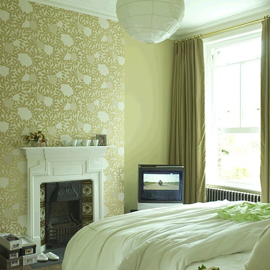
 The main task of the bedroom is comfort, relaxation and rest. Therefore, it is quite important to choose shades and colors for the bedroom that will give a feeling of comfort, calm and tranquility. A combination of light blue, beige, light orange, and soft pink colors is ideal.
When decorating the wall above the head of the bed, highlight it with wallpaper of a different color - this will create a feeling of sophistication and luxury in the design.
![]() An excellent combination of wallpaper of two colors on - not simple task, as it might seem at first glance. Since there is a lot of different furniture in the kitchen, the wallpaper should ideally match it. As a rule, one of kitchen walls is decorated with tiles, and there is not much space left for combining wallpaper of two colors.
An excellent combination of wallpaper of two colors on - not simple task, as it might seem at first glance. Since there is a lot of different furniture in the kitchen, the wallpaper should ideally match it. As a rule, one of kitchen walls is decorated with tiles, and there is not much space left for combining wallpaper of two colors.
Wallpaper in two colors for the kitchenchoose better in neutral tones no difficult patterns.
Most suitable for standard small kitchens pastel shades and colors, and most often with small patterns.
Bright, rich colors and a cheerful motif will allow us to easily choose two wallpaper colors in. The basic rule of color combination will still remain in force. And it’s better not to combine too many colors and shades, even in a nursery. A maximum of three colors will look good, and no more than two bright and rich tones. 
The use of traditional shades in the nursery will not be prerequisite. It is good if the room is made in neutral, calm shades, especially for the room of a small child.
Violet, green, peach, yellow, apricot, walnut and pale lilac colors combine very nicely.
Such combinations are ideal for both girls and boys.
We hope that our article helped you figure out how to combine two colors of wallpaper in the interior of an apartment. And you will have a lot of creative and original ideas designs that you will certainly bring to life.
Experimenting with wallpaper in different colors allows you to achieve an optimal balance in the feel and perception of the room. Wallpaper manufacturers always build their collections in such a way that among the entire assortment you can choose two or three ideal suitable for each other kind. Moreover, not only colors, but also textures can be combined.
To learn how to combine wallpaper colors in the interior, you need to remember the main rule: different types of wallpaper should not only be contrasting, but also have some common features. If you choose wallpaper that is identical in color and differs in shade, it should also have a common pattern and texture.
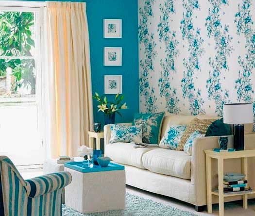
Wallpaper color combination in the living room
The living room is the most trafficked place, so all owners strive to make it cozy and attractive. A design technique such as combining wallpaper can be a good move, you just need to know how to use it correctly.
Basic combination techniques different wallpapers in one room there is an alternation of horizontal and vertical stripes, as well as a combination of different shades of the same color. A more daring option is to use combinations of completely opposite colors for one room.
Since the living room is a place for active pastime, bright experiments can be carried out here. For example, try a combination of wallpaper colors such as green and purple. Green also goes well with orange. Such contrasts set the mood of the room.
 |
 |
 |
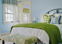
Wallpaper color combination in the bedroom
The bedroom is a place for relaxation and a night's sleep. An atmosphere of romance and peace should reign here. Therefore, avoid combining contrasting and bright colors.
Try a combination with brown, soft turquoise, purple, pink. In principle, neutral beige goes well with most colors - both warm and cool. My only advice is to avoid combining beige and gray.
 |
 |
 |
In a children's bedroom, you can try a combination with brighter tangerine, pumpkin, and brick shades of orange. The result will be an interesting and bright, but at the same time not annoying interior.
 |
 |
 |
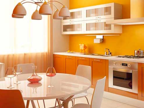
Wallpaper color combination in the kitchen
The kitchen is often decorated in several colors, but you should not use more than 3 shades. And if the color kitchen set and the walls match, then the furniture should be of a different shade.
The combination of the color of furniture and wallpaper in the interior of a given room is no less important than, say, in the living room, since the resulting imbalance or monotony can negate all your efforts to create a designer interior.
The following colors and shades are best combined in the kitchen: orange and yellow, turquoise and beige, yellow and turquoise, green and orange. Try to avoid combining two cool colors of wallpaper and furniture, such as lilac and gray. This will completely kill your appetite, which is unacceptable for the kitchen and dining room.
 |
 |
 |
Wallpaper color combination in the hallway
Guests enter the hallway first, so it is important to immediately create the right impression of the owner of the home. For a narrow corridor, choose light and plain wallpaper in combination with a darker horizontal stripe along the bottom or top of the room.
It's no secret that from color palette The emotional mood on the walls of our home largely depends. Wallpaper, as a finishing option, is the most affordable and common solution. A competent combination of different wallpapers in the interior can not only improve the mood of the household, but also visually change the size and overall fulness of the room.
A big role here is also played by the fact that the vast majority of our compatriots can hang wallpaper with their own hands. This means that, having mastered a few simple skills and knowing the general laws of compatibility, you can independently make your home a unique cozy nest, with its own unique charm.
The video in this article shows the types of wallpaper.
Laws of pattern combination
Vertical alternating stripes

- This technique has been known for quite a long time, alternating horizontal stripes different sizes and colors with a certain frequency can change the geometry of the room.
- For this, as a rule, rolls with the same width and, most importantly, the same texture are used. You can alternate in different ways, you don’t have to do it traditionally through one, you can do it through 2 or even 3 stripes. The main thing is that a certain rhythm is captured in this; this technique does not tolerate chaos.
- The combination of wallpaper colors in the interior with a predominance of vertical stripes is also of no small importance. Here you can do two things. The first option involves alternating different shades of the same color. According to the second, opposite colors of the spectrum alternate.
- instills calmness and balance, it is more characterized by light, pastel shades, taking into account the texture, it creates the impression of a peculiar play of shadows on the wall. The contrasting option is closer to a strict style with its own unique character.

Advice: here it is quite acceptable to use canvases of the same type, but with different textured patterns.
This will additionally add coziness and make a slight hint of stylization for a certain era.
- From a practical point of view, covering such premises is perhaps the easiest. The joints between different stripes are perfectly masked by alternating colors or textures.
Horizontal wall division

- Horizontal division is also one of the common classic styles.. Here, almost the same techniques are used as with the horizontal stripe, but somewhat wider. IN in this case In addition to the traditional alternation of color and texture stripes, the combination of wood and wallpaper in the interior along the horizon works well.
- Unlike vertical version, with horizontal division, the height of the ceilings is important. The higher the ceiling, the wider the strip, so for high ceilings strips of 1.5 - 2 m are recommended, for average heights 1 - 1.5 m, with low ceilings no more than 1 m is taken. Contrasting combinations look great different types canvases So vinyl wallpapers with a rough texture can be diluted with soft patterns of textile wallpaper.

Important: when pasting with your own hands, the horizon should be marked along the floor, and not along the ceiling.
This is fundamentally important, since in this case there will be the right combination of wallpaper and furniture in the interior, they will be on the same level.
- Also, when joining horizontal panels, experts recommend making a slight overlap and not smearing the edges; the joint can be drawn with a pencil on the wall. After the glue has set, you can coat and join the edges, cutting off the excess.
- This is due to the fact that horizontally glued strips are more susceptible to deformation.. In this case, the widespread use of borders, moldings, fillets and other accessories is appropriate.
Wallpaper inserts

- This technique is used on an already prepared base; it is most convenient to do this on plain painted walls. Contrasting inserts of various configurations are glued on top of the finished base. From a technological point of view, such decoration is not particularly difficult; here it is more important to decide in what style you want to decorate the room.
- Inserts made of thick material with a pronounced texture will look most impressive; non-woven or vinyl wallpaper is good. If the wall has a textured coating, then you can use it, but in this option it is important to think about the combination of wallpaper and curtains in the interior.
- IN classic style it is envisaged to frame the inserts with various kinds of planks or borders. Framed, square or rectangular inserts are closer to Baroque. Complex geometric shapes in various variations are classified as neoclassicism.
Dividing a room according to functional orientation

- This technique is used for zonal division of a room.. So let's say the nursery can be visually divided into 3 main areas. This will be a place to sleep, which is characterized by calm, peaceful shades. For the work sector, bright, sometimes aggressive, but usually plain wallpaper is used. The playing part of the room is designed according to the child’s predisposition and tastes, but always in a life-affirming style.
- In the living room, the most common place is where the TV is installed.. Since it itself is the center of attention, this effect can be enhanced by highlighting this sector with contrasting colors of textured canvases.
- In the bedroom, it would be most reasonable to highlight the part of the wall that borders the head of the bed, but in this case, contrasting colors will only irritate. Psychologists advise using different tones of the same calm color.
The video in this article presents the opinion of experts on wallpaper compatibility.
patchwork quilt
- If you have a rich imagination and your creative thoughts flow like a fountain, then this solution may suit you. The instructions are absolutely simple; cut out any pieces of wallpaper of various sizes and configurations and place them according to your vision of the overall concept of the room. You can glue both ordered combinations of elements and chaotically placed islands.
- But, despite the apparent democracy, there are also certain laws here. So, it is advisable to take wallpaper of one type and one density; if you decide to work with non-woven fabrics, then only they should be present. There are also 2 approaches to decorating. You can take several shades of the same color and combine them. Or use different colors, but in this case they should be united by something, for example, the general plot of the drawing.
- As for the gluing technique, this is at your discretion; you can glue the wallpaper overlapping or end-to-end, the main thing is that you like it. With the right approach, the price of such a panel will be quite affordable, but the visual effect will be enchanting. This technique is more characteristic of young people and people of art.
![]()
Proper use of niches and protrusions
- In the old days, the presence of an irregularly shaped niche or protrusion in a room was considered a problem; they tried to somehow close them or drape them with something. Currently, many designers, on the contrary, use various architectural irregularities for the benefit of the interior. The main thing here is to follow certain rules.
- Contrasting color separation works very well. So, for a white wall, a dark, sometimes even black, tone is used. A niche will look good on a blue background peach color. A soft pink interior can be perfectly diluted with various variations of green.

Tip: if the room is designed in one color, then the niche can be decorated with wallpaper with a pattern.
For the bedroom these should be calm ornaments; in the living room or hall, you can decorate a niche more intensively.
- The gluing technology here is traditional, but you will have to tinker. As a rule, such architectural excesses have a lot of angles, turns, and sometimes irregular shapes.
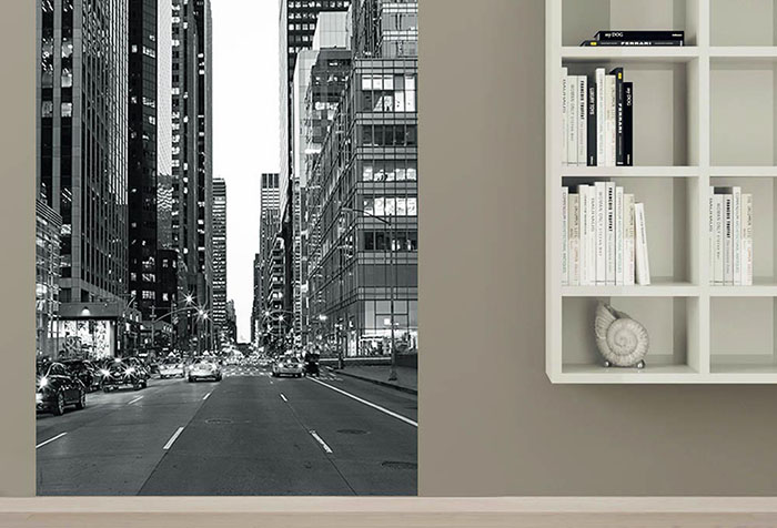
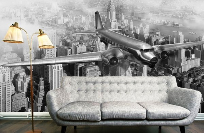
Layout of photo wallpaper in the interior
With the advent of photo wallpapers, a new era began in interior design. They opened up endless possibilities for bold decisions and creative approaches. No one will argue that the right combination of wallpaper and photo wallpaper in the interior can make a room unique.
- If you plan to place an image with views of large modern cities, then almost any color will do, the main thing is that the background space does not contain colorful patterns or ornaments, or even better, it is monochromatic.
- It is better to place bright, lush vegetation in rooms located on the sunny side. White goes well with it; shades of grey, pearl or beige are also suitable.
- For the north side, bright, dynamic colors are used that can warm and invigorate. It is better to use light wallpaper with a warm tint as a background.
- For photo wallpapers in blue, amber or ruby tones, a white, gray or lilac background is recommended.
- The use of contrasting combinations is common, so khaki is contrasted with red, blue is combined with orange, brown with turquoise, salad is well shaded with purple.

Important: if your goal is a cozy harmony of comfort, then combine olive with pale yellow, white with cream, brown with beige.
The video in this article shows examples of combining photo wallpapers.
Conclusion
Examples of combining wallpaper in the interior are partially presented in this article, but do not be afraid to experiment, design is, first of all, creativity. We have only tried to outline for you the fundamental principles, based on which you can avoid some mistakes.

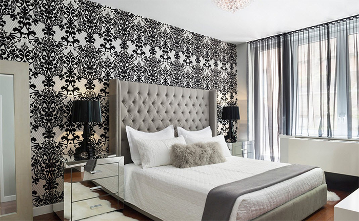
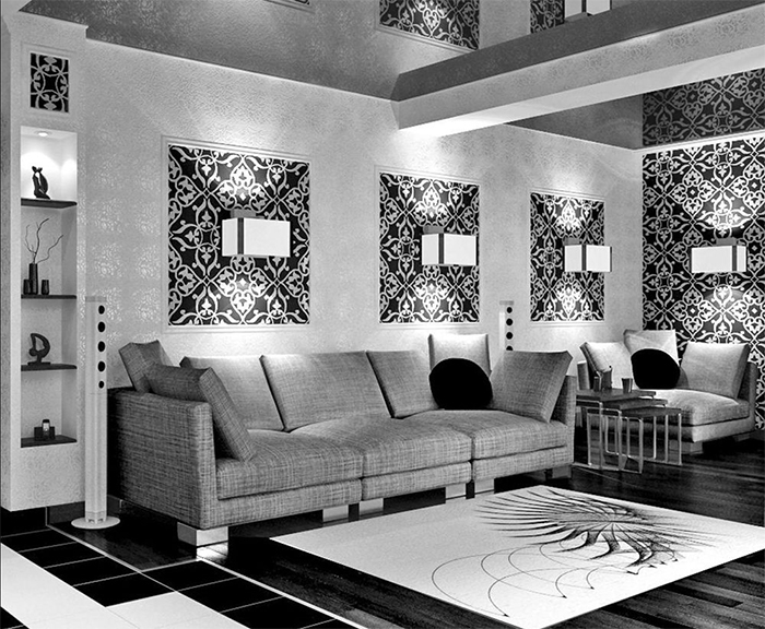
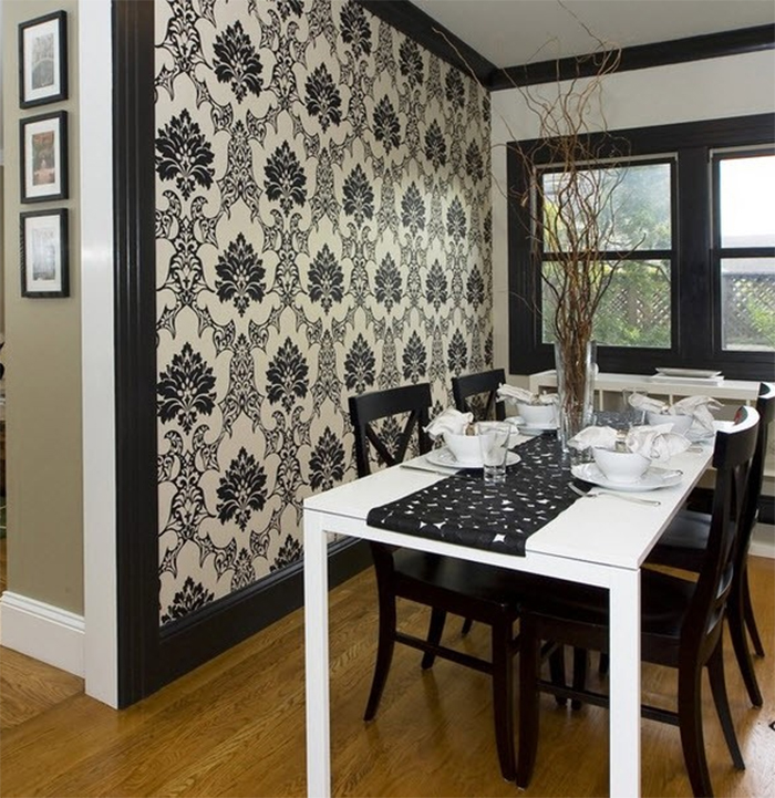
Black and white - irresistible color combination, relevant for all times, both in fashion and in interior design. Black and white wallpaper is a very bold decision that requires a carefully planned approach. This combination looks extremely impressive, but due to the high contrast, it dazzles the eyes. How to avoid a gloomy and formal style by using black and white in wall decoration? Designers have plenty of techniques that allow them to use this color scheme without fear.
Profitable ideas and forbidden solutions
The combination of black and white wallpaper colors is recommended for the following living rooms.
- Matrimonial bedrooms. Quite suitable for creating an intriguing or mystical atmosphere.
- Men's bedrooms. In them, the black and white color looks brutal and strict.
- Cabinet. Monochrome promotes concentration.
- Hall, living room. In these rooms, the black and white tandem must be used in doses so as not to fall into dark tones and gothic. Even if the owners like such an atmosphere, guests are not always comfortable in it.
If the room is not quite suitable for decorating with wallpaper in black and white colors, cover only one wall or part of it with them.

In some rooms, designers categorically advise against using black and white wall coverings.
- Hallway . She should be friendly and cozy, but not strict. With a lack of light, which is always present in hallways, black and white looks depressing. A dark corridor is not the best start to an apartment.
- Children's room Choice black and white walls for a child's room, given the existing riot of colors and variety of plot drawings, it looks, at least, strange.
- The dining room is definitely not. Monochrome discourages appetite and does not contribute to creating a friendly atmosphere at the table.
- Wall decoration in the kitchen in black and white is possible under certain conditions. If the kitchen is large enough, you can cover one wall. Elongated rooms harmonize, decorating long wall in light tones, and the short one in black and white. If the kitchen is combined with a dining room, then it is better to avoid black and white wall coverings.
- Small rooms– dressing rooms, lobbies small size, toilet and so on. Such wall decoration invariably evokes associations with a cramped and dark closet.

It is undesirable to decorate a wall in monochrome that is looked at for a long time, for example behind a TV. You can use the bedside area, the wall behind the sofa or closet.
![]()
Drawing and proportions
Mood black and white interiors determined by the ratio of black and white.
- Black drawing on a white background– this wallpaper is suitable for decorating walls in small or dark rooms. White color makes the room brighter and visually expands the space. At the same time, it is taken into account that a small pattern and thin lines make the wall move away, while a large pattern brings it closer.
- White on black is for spacious rooms and well-lit areas. Black wallpaper with a large pattern is usually used on a small section of the wall or if the wall is divided horizontally (in this case, the lower third of the wall is decorated with light wallpaper).
- Equal proportions of black and white. This combination is also used only for spacious rooms. This is very fashion trend, it is widely used in modern interior. This approach requires good lighting.

To enhance the lighting effect, use glossy wallpaper - they reflect light.

General style
Black and white wallpaper is suitable only for certain interior styles. Besides, general style should be kept clearly enough so as not to create dissonance in the room.
- Classic style– black flowers, plants, exquisite fine lines and vignettes on a white background.
- Minimalism. Minimum furniture and decor, maximum space, wallpaper without color patterns, two-color.
- Neo-Baroque or Glamor. A black relief pattern on a silver background will emphasize the atmosphere of luxury. A satin ornament on a matte background is appropriate.
- To create a retro style Often they use black and white stripes or wallpaper made to look like a newspaper sheet.


Wall decoration with a black and white geometric print is typical for high-tech and modern style. Sometimes this technique is used in Japanese design, which is characterized by subdued colors and monochrome designs. Black and white contrast will look great in a modern studio apartment in the art deco style.

Designer secrets: furniture and accessories
Properly selected furniture and accessories will help to avoid awkwardness in the interior or the other extreme - bureaucratic design. Guided by the following principles.
- White or mirrored, silver furniture goes well with black and white walls. If the furniture is black, then it must be polished, with a shiny surface that reflects the light falling on it.
- The furniture has a minimum of decor, but mirror inserts, chrome parts, smoky glass, and tables with glass surfaces are welcome.
- Avoid bright, saturated colors of furniture. Neutral and bright hues. On a black and white background, you can leave one or two bright objects - a table, ottoman or banquette.
- Blue, red or yellow sconces and lamps will refresh the room. Small bright accessories are also used - plates, vases, souvenirs.
- It is not recommended to place colored furniture natural wood– against the black and white background of the walls it looks inexpressive.
- For wallpaper with a predominance of black color, large light objects are selected - an armchair, a blanket, a sofa.
Very good welcome- hang a mirror on a dark wall and reflect a light source in it - a chandelier or lamps. Also, a dark wall will not act depressingly if you hang several sconces on it.
Combination with other colors
Very often, black and white wallpaper is combined with other colors. In this case, only one wall is pasted over - behind the sofa or bed, at the desk, near dressing table. You can cover the entire wall or just part of it. The latter option is used in small rooms so that there is no gloomy impression of the wall decoration.
The companion color is selected from a pastel range. Cream and light yellow go best with black and white. It is possible to decorate the other three walls with pure white wallpaper, which will serve as a background for various accessories. The alternation of black and white and light (cream or white) plain stripes looks very stylish. They can be uniform, or you can play with the width, highlighting different zones in the room.

Dark companion colors will add gloominess to the interior, so it is better to choose their counterpart from a pastel range. For example, instead of purple - pale lilac, and replace chocolate with light pistachio or milk. You should not combine black and white with gray– this combination may only be appropriate in the office.

Decorating a room in black and white requires sufficient courage and a clearly consistent style. The white color itself is quite cool and impersonal, but it makes the room spacious and bright. Black, on the contrary, creates density and a sense of security, makes the room more comfortable, but compresses the space. By correctly dosing the ratio of these two colors depending on the characteristics of the room, you can achieve amazing results.
Wallpaper with a black and white pattern looks very stylish and modern. They can decorate almost any room - living room and bedroom, kitchen and hall. General rule– the room should be spacious enough and well lit. Otherwise, use white wallpaper with a light and small black pattern. Black and white are quite difficult colors for the psyche, so if you are not sure that you want to decorate the interior in this way, take a closer look at more soft options: black design on a cream background, silver or brown on white.